filmov
tv
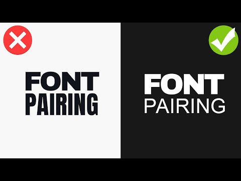
PAIR FONTS LIKE A PRO - 1 Simple Technique That Works!

Показать описание
In todays graphic design video tutorial, learn how to pair fonts LIKE A PRO! I show you the stunning results from using contrast on your typography, and how easy it is to select specific fonts for an optimum contrast and solid font pairing.
In the video, we walk through 4 key ways to pair fonts using contrast, and the 4 different ways are my personal selection for you to learn and use in your graphic design projects. They all focus on ways to use contrast within typography, which is an easy way to font pair. Let me know which of the 4 methods in the video appeals to you more..So why do we focus on contrast in the video as a means to pair fonts? Contrast, when done correctly, allows your design to become that more interesting and balanced. Having 2 fonts that are similar causes a clash, and this is negative to any viewer and for your design. So please do follow along with the video and learn all about font pairing while utilising contrast, for your typography!
If you found typography font pairing tutorial enjoyable or useful, let me know in the comments section and drop a like on your way out. Subscribe to stay updated to all of my uploads and until next time, design your future today, peace
🔴 Design Your Very Own Website w/ Bookmark
🔴 SUBSCRIBE TO MY PEACEFUL & POSITIVITY CHANNEL
🔴 EXCLUSIVE CONTENT, TUTORIALS, DOWNLOADS & MORE
🔴 JOIN MY EMAIL LIST For Weekly Updates & Exclusive Content:
📢 📢📢 SUBSCRIBE TO MY CHANNEL
.........................................................................................................
USEFUL AFFILIATE LINKS:
GET NORDVPN:
USE COUPON CODE: satori
USE THE CODE SO YOU CAN GET 75% off 3-year plan + 1 month free
Sign up for over 71,000 Design Assets:
.........................................................................................................
7 FREE SCRIPTS FOR ILLUSTRATOR:
My LONGEST ever tutorial on an isometric design
Create JAW-DROPPING design by using graphic design principles
***************** MUSIC *****************
JULIAN AVILA -
Joakim Karud check his music out here
▶ Copyright
The work is protected by copyright. This is applied to the video recording of itself as well as all artistic aspects including special protection on the final outcome. Legal steps will have to be taken if copyright is breeched. Music is used from the YouTube audio library and thus copyright free music
Resources Used:
FTC: This video is sponsored by Bookmark
Комментарии
 0:06:50
 0:11:05
 0:07:00
 0:11:03
 0:04:48
 0:06:55
 0:07:43
 0:16:00
 0:04:01
 0:07:03
 0:05:35
 0:00:07
 0:07:44
 0:10:30
 0:11:12
 0:00:16
 0:28:53
 0:00:20
 0:01:20
 0:01:06
 0:00:57
 0:07:23
 0:03:32
 0:07:17