filmov
tv
17. Python to make nice figures. Part III: advanced plots

Показать описание
This is part 3 in a 3-part series on making beautiful scientific figures in python. In this video, I will cover some advanced scientific plots in python.
00:00 Generic advanced plot
6:45 stacked plots with fill between
11:51 multipanel plots
23:29 heatmaps
37:24 multiple axes plots
44:32 Rietveld refinement diffraction plots
51:24 3D plots
00:00 Generic advanced plot
6:45 stacked plots with fill between
11:51 multipanel plots
23:29 heatmaps
37:24 multiple axes plots
44:32 Rietveld refinement diffraction plots
51:24 3D plots
 0:56:44
17. Python to make nice figures. Part III: advanced plots
 0:00:32
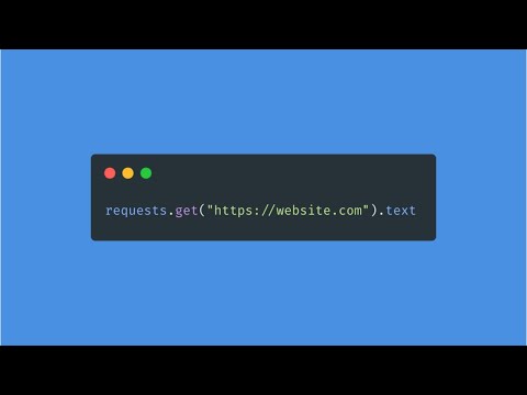
Python WEB SCRAPING in 30 Seconds! 🔥👨💻 #shorts
 0:00:17
Amazing Rotating Python Graphics Design using Turtle 🐢 #python #pythonshorts #coding #viral #design...
 0:00:31
Pygame - Create game in python || Pygame python tutorial #python #pygame
 0:00:55
Be a Python Pro with Enumerate
 0:09:52
Giant Python Bit My Face 😳
 0:00:14
Amazing Flower Design using Python turtle 🐢 #python #coding #funny #viral #trending #design
 0:13:00
Master - 17 Modular Coding in Python
 0:03:59
CodeCombat The Final Kithmaze - Level 17 Python Tutorial with Solution
 0:13:17
Beautiful Terminal Styling in Python With Rich
 0:00:31
Learn Python in 30 Seconds | Project-Based Full Course | Make A Calculator
 0:00:45
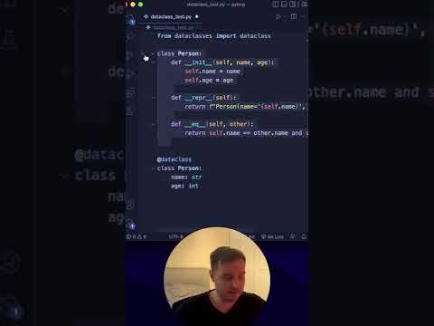
Why dataclasses in Python are awesome!
 0:00:22
Learn to Make a Rickrolling Website with Python in 17 Seconds
 0:09:12
25 nooby Python habits you need to ditch
 0:27:45
Python Tutorial 17: Python Functions Examples and Solutions
 0:00:28
Developer Last Expression 😂 #shorts #developer #ytshorts #uiux #python #flutterdevelopment
 0:11:12
Modern Graphical User Interfaces in Python
 0:00:27
Is Python a great language for 13-year-olds?
 4:26:52
Learn Python - Full Course for Beginners [Tutorial]
 0:14:51
Python Realtime Chat: Build a FULL-STACK app in 17 Minutes! (Best UI 🤩)
 0:04:52
#17 Python Tutorial for Beginners | Swap 2 Variables in Python
 0:48:55
Python beginner course | Great for kids!
 0:10:57
How to Create a Beautiful Python Visualization Dashboard With Panel/Hvplot
 0:37:40
Codecademy - Python: Tutorial #17
Комментарии