filmov
tv
Your Colors Suck (it's not your fault)

Показать описание
The first 100 people to use code ACEROLA at the link below will get 60% off of Incogni:
Digital color theory is a mysterious black box that few resources bother explaining, but how does it all work? Where did it all come from? And why are the color pickers in the art programs you use so bad?
Topics covered include: Quantization, color banding, dithering, value mapping, palette swapping, radiometry, photometry, how humans perceive color, colorimetry, spectral rendering, the rgb color model, deriving srgb, the hsl color model, gradient mapping, randomly generated color palettes, perceptual color spaces, the lab color model, oklab
Use the palette generator here:
(sorry website is down for the foreseeable future but there are much better color palette generators you can find lol this was for an experiment not meant to be used as an actual service)
Check out Evan's stream!
Photoshop OK Color Picker:
Support me on Patreon!
Socials:
References:
- Real-Time Rendering Chapter 8: Light And Color
- An Interactive Method for Generating Harmonious Color Schemes
Thanks so much to these artists!
Music:
Afternoon Break - Persona 3 OST
Master Of Tartarus - Persona 3 OST
This Mysterious Feeling - Persona 3 OST
Midori Eyes - Paradise Killer OST
During The Test - Persona 3 OST
Junes Theme - Persona 4 OST
New Game - WORLD OF HORROR OST
In A Moment's Time - Skullgirls OST
A New Frontier - VA-11 Hall-A OST
Every Day Is Night - VA-11 Hall-A OST
Underground Club - VA-11 Hall-A OST
Your Love Is A Drug - VA-11 Hall-A OST
Karmotrine Dream - VA-11 Hall-A OST
GO!GO!STYLE - Paradise Killer OST
Police Station - Persona OST
Thanks for watching!
This video is dedicated to my friend, Alotryx.
#acerola #graphics #gamedev #unity3d #graphics #shaders
 0:37:01
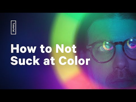
Your Colors Suck (it's not your fault)
 0:12:49
Your Color Grading Sucks, Not Your Footage!
 0:07:34
Your Colors Suck And This Is Why
 0:07:52
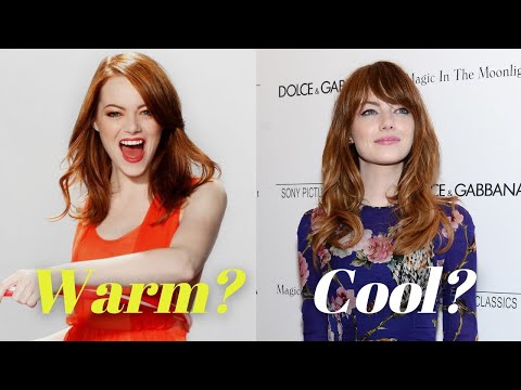
How to Not Suck at Color - 5 color theory tips every designer should know
 0:50:37
Why Color Management Absolutely Sucks (It’s Not You)
 0:00:06
If Breaking Bad and Twilight switched colors
 0:01:00
How to not SUCK at Colors #shorts
 0:00:06
If Oppenheimer and Breaking Bad switched colors
 0:00:37
Why you look bad in your own color season
 0:07:56
Why Your Colors Look Bad
 0:00:23
Indicolite is not such a bad color!!
 0:00:23
Your brand’s color palette SUCKS and is losing you money! #shorts #psychology #branding
 0:01:00
Try this if your color combinations suck #watercolorpainting #shorts
 0:01:00
If you are Soft Summer, True Autumn colours would not be “bad” on U #colouranalysis #coloranalysis...
 0:00:16
Unbelievably Bad Colors Presentation
 0:18:17
Why Do I Look Bad in BOTH Warm and Cool Colors?? Here's Why.
 0:00:34
PURPLE IS A BAD COLOR IN ROBLOX! 😢
 0:00:17
💙Color meme blue is not a bad color💙
 0:00:04
ahahhahahahha im not cringe plus your color is bad
 0:00:29
Blue isn’t a bad color 💙💎
 0:12:18
i was wrong...
 0:08:48
Why Your Colors Look Bad In Procreate - And it's Not What You Think (Procreate Tips)
 0:00:51
Help me figure out my lip blindness 🫶🏼
 0:59:15
Barbie Becomes a Mermaid 💎 Gorgeous Beauty Makeover
Комментарии