filmov
tv
Take Reports And Visuals To Another Level Combining Filters And Interactions In Power BI

Показать описание
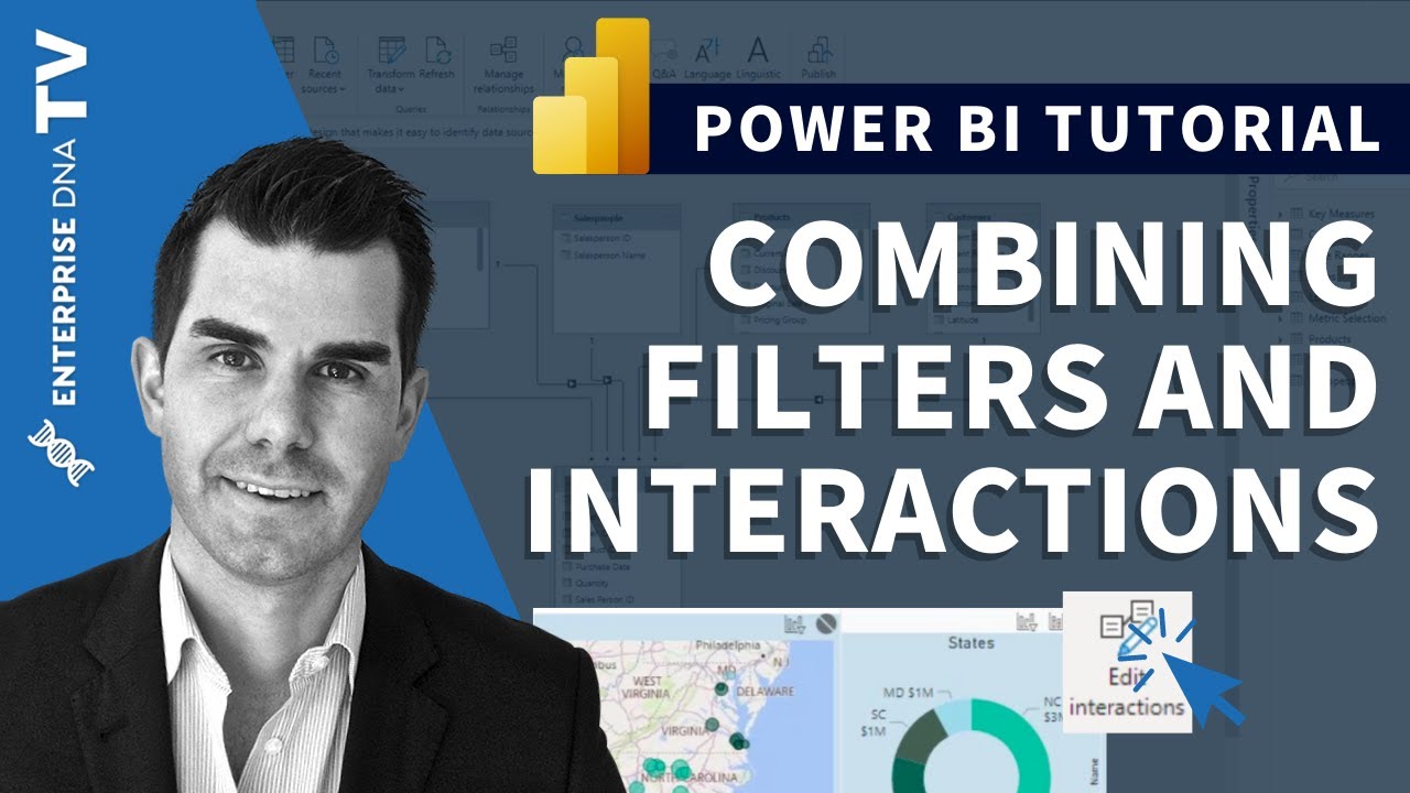
As a Power BI user, it’s always good to find ways how you can take your reports and visuals to another level. In this tutorial, I’ll show how filters operate and how to manipulate them to showcase your visualizations easier and in a more intuitive way especially if you need to create groupings of information in your analysis.
Sam
***** Video Details *****
00:00 Introduction
01:00 Get your model right
02:10 Changing how visuals interact
02:27 Changing filters
02:40 Using the filter fields
04:09 Editing visual interactions
04:52 Turning off filters
06:42 Multi-filtering visuals
***** Related Links *****
***** Learning Power BI? *****
#EnterpriseDNA #PowerBI #PowerBITutorial #PowerBIDesktop #PowerBIDAX #DAX #DAXTutorial #SamMcKay #DataVisualization #DataVisualizationTutorial #DataVisualizationPowerBI
Take Reports And Visuals To Another Level Combining Filters And Interactions In Power BI
Reports & Visualizations Pt. 2 - Power BI Best Practices Vol. 4
How to Transform Excel Data into a Striking Visual Report with Microsoft Power BI
Swap Power BI Visuals to add FLEXIBILITY in your reports
Reports & Visualizations Pt. 1 - Power BI Best Practices Vol. 4
Transform your reports with INTERACTIVE buttons that SWITCH visuals
Split the Power BI VISUAL into PAGES 😱
Power BI Tips & Tricks: Enhance Reports with Visuals & Formatting
Level Up Your Power BI Reports with Custom Visuals! Import Any Visual You Need (2024)
How To Generate Report or Data Report or Report Generation in Visual Basic 6.0
The Unexpected Details of the Israel-Hamas Ceasefire & Who Should Take Credit?
Maximizing the Visual Appeal of Your Power BI Reports with HTML - Webinar 01.03.2023
Get your Tally outstanding Reports in Visual graphs & Reduce Payment Delays
3 steps to pin Reporting Services visuals to a Power BI Dashboard
Real World reporting using stunning Power BI visuals to solve business requirements and create stell
Get visual answers from your data with Fibery reports
How to Create a Report with a Parameter using ReportViewer in Visual Studio
Vault reports and visual mapping
How to get Secure Images in Power BI Reports
Physician Compensation Reporting – Leveraging Visual Dashboards and Analytics
Paginated Report Visual Complete Tutorial in Power BI (13-10) Power BI
Creating Multi-Threaded Visualizations Within Power BI Reports - Compelling Technique
Enhance Issue Understanding by 25% with ShakeBug's Visual Bug Reporting App!
Dashboard Component Allows you to Display a Report Chart as a Visual Indicator #salesforce
Комментарии
 0:11:45
 0:15:11
 0:30:22
 0:06:26
 0:21:30
 0:11:32
 0:00:49
 0:27:35
 0:03:59
 0:10:23
 0:57:41
 1:14:42
 0:00:41
 0:04:57
 0:57:59
 0:47:57
 0:09:30
 0:05:05
 0:08:25
 0:38:39
 0:12:52
 0:16:03
 0:00:24
 0:00:13