filmov
tv
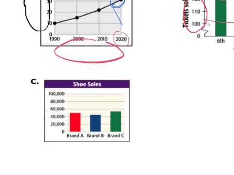
Misleading graphs in representing data

Показать описание
Experienced teacher explains Misleading graphs in representing data!
StudyPug focuses on real, in-depth examples, the kind you see on your exams or at the back of your textbook chapter! The questions can be tricky; we show you how to solve it.
===
- Hi, welcome to this question right here. So this question here it'll ask you in a different approach, does it look like more ice cream cones were sold than the fries? In this case it's yes, okay? Because sometimes the pictograph is trying to show us the amount or the distance. By looking at the drawings right, here it does look like we have more ice creams in terms of the length because it finishes here, right? The fries finish up here, the pizzas finish up there. So it does look like there are more ice creams sold compared to the number of fries, okay? But we know in reality there are four fries that's sold and there's only three ice cream that's sold. It should be the fries has the best selling, okay? But in this case, it does look like you have more ice creams that are sold just because the drawing of the ice creams are bigger. So this is something that you should watch out for. You should draw them in a similar shape and size, okay? Thanks for watching.
===
Follow Us
 0:00:58
 0:10:29
 0:09:22
 0:07:26
 0:12:04
 0:06:15
 0:10:25
 0:03:32
 0:03:14
 0:12:14
 0:01:17
 0:04:16
 0:03:00
 0:09:48
 0:06:51
 0:04:20
 0:04:35
 0:10:46
 0:04:53
 0:11:09
 0:06:49
 0:08:36
 0:03:13
 0:01:37