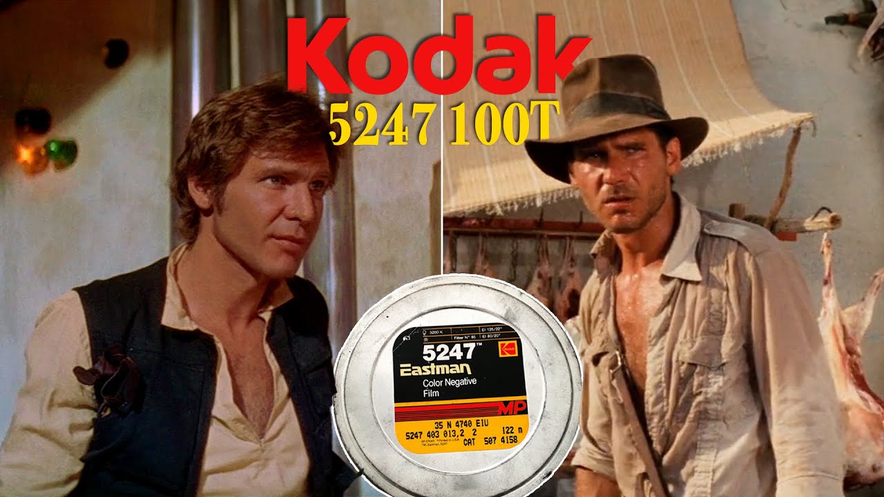
Why Movies From The 70s & 80s Look Like This: Kodak 100T 5247
preview_player
Показать описание

Let’s take a look Eastman’s 5247 100T II film stock, its characteristics, the new development process that it created, and why modern movies have a more diverse range of looks when compared to many of these films from the 70s and 80s.

MERCH:

SOCIALS:

GEAR:

MUSIC:
Charlie Ryan - ‘No Stone Unturned’
Kevin Graham - ‘Curiosity’
Gregor - ‘Morning Breeze’
Sun Rain - ‘Planets’
Sero - ‘Mid August’
Joley - ‘Night Stroll’
Liquid Memoirs - ‘Distant Dream’
Chill Winston - ‘The Truth’

0:00 Introduction
1:07 Look
3:42 Exposure Index
5:52 Colour Balance
7:12 Squarespace
8:14 Development
9:06 ECN-2 Processing
10:24 Printer Lights
11:42 Digital Intermediate
12:54 Conclusion

DISCLAIMER: Some links in this description are affiliate links. If you purchase a product or service with these links I may receive a small commission without an additional charge to you.

Thank you for supporting my channel so I can continue to provide you with free videos!
Рекомендации по теме
Комментарии
Автор

I’m sure it’s because as an 80’s kid I grew up with these movies, but this film palette and look just seems so beautiful to me.

dirkfierce
Автор

That film stock often gave the screen a "painting come to life" kind of feel. It gives those movies a kind of epic, romanticized unique vibe to it.

cleon
Автор

As a Hollywood camera guy back then, quite honestly we thought the stock was pretty limiting. To shoot at night, we needed a battery of carbon arcs up on “parallels”, built by the grips and run by a couple electricians, which had to have their carbons “trimmed” constantly. Everyone rejoiced with each successor film stock that required less light and the invention of better HMI lighting instruments.

CameraLaw
Автор

Excellent breakdown. I always preferred the gritty 70's/80's film look over today's slick digital look. But I never understood how they differentiated technically. Thank you for this. I wish the industry would preserve the look of classic films because they just have a better feel to them, in my opinion.

KenoSNeal
Автор

I worked in the Camera Dept at Warner Bros (actually The Burbank Studios as it was called then) in the 80s. Eastman came out with the new and faster 5293 in 1982 and the improved 5294 in 1983. We would use white tape to wrap 5247 magazines (exterior day) and red tape on the 5294 mags (interiors or night work). Getting the two film stocks mixed up would have been a disaster.

I remember very well when John Alonzo shot Blue Thunder which was released in May of 1983. Seeing the night helicopter shots over LA, it was astounding how the city lights popped in the pitch dark. It was a welcome addition to the old 5247 stock and almost everyone went to using both. I was also fascinated watching Mr Alonzo’s experimenting with fiber optics to help light interior sets. Never would try that with 5247.

brucekuehn
Автор

I love how 5247 crushes the blacks in shadow, it helps to make the film feel more focused on what’s actually being filmed.

RikerLovesWorf
Автор

Superb, thank you. I was a film loader on feature films and loaded this stock thousands of times…Arri mags were always easier than Panavision mags! I remember those labels so well - doing mag scratch tests, gate tests, focus leaders, all that great stuff that’s ancient history to digital camera crews. Handling the actual camera negative in a darkroom on a camera truck always was a thrill …and yes, I did edge-fog a roll once, and yes, it was a huge action scene with hundreds of extras and stunts …with horses, of course. I was extremely tired, pulled the tape off the Panavision mag, popped the latches and lifted the cover …and I remember thinking : “Hmmm…what’s that?” because, of course, a loader never actually SEES a full 1000’ roll of exposed film …unless something has gone terribly wrong. It took under a second before the panic hit me and I pulled the cord for the light. I was in a cold sweat, I bagged and canned the roll, then had to face the music. The longest walk of my life was the walk of 200 yards from the camera truck to the first assistant (focus-puller) and I told him the worst thing a loader can tell you : I fogged a roll. He put his hand on my shoulder and thanked me for telling him. Everyone was cool, but man, that was a day. As it turned out, the roll was fine and was only barely edge fogged because the roll is wound so tight and the dark room light is dim, I dodged a bullet…god bless those tight-winding Panavision mags!

johnmoorefilm
Автор

if there's one thing I've noticed, it's that film captures greens beautifully while digital greens always look super artificial

jakewestbrook
Автор

This film stock and the movies they were used on are absolutely gorgeous.

lukelarsson
Автор

I like how these earlier movies looked more natural. Not like now how everything has a filter or has the saturation cranked up.

klzdoee
Автор

I always thought as a kid growing up in the 90s that the films in the 70s just looks so more… the only word I could think of as a kid is “professional” and nowadays I’d say they had more warmth, depth and even the word fee/soul. Thanks for this video he explains the technical reason for my visual observation! Love this look!

jeffHughWilliams
Автор

I'm not even from the 70s, 80s or 90s, but I love how modern some of these films still look to this day, Star Wars Original Trilogy, Apocalypse Now, The Shining, Indiana Jones, or Blade Runner which looks 20 years ahead of it's time, I love when movies from the 70s, 80s and 90s look like they were shot yesterday, that's when I say the image quality aged well, of course restoring the negatives (even for 4K transfers) might have something to do with that.

jesustovar
Автор

I am never going to be able to unsee the red colors in those movies

BobDeCaprio
Автор

Not to mention that they didn't shoot against green screen or fill the frame with blatant CGI. I like the older look to movies. I watched DOG DAY AFTERNOON (1975) a few days ago, I love how that film looks

ManvasPachenko
Автор

I never even thought about this before, but now I understand why 70s films look the way they do. When Steven Spielberg made Duel, he said he didn't really care what kind of car the main character drove, but it had to be visible against the desert background. Now I get why he chose a bright red car. Makes perfect sense.

TheJstewart
Автор

Excellent analysis. Films today do have an over reliance on digital grading - Altering the colour completely in post instead of shooting it correctly. The natural look of the 5247 is iconic and really does look more cinematic than today. Also, the use of key lighting, even in daytime scenes is lacking today. Even if it was more difficult for the camera dept. it just looks way more cinematic than shooting everything with available natural light.

mistersharkfilms
Автор

I never thought about it, but for some reason these movies gave me some nostalgia, even the ones I didn't watch back then. Now I know, thank you.

qv
Автор

The first version of 5247 along with a new ECN2 processing in 1974 was disliked by Hollywood cinematographers who felt it was too contrasty compared to 5254 and didn’t push-process as well (a common technique at the time). So Kodak sold both 5247 and 5254 in Hollywood, though this meant some labs had to be converted for the new process and others kept the old process set-up. In Europe and the U.K., there was no choice but to switch to 5247 though you could still find labs to process 5254 (Kubrick was shooting “Barry Lyndon” long enough on 5254 that the lab still had to keep an ECN 1 processor going.) In mid-1976, Kodak released an improved 5247 and obsoleted 5254. “Star Wars” started filming in the spring of 1976 and mostly used the early 5247 but “Close Encounters” probably mostly used the newer 5247, plus their 65mm VFX photography had to use 5254 because Kodak wasn’t selling 5247 yet in 65mm. Kodak kept tweaking 5247 over the years before it was obsoleted around 1994. John Toll shot the day exterior work of “Legends of the Fall” on 5247 but had to switch to EXR 5248 for “Braveheart” the next year.

davidmullen
Автор

I love watching shows like Quincy ME and others from that era. There was something warm about the tones. Outdoor scenes looked so summery!

garethjohnstone
Автор

Films from the 1970’s and 80’s were so much more pleasing to the eye than today’s digitally enhanced stuff.

OriginalGrasshopper