filmov
tv
The CIELAB lecture

Показать описание
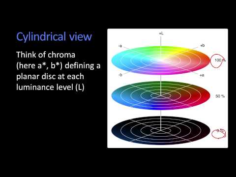
CIELAB color space is the most common way to measure, specify, and provide tolerances for color. John the Math Guy describes the CIELAB color space, along with his rants about how it doesn't quite work the way we want it to.
 0:45:26
The CIELAB lecture
 0:01:54
What is CIELAB?
 0:06:08
CIE Lab einfach erklärt
 0:02:01
CIW L a b Color Space
 0:02:20
Other Color Spaces
 0:02:22
How to Communicate Color Precisely?
 0:15:54
Why the heck do I need all that spectral data
 0:30:06
Chris Lilley: The Evolution Of CSS4 Colors - CSSConf.Asia 2016
 0:02:33
The color of beer with the CIELab method
 0:10:05
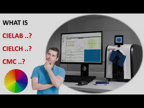
What is CIELAB, CIELCH, CMC ?
 0:09:52
Colorful Image Colorization | Lecture 30 (Part 3) | Applied Deep Learning (Supplementary)
 0:06:12
Free Macros! Colour Selection Part 3a: CIE Delta-E* Calculation
 0:29:54
Six things you should not do with CIELAB, Seymour, TAGA 2022
 0:02:08
CIE RGB Color Space
 0:52:19
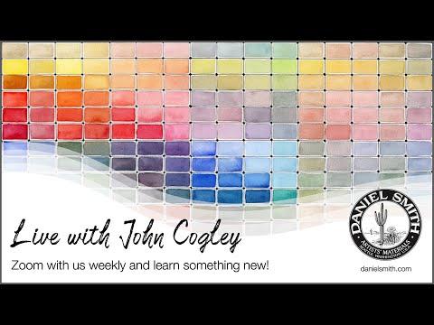
CieLab Color Map and other Artist Resources
 0:11:00
Color Gamuts, Color Matching, and XYZ
 0:37:54
'RGB to XYZ: The Science and History of Color' by John Austin
 0:27:41
Synaesthesia - Alberta Ipser (10/20/17)
 0:03:02
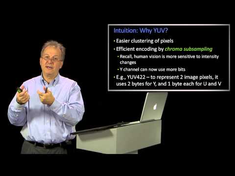
Intuition and Other Luma Chroma Color Spaces
 0:48:01
Chris Lilley | The evolution of CSS4 Color | CSS Day 2016
 0:18:57
Visnu Pitiyanuvath: HSL: The RGB You've Been Waiting For - JSConf Iceland 2016
 0:00:32
how to measure colors #delta #exact #xrite
 0:30:40
Searching Images by Color
 0:04:47
Indie Lab - Color Perception and Characterization
Комментарии