filmov
tv
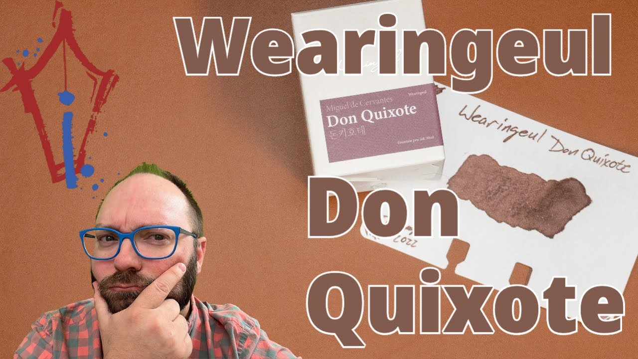
Wearingeul Don Quixote: What even is this color?
Показать описание
Okay, I don't know what to call this color. I picked it out because I couldn't really identify the color on the label, but you know I love a weird color. This one, though, I'm on the fence about. It's too light in one pen, and kinda too dark in another. I think I can find the right nib for this ink, but it's got to be *just* right. So: grab it if the funky color does it for you or if you really like the search for the perfect ink/nib combo.
Subscribe to the channel. Tell a friend about the channel. Leave a comment. Hit the like button if you like the video. Do the YouTube stuff!
To find the ink:
Bottles:
Become a Patron!
Get your Inkdependence merch!
Mike on Twitch:
Or you can use this link to support directly:
** I think Dromgoole's gave me this for review. Or maybe I bought it from them. I honestly can't remember, so just assume that they gave it to me. I try not to let that sort of thing color my reviews. What you see is what I got. Thanks for the support, Patrons! **
#inkdependence #penaddict #Dromgooles #Wearingeul
Chapters
0:00 Become a Patron!
0:10 Wearingeul's box and bottle
0:52 Don Quixote on Rhodia with two pens
3:06 Water Test
4:31 Chromatography
4:57 Copy Paper, Cosmo Air Snow, Wheat Straw, and Tomoe River Papers
7:55 Color Comparisons
 0:09:52
Wearingeul Don Quixote: What even is this color?
 0:04:39
Wearingeul Don Quixote
 0:11:05
#30inks30days (June 2023) Day 5: Wearingeul Don Quixote
 0:10:51
#30inks30days Day 24 (June 2023) - Wearingeul Whom the Bell Tolls
 0:00:22
Daddy Long Legs Ink Just Joined the Wearingeul World Lit Ink Collection
 0:00:16
I am in my red ink era Wearingeul’s Anne of Green Gables #wearingeul #ink #anneofgreengables #swatch...
 0:00:21
#calligraphy with #wearingeul #fountainpenink and a #glasspen ~ #penmanship #lettering #handwriting
 0:04:10
Wearingeul Dr Jekyll and Mr Hyde ink transformation
 0:00:54
Wearingeul's 2 NEW Shakespeare Inspired Inks 'Defy the Stars' with Gorgeous Shimmer P...
 0:00:24
Wearingeul Monthly World Lit. Collection A Doll's House Fountain Pen Ink #Shorts Ink Splash Vid...
 0:00:11
Anubis by #wearingeul 😍#newink #swatch #wearingeulink #anubis #fountainpenink
 0:01:09
New Dracula Ink: Wearingeul's Latest Monthly World Lit. Collection Ink Release has a Sharp Bite
 0:09:53
#30inks30days September 2023 - Day 17: Wearingeul Daddy-Long-Legs
 0:23:03
03 Wearingeul Metamorphosis - #30inks30days April 2023
 0:25:36
NEW INKS: SWATCHING WEARINGEUL INKS | ATLAS STATIONERS HAUL | Charmaine Dulak
 0:00:23
#calligraphy with black dream #fountainpenink from #wearingeul ~ #glasspen #dippen #penmanship
 0:09:50
Bwa! Is this Draculaic ink scary, or just scary cool? Wearingeul's Dracula!
 0:01:48
Wearingeul The Wonderful Wizard of Oz Spell Book Ink Set Unboxing & How To
 0:17:50
24 Wearingeul Wayfarer - #30inks30days April 2023
 0:10:49
#30inks30days September 2023 - Day 2: Wearingeul Anne of Green Gables
 0:31:56
FIRE SWATCH WITH ME // feat. Sailor, Wearingeul, and Ferris Wheel Press
 0:06:47
Wearingeul Dracula | Crimson Red with Blue Shimmer Swab and Review!
 0:15:13
28 Wearingeul Great Gatsby - #30inks30days April 2023
 0:08:25
Ink & Lyric - Wearinguel Twelfth Night
Комментарии