filmov
tv
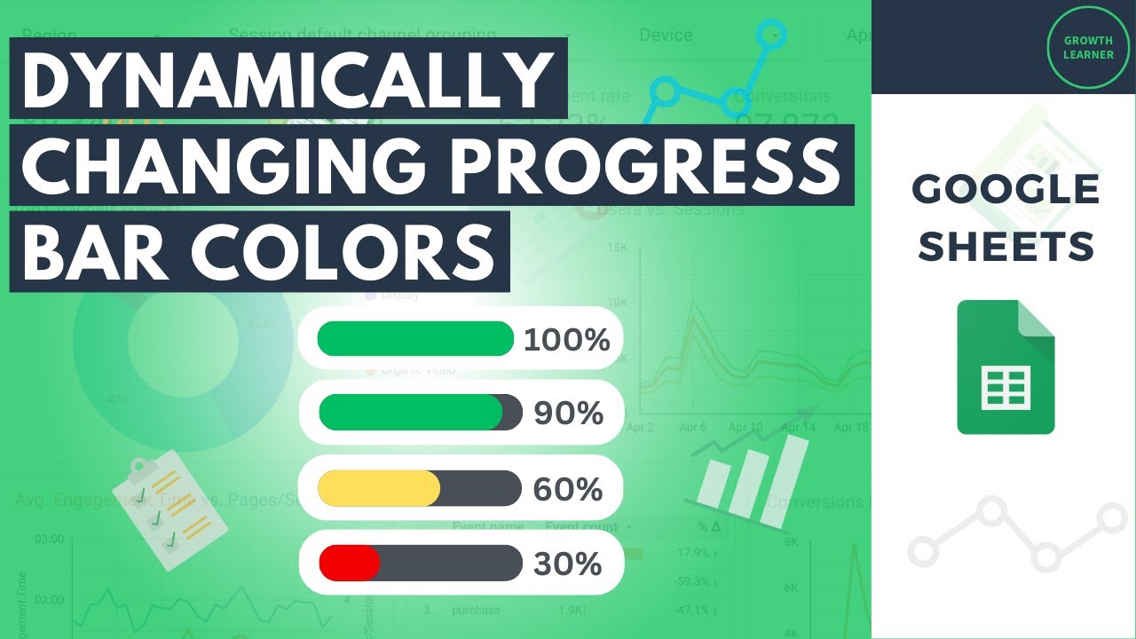
Dynamically Changing Progress Bar Color Based on Value (Google Sheets)

Показать описание
Transforming Numbers into Visual Cues: Dynamic Progress Bars with Color in Google Sheets
Google Sheets offers a powerful yet versatile function, IFS, that can be harnessed to create dynamically changing progress bars with color-coded displays. In conjunction with the Google Sheet’s sparkline function, this ability allows you to take your static data visualizations to another level, allowing the data visualization in the progress bar's appearance to adapt and change color based on the data it represents.
This is the magic of Google Sheet’s progress bars – dynamic representations of values using color, adding a layer of visual understanding to your spreadsheet. The key to unlocking your progress bar data visualization lies within the sparkline function and the IFS function, Google Sheets' versatile tool for conditional formatting.
Using the IFS function with the sparkline function in Google Sheets allows you to establish a series of conditions and change the output accordingly. In the context of progress bars, these conditions represent different percentage ranges (e.g., 0-25%, 26-50%, 51-75%, 76-100%). Each condition is then paired with a specific color, creating a data visualization that reflects the underlying numerical value.
Therefore, creating progress bars with dynamic color changes and updates in Google Sheets empowers you to:
-Enhance data visualization: Quickly grasp progress, performance, or completion rates through visual cues.
-Enhance data interpretation: The dynamic nature of the progress bars keeps pace with your changing data, ensuring the visual representation remains accurate and up-to-date.
-Improve communication: Clearly communicate data insights to stakeholders without relying solely on numerical values. The color-coded bars offer an instant visual cue of the progress stage, improving data comprehension for viewers.
-Customize thresholds and colors: You can tailor the conditions and color choices within the IFS function to match your specific needs and preferences.
-Boost user engagement: Make spreadsheets more visually appealing and easier to interpret, fostering better user interaction.
Here's an example of how you can use the SPARKLINE function and the IFS function to create a dynamically changing progress bar:
=SPARKLINE([data point], {"charttype", "bar"; "max", 100%; color1, IFS([condition1], [color A], [condition2], [color B], [condition3], [color C])})
Remember, Google Sheets offers a powerful combination of functions like IFS and SPARKLINE, enabling you to go beyond static data representation and create dynamic data visualizations that enhance clarity, communication, and user engagement within your spreadsheets.
Комментарии
 0:02:05
 0:01:08
 0:00:48
 0:09:49
 0:02:17
 0:16:02
 0:02:01
 0:07:41
 0:09:30
 0:01:31
 0:00:24
 0:00:42
 0:00:47
 0:10:02
 0:03:19
 0:00:55
 0:08:07
 0:01:47
 0:00:44
 0:03:35
 0:05:06
 0:04:05
 0:09:40
 0:09:34