filmov
tv
Create Diverging Bar Charts in Excel & Power BI | Bipolar Bar Chart Full Tutorial

Показать описание
Welcome to Lean Excel Solutions! In this comprehensive tutorial, we delve into the step-by-step process of creating visually impactful Diverging Bar Charts, also known as Bipolar Bar Charts, in both Excel and Power BI.
📊 What You'll Learn:
- The differences between Diverging Bar Charts and traditional Bar Charts.
- When and why to use Diverging Bar Charts for your data.
- How to prepare your dataset for a Diverging Bar Chart.
- Detailed instructions to create Diverging Bar Charts in Excel.
- How to replicate the process in Power BI for dynamic reporting.
🔍 Tutorial Breakdown:
00:00 Introduction to Diverging Bar Charts
01:19 Chart Creation in Excel
06:54 Chart Creation in Power BI
Recommended Videos:
Recommended Playlist:
Check the Links for more:
Be sure to follow the links to stay in touch:
#DivergingBarChart #exceltutorial #powerbitutorial #datavisualization #leanexcelsolutions #excelcharts #PowerBIReporting #BI #dataanalysis #exceltips
 0:05:18
How to Build a Diverging Bar Chart in Tableau
 0:11:51
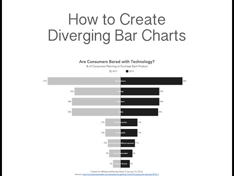
How to Create Diverging Bar Charts
 0:13:33
Create Diverging Bar Charts in Excel & Power BI | Bipolar Bar Chart Full Tutorial
 0:09:12
How to Create a Diverging Bar Chart with One Measure
 0:01:06
How to Build a Diverging Bar Chart in Power BI
 0:03:22
How to create a BiDirectional Bar Chart in Excel (or Mirror Chart)
 0:01:24
How to Create a Diverging Stacked Bar Chart in Tableau
 0:08:05
How to Create Diverging Bar Chart in Tableau
 2:13:57
Tableau Full Course Part-1
 0:35:40
How to Create Diverging Bar Charts With {ggplot2} | Step-by-Step Tutorial
 0:13:23
Make it in Excel! | Diverging bar charts
 0:08:58
034. A better way to create Charts for SURVEY RESULTS in EXCEL
 0:10:52
Diverging Bar Chart - How to Create Diverging Bar Chart in R
 0:07:07
How to in Tableau in 5 mins: Build a Diverging Stacked Bar Chart
 0:02:16
How to create a Bi directional bar chart in Excel?
 0:11:51
How to Make a Diverging Stacked Bar Chart in PowerPoint 🔥 [PPT CHARTS!]
 0:13:11
Diverging Bar Charts | Build This Viz | Tableau Tutorial with Data Coach
 0:10:38
Charting Survey Results in Excel (Visualize Employee Satisfaction results)
 0:06:19
Diverging Bar Chart in Tableau
 0:12:14
How to Visualize Overall Experience Rating Results with a Diverging Stacked Bar Chart in PowerPoint!
 0:16:12
Create a Diverging Bar Chart
 0:07:36
How to Make a Diverging Bar Chart in Tableau?
 0:11:11
Create a Diverging Column Chart in Excel
 0:11:25
How to Make a Diverging Bar Chart in R
Комментарии