filmov
tv
Why the US has two different highway fonts
Показать описание
The typefaces on highway signs, deconstructed.
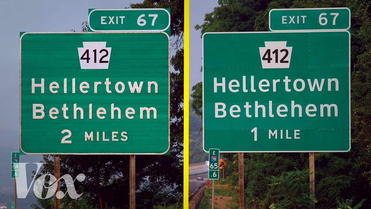
When you head out on the highway in the United States, you’re probably paying attention to the signs above your car and on the side of the road — the ones that direct you to your destination. If you’re looking for an exit or a rest stop, chances are you’ll see the typeface Highway Gothic. It became the highway standard in the 1950s, born out of an initiative from the California Department of Transportation to develop a clearer and more flexible standard for highway signs.
But for the past decade, a new typeface has been trying to take its place: Clearview. This new typeface boasts wider spaces inside of letters and less chunky letterforms, and tries to solve some of Highway Gothic’s readability issues. Learn more in the video above.
More from typeface designer Tobias Frere-Jones, who designed the typeface Interstate as an homage to Highway Gothic:
More information on how the FHWA decided to grant Clearview an interim approval:
More on research behind Clearview’s legibility:
More on the differences between Highway Gothic and Clearview:
 0:08:43
Why the US has two parties -- & how to add more | Sarah Messerschmidt | TEDxValparaisoUniversity
 0:02:39
Why the US has a two-party system | VOANews
 0:05:08
Why the US has two different highway fonts
 0:01:43
Here's the reason why the U.S. presidency has a two-term limit
 11:55:00
WATCH: Tensions rise in the Middle East & Candidates rally ahead of U.S. election | LiveNOW from...
 0:04:24
Kamala Harris slammed after mocking religious protesters at rally
 0:55:41
LIVE: Donald Trump visits McDonald’s on MAGA tour of Pennsylvania
 0:03:14
U.S. military uses B-2 bombers to strike Houthi targets in Yemen
 0:01:36
How Has Support Changed Over Time for the Two Main US Political Parties?
 0:00:47
How The US Map Has Changed In 200 Years
 1:03:28
Donald Trump delivers remarks at the Al Smith dinner
 0:01:40
U.S. strikes Iran-backed Houthis in Yemen
 1:03:20
Break This Ball in 1 Minute, Win $1,000!
 0:08:53
WATCH: ‘Painfully obvious’ U.S. has two systems of justice, says Floyd family attorney
 0:01:00
Has the U.S. always had two political parties?
 0:02:54
Greenspan: U.S. Has Two Economies, the Good and the Bad
 0:24:48
Everything you need to know two weeks out from the US election | The Daily T Podcast
 0:23:03
Why the U.S. has a two-party system and what can be done about it
 0:08:17
SHIN SONIC vs. SHIN TAILS... (Cartoon Animation)
 0:17:49
Harris says election is 'two different visions' for nation
 0:09:59
Trump Roasts EVERYONE At Al Smith Dinner, Leaves Room In Splits | Best 10 Minutes | US Election 2024
 0:18:52
DRESS TO IMPRESS had the BIGGEST HALLOWEEN UPDATE on ROBLOX... *CODES + LANA LORE*
 0:00:40
US Navy identifies 2 aviators killed in EA-18G Growler jet crash near Mount Rainier
 0:34:22
Good Morning America Full Broadcast – Sunday, October 20, 2024
Комментарии