filmov
tv
A few (more) minutes of fun - tiny cards with Tim Holtz stamps

Показать описание
In this series you can join me at the craft table once a week for a few minutes of art and craft creativity - between ten and twenty minutes usually. But sometimes a project needs a little MORE than just a few minutes... so in A Few (More) Minutes of Fun, you'll be invited along for a deeper dive into my creative process.
Today I'm playing with the gorgeous new (to me) Forgotten Garden stamps by Tim Holtz and Stampers Anonymous. I had some offcuts of watercolour card from a previous project which were already folded so - in a very unusual step for me - I decided to make some cards. I hardly ever make cards - I don't really know why, but when I do I usually work in multiples. That allows me to work in the way I find most creative joy... with repetition and variation, creating visual poetry in a series.
See the "aged paper" backgrounds come to life, and follow along as some of the cards are stamped direct, and others are fussy-cut and layered.
Tim Holtz stamps by Stampers Anonymous:
Forgotten Garden CMS481
Field Notes CMS396
Correspondence CMS 225
Eccentric (seen but not used) CMS 448
Distress Inks by Ranger Ink - Pumice Stone, Frayed Burlap, Walnut Stain, Peeled Paint, Mown Lawn, Bundled Sage, Scattered Straw, Wild Honey
Archival Inks by Ranger Ink - Pebble Beach, Ground Espresso Distress Archival Ink
Tim Holtz Idea-ology Clippings word stickers
I bought all the products used in this video myself.
#timholtz #stampersanonymous #cardmaking #artseries #artcards #distressink #distressinks
 0:03:33
Few More Minutes Official Video!
 0:52:25
A few (more) minutes of fun - with autumn leaves
 0:30:45
A few (more) minutes of fun - with two ways with sprays
 0:38:23
A few (more) minutes of fun - with embossed watercolour backgrounds
 0:47:50
A few (more) minutes of fun - with stencilled bricks and stones
 0:03:39
Few More Minutes
 0:48:19
A few (more) minutes of fun - stamping and Distress colouring
 0:45:00
A few (more) minutes of fun - tiny cards with Tim Holtz stamps
 0:51:55
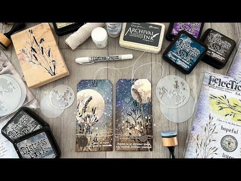
A few (more) minutes of fun - Moon Mask Meadow Tags
 0:35:03
A few (more) minutes of fun with recycled teabag sachets
 0:37:20
A few (more) minutes of fun - with a mixed media butterfly quartet
 0:45:18
A few (more) minutes of fun with autumn leaf prints
 0:32:12
A few (more) mInutes of fun - with collaged tags
 0:37:17
A few (more) minutes of fun - collaging a journal page
 0:02:44
Wait a few more minutes for an electric Uber, says firm’s boss | BBC News
 0:00:20
Only a few more minutes…|| #gacha #gachalife #funny #anxiety #meme #gachaclub #test #minutes
 0:00:10
Just a few more minutes and they’ll be ready to scare the crap out of the delivery man😂
 0:46:53
A few (more) minutes of fun - Distress Inks & Oxides on the gel plate
 0:00:10
“Just a few more minutes”
 0:00:06
this could be a few more minutes 🤣
 0:00:07
Just a few more minutes…
 0:02:00
A Few More Minutes
 0:00:56
“I want to spend a few more minutes with the beautiful girl the red dress!”#movie #film #shorts
 0:00:52
Trump’s Pennsylvania town hall turns into impromptu concert after medical incidents
Комментарии