filmov
tv
Microsoft Excel 3D Maps - A Complete Guide

Показать описание
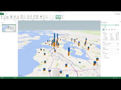
Microsoft Excel is an extremely powerful data analysis and a data visualization software package. 3D Maps of Microsoft Excel is one such powerful tool which offers the capability of exploring and visualizing geographical and geospatial data with a variety of customizable options.
This tutorial will introduce you to a wide array of functionalities of Microsoft Excel 3D Maps. Using a number of real-life datasets, you will learn how to create regional visualizations, display data using stacked and clustered columns, how to create bubble/ pie charts, how to develop heatmaps and how to create 3D animations using spatially and temporally varying datasets all within Microsoft Excel.
You can use the following timestamps to skip around the video as you wish, however if you watch the entire video all the way from the beginning to the end, you will be able to grasp quite a lot of tips and tricks to make your experience with Microsoft Excel 3D Maps absolutely seamless.
Here's the timeline:
00:00 - Introduction & Regional Map Charts
13:54 - Stacked Column Charts, Clustered Column Charts and Bubble/Pie Charts
23:53 - Classification of Datasets
27:32 - Creating Heatmaps
35:33 - 3D Animations of Spatial and Temporal Data
#3dmaps #microsoftexcel #geodeltalabs
 0:43:59
Microsoft Excel 3D Maps - A Complete Guide
 0:04:54
MS Excel: Creating 3D Maps and Tours in Microsoft Excel with Picture Backgrounds
 0:15:23
Use 3D Maps in Excel - Create Beautiful Map Charts
 0:07:01
MS Excel 365 3d Maps
 0:03:24
MS Excel: Creating an Animated GPS Route on a 3D Map Using MS Excel
 0:07:33
Excel 2016 Visualize data in 3d maps
 0:16:15
Excel 3D Maps - Tell The Story Behind The Numbers
 0:08:46
Microsoft Excel 3D Map
 0:04:15
Microsoft Excel Create 3D Maps Video
 0:06:29
Use 3D Maps in Excel - Create Beautiful Map Charts - How to Make a 3D Map in Excel –Tutorial Hindi
 0:09:01
Excel 3D maps
 0:12:53
🌍 How to make interactive Excel Map charts
 0:03:17
50 Tips and Tricks Excel 3D maps Create Video
 0:01:36
How To Insert 3-D Maps in a Microsoft Excel Spreadsheet?
 0:10:29
How to Plot Coordinates (Latitude and Longitude) in Excel | 3D Map in Excel
 0:09:19
Mastering Microsoft Excel for Office 365: How To Build 3D Maps In Excel
 0:02:36
Creating a 3D Map in Microsoft Excel for YouTube Video Visualization
 0:05:14
Excel Video 514 Scenes in 3D Maps
 0:04:52
Excel - Creating Custom KML Regions For Excel 3D Map - Episode 2557
 0:03:25
How to use 3D maps in Microsoft Excel
 0:01:33
Excel 2019 & 365 Tutorial Enabling 3D Maps Microsoft Training
 0:00:17
Excel 3D Map of the UK
 0:04:42
Excel Video 513 Layers in 3D Maps
 0:00:12
Data Visualisation Using Microsoft Excel 3D Map
Комментарии