filmov
tv
frequency distribution, bar, pie chart | normal distribution, skewness, kurtosis | python

Показать описание
In this informative video, we dive deep into the world of data distributions and statistical analysis using Python. We'll guide you through creating frequency distribution plots using popular libraries like Pandas, Matplotlib, and Seaborn.
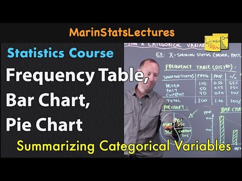
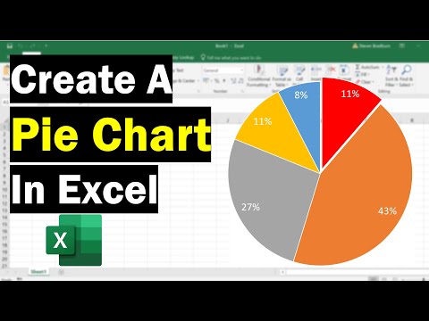
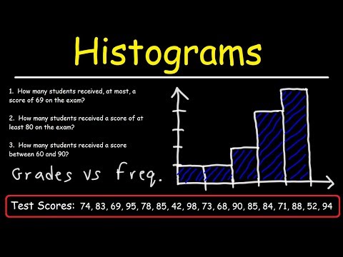
📊 Frequency Distribution Plot:
Learn how to visualize data in a clear and insightful manner by constructing frequency distribution plots. We'll show you how to use Pandas to load data, then use Matplotlib and Seaborn to informative visualizations like bar graph and pie chart.
📈 Understanding Normal Distribution:
Explore the fundamentals of the normal distribution and its importance in statistics. We'll explain the key concepts, properties, and characteristics of this ubiquitous distribution, commonly known as the bell curve.
📊 Skewness and Kurtosis:
Delve into skewness and kurtosis, two essential statistical measures that provide insights into the shape and behavior of data distributions. Understand how these metrics can help you assess the symmetry, tail behavior, and overall characteristics of your data.
Whether you're a data science enthusiast, a student, or a professional seeking to enhance your data visualization and statistical analysis skills, this video has something valuable for you. Join us on this data-driven journey and gain a deeper understanding of your data's distribution and its underlying statistical properties.
Don't forget to like, subscribe, and hit the notification bell to stay updated with our latest data science tutorials and tips. Let's embark on this enlightening data exploration together!
Follow me on:
#DataScience #DataVisualization #Statistics #Python #Pandas #Matplotlib #Seaborn #DataAnalysis #FrequencyDistribution #NormalDistribution #Skewness #Kurtosis #DataExploration #StatisticalAnalysis #DataAnalytics #DataViz #DataInsights #PythonProgramming #DataTutorial #DataSkills #LearnDataScience #DataScienceCommunity #DataAnalysisTools #DataStats #DataGraphs #DataPlots #EducationalVideo #DataLearning #DataVisuals #bargraph #piechart
 0:07:36
 0:07:35
 0:14:49
 0:05:15
 0:05:59
 0:11:56
 0:20:26
 0:16:29
 1:15:59
 0:07:16
 0:08:57
 0:09:20
 0:08:10
 0:10:58
 0:10:15
 0:00:50
 0:06:08
 0:04:50
 0:09:24
 0:07:25
 0:11:59
 0:05:13
 0:15:54
 0:11:16