filmov
tv
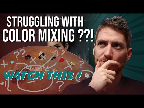
One COLOR MIXING STRATEGY to Improve your PAINTINGS | Art Tips for Beginners + Demonstration

Показать описание
In this episode I want to share with you a color mixing strategy that can help you get better colors in your paintings. This is not a secret color is a very complicated subject let alone color mixing... So hopefully, this color strategy that saved me as a beginner can help you for your paintings!
Like and subscribe !
***
➡ Thank you for supporting me on Patreon!
➡ LEARN OIL PAINTING - A 7 HOURS VIDEO COURSE :
Social media :
Facebook :
Instagram :
Support me on PATREON and access real-time tutorials with commentary (and more) :
If you want to connect with me, the best option is to use the contact form on my website.
Website :
Write me :
***
About me (bio) :
I am an artist living and working in France. I learned the techniques of the Atelier of the Nineteenth century and now I try to share some of my knowledge with the rest of the world, because I think that beauty still has an important role to play in artistic creation. I do mostly drawing and oil painting, and my goal is always to provide techniques and explanations that can be useful to anyone, from beginners to more advanced artists.
The material I use most of the time (not necessarily in this video) :
Drawing
Equipement
✓ Kneaded eraser
✓ Plumb line
✓ Small mirror
✓ An old synthetic brush
✓ Masking tape
✓ Cutter
✓ Sandpaper or sanding block
✓ Mahlstick or Hand rest (DIY)
✓ Level ruler
Graphite
✓ Pencils 2H, HB and 2B
Charcoal
✓ If available: Nitram charcoals (H, HB and B)
!!! Or, if not::
✓ Square Venetian charcoals Lefranc and Bourgeois
✓ Natural charcoal box (check that the heart of the stick is not spongy and hollow)
Black and white chalk
✓ Sketch pencil Conté white
✓ Square Conté noir : HB and 2B
✓ Chalk or pencil holder
✓ Pencil sketch Conté Pierre noire : H and HB
Sanguine
✓ Sketch pencil Conté : Blood and blood Medici
✓ Crayon Polychromos Faber-Castel : sanguine
✓ Sketch pencil Conté white
Oil painting
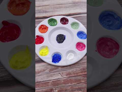
Palette
(Extra-fine paint, recommended brands according to availability: Lefranc Bourgeois, Winsor and Newton, Royal Talens Rembrandt, Sennelier)
✓ Titanium white PW6
✓ Yellow ochre PY42
✓ Burnt Sienna PR101 or PBr7
✓ Venetian red or English red PR101
✓ Permanent Alizarin crimson (Attention: do not use the traditional pigment, which is not very light-fast) PV19 or PR177
✓ Cobalt teal blue PG50
✓ French ultramarine blue PB29
✓ Raw umber PBr7
✓ Burnt umber PBr7
✓ Ivory Black PBk9
Brushes
✓ About ten filbert hog bristle brushes sizes n° 4, 6, 8, 10 and 12
✓ Some flat brushes
✓ Round sable brush or round Kolinsky sable n°10 (from the size of the nail (about one inch) or synthetic imitation
Medium
✓ Linseed stand oil
✓ Odourless mineral spirits
✓ Safflower oil
Surface
✓ Linen canvas, fine grain universal coating
✓ Canson oil-acrylic oil paper Figueras
Others
✓ Palette
✓ Foam and spalter brushes
✓ Palette knife in the shape of a water drop
✓ A few small pots, containers, jars...
✓ Paper towels
***
Thanks for watching !
Like and subscribe !
***
➡ Thank you for supporting me on Patreon!
➡ LEARN OIL PAINTING - A 7 HOURS VIDEO COURSE :
Social media :
Facebook :
Instagram :
Support me on PATREON and access real-time tutorials with commentary (and more) :
If you want to connect with me, the best option is to use the contact form on my website.
Website :
Write me :
***
About me (bio) :
I am an artist living and working in France. I learned the techniques of the Atelier of the Nineteenth century and now I try to share some of my knowledge with the rest of the world, because I think that beauty still has an important role to play in artistic creation. I do mostly drawing and oil painting, and my goal is always to provide techniques and explanations that can be useful to anyone, from beginners to more advanced artists.
The material I use most of the time (not necessarily in this video) :
Drawing
Equipement
✓ Kneaded eraser
✓ Plumb line
✓ Small mirror
✓ An old synthetic brush
✓ Masking tape
✓ Cutter
✓ Sandpaper or sanding block
✓ Mahlstick or Hand rest (DIY)
✓ Level ruler
Graphite
✓ Pencils 2H, HB and 2B
Charcoal
✓ If available: Nitram charcoals (H, HB and B)
!!! Or, if not::
✓ Square Venetian charcoals Lefranc and Bourgeois
✓ Natural charcoal box (check that the heart of the stick is not spongy and hollow)
Black and white chalk
✓ Sketch pencil Conté white
✓ Square Conté noir : HB and 2B
✓ Chalk or pencil holder
✓ Pencil sketch Conté Pierre noire : H and HB
Sanguine
✓ Sketch pencil Conté : Blood and blood Medici
✓ Crayon Polychromos Faber-Castel : sanguine
✓ Sketch pencil Conté white
Oil painting
Palette
(Extra-fine paint, recommended brands according to availability: Lefranc Bourgeois, Winsor and Newton, Royal Talens Rembrandt, Sennelier)
✓ Titanium white PW6
✓ Yellow ochre PY42
✓ Burnt Sienna PR101 or PBr7
✓ Venetian red or English red PR101
✓ Permanent Alizarin crimson (Attention: do not use the traditional pigment, which is not very light-fast) PV19 or PR177
✓ Cobalt teal blue PG50
✓ French ultramarine blue PB29
✓ Raw umber PBr7
✓ Burnt umber PBr7
✓ Ivory Black PBk9
Brushes
✓ About ten filbert hog bristle brushes sizes n° 4, 6, 8, 10 and 12
✓ Some flat brushes
✓ Round sable brush or round Kolinsky sable n°10 (from the size of the nail (about one inch) or synthetic imitation
Medium
✓ Linseed stand oil
✓ Odourless mineral spirits
✓ Safflower oil
Surface
✓ Linen canvas, fine grain universal coating
✓ Canson oil-acrylic oil paper Figueras
Others
✓ Palette
✓ Foam and spalter brushes
✓ Palette knife in the shape of a water drop
✓ A few small pots, containers, jars...
✓ Paper towels
***
Thanks for watching !
 0:12:01
One COLOR MIXING STRATEGY to Improve your PAINTINGS | Art Tips for Beginners + Demonstration
 0:00:28
colour mixing part 1| How to mix colour | Beginners guide #shorts #primarycolours
 0:00:15
Mixing colors! 🎨🎨
 0:04:17
Colour mixing basics - Acrylic painting technique to match a colour
 0:00:14
Mixing Colors with White! 🤍 #art
 0:00:31
How to make white #colormixing #oddlysatisfying #whitepaint #tappingsounds #asmr #asmrart
 0:10:40
24 Colors Made from Just 3 Primary Colors | Acrylic Color Mixing Tutorial
 0:00:59
Paint mixes to beautiful solid color! 🌈
 0:32:56
10 Things You Never Knew About Flattery Over 50
 0:00:17
Mixing colors! What’s your favorite!? 🎨✨ #shorts
 0:00:16
how to make purple colour | color mixing #shorts #youtuber #viral #art #satisfying #mixing #paint
 0:00:15
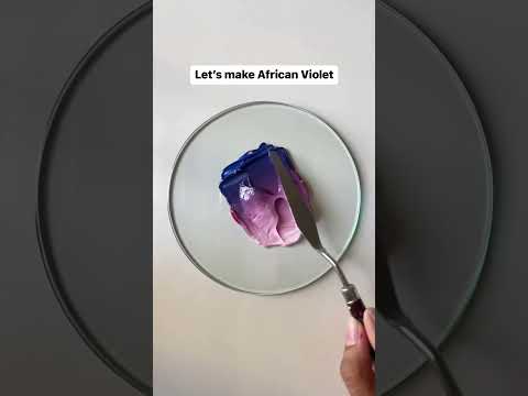
African Violet✨ | Paint Mixing Tutorial | Color Mixing | QuinnsArte | #shorts #painting #paint
 0:00:35
Guess the mixed colors (increasing difficulty) #paintmixing #colormixing #asmrart #satisfyingart
 0:00:34
Color Mixing Tutorial 🎨 #shorts #short #colors
 0:00:24
Watercolor color mixing - turquoise and orange (tube said turquoise, I know it looks blue lol)
 0:00:35
Unorthodox color mixing recipes #colormixing #paintmixing #oddlysatisfying #artvideos #guessthecolor
 0:00:15
Color study for oil painting 🎨 (Mixing Guide in description) #shorts
 0:00:58
RELAXING Way to Learn to Mix Colours #colormixing #art #watercolortutorial
 0:00:38
Color mixing recipes from red, blue, yellow #colors #shorts #mixing #painting
 0:29:25
How to Mix ANY Color - No Talent Method - oil painting instruction
 0:01:00
Color mixing || Color recipes #art #satisfying #shorts
 0:00:45
Guess the mixed colors (increasing difficulty) #colormixing #paintmixing #satisfying #asmrart
 0:05:26
How to Mix SKIN TONES with Oil Paint: ONE Tube Color + B&W
 0:00:32
Color Mixing Recipes Just From Red, Yellow and Deep Blue / Primary Colors #shorts #colors #art
Комментарии