filmov
tv
Logo Designing In 2021 - Are You Ready?

Показать описание
The world of logo designing is changing, are you ready for the change, and are you aware why or how this landscape is changing? Find out in today's video!
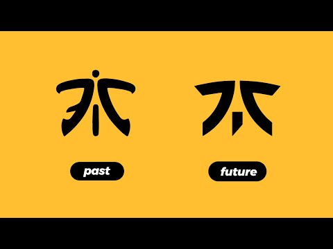
The world of logo designing has always be in a state of flux. Change is inevitable, but as a logo designer, you should be aware of the change and also keep up with that change. There are several very valid reasons why logo designing in 2021 is going to be slightly different to say 10 years ago, and one of those reasons might be the very thing you are watching todays video on - smartphones.
As screens become smaller, and people's attention grows weaker, logo designs need to adapt to remain relevant and accessible to the end user. In the video today, I explore this concept, and talk about how existing brands are staying afloat by adapting to this change, and designing or rebranding their logos accordingly. So if you want to make it as a logo designer and succeed in this field, adapting to change and understanding how things are evolving is going to be fundamental.
If you found todays logo design video for 2021 enjoyable or useful, let me know in the comments section and drop a like on your way out. Subscribe to stay updated to all of my uploads and until next time, design your future today, peace
🔴 Get some 1 on 1 feedback on your designs or portfolio
🔴 Digital Downloads & Portfolio Site
📢 📢📢 SUBSCRIBE TO MY CHANNEL
********************************************************************
What Makes A Portfolio PROFESSIONAL?:
Will Ai Take Over Graphic Design??
Only 1% Of Designers Know These Illustrator Tips
********************************************************************
Join Me On Twitter!
Here's My Instagram!
***************** MUSIC *****************
Music by JULIAN AVILA
▶ Copyright
The work is protected by copyright. This is applied to the video recording of itself as well as all artistic aspects including special protection on the final outcome. Legal steps will have to be taken if copyright is breeched. Music is used from the YouTube audio library and or sourced with permission from the author
End Screen:
Комментарии
 0:03:40
 0:05:00
 0:06:55
 0:01:00
 0:06:30
 0:09:02
 0:05:08
 0:04:01
 0:07:56
 0:03:25
 0:08:44
 0:04:19
 0:08:49
 0:00:57
 0:00:45
 0:09:43
 0:04:48
 0:02:37
 0:00:41
 0:03:39
 0:14:04
 0:00:30
 0:09:19
 0:05:48