filmov
tv
Python Seaborn Tutorial for Beginners 2020 - Part 3

Показать описание
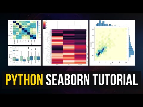
Python Seaborn Tutorial for Beginners 2020. Learn how to use Seaborn to visualize and analyse your data in Python. Learn when to use which plot and why; depending what you are trying to achieve. Additionally, learn how to interpret the results you see in your plot. In the first video of the series, I cover extensively HeatMaps , SubPlots, PairPlots and JoinPlots.
Support the channel on Patreon:
Data Analytics Course Link:
Part 2 Link: TBC
Part 3 Link: TBC
Tutorial Overview:
What is Seaborn and how/why it's used
Trend Plots:
Line Plots
Summary Plots:
Bar Plots
Distribution of Data:
Histogram
Box Plots
Relationship Plots:
Scatter Plots
lmplot (combo of regplot() and FacetGrid)
Holistic views / Combo:
Sub Plots
Pair Plots
Join Plots
Correlation / Relationships:
Heat Map
How to download and install Python through Anaconda:
Download the raw data & the Python Notebook:
Yiannis Pitsillides on Social Media:
Seaborn Tutorial : Seaborn Full Course
Python Seaborn Tutorial | Python Seaborn Plots | Python Seaborn Tutorial For Beginners | Simplilearn
Seaborn Is The Easier Matplotlib
Seaborn Tutorial for Beginners in Python (Data Visualization)
Complete Python Seaborn Data Visualization Tutorial for Beginners
Python Seaborn Tutorial | Data Visualization Using Seaborn in Python | Python Seaborn Tutorial
Python Seaborn for Course
Tutorial 9- Seaborn Tutorial- Distplot, Joinplot, Pairplot Part 1
How to Create Professional Graphs in Python with Matplotlib & Seaborn
How to Visualize Data in Python Using Seaborn | Seaborn Tutorial.
Python Seaborn Tutorial | Data Visualization in Python Using Seaborn | Edureka
Data Analysis with Python - Full Course for Beginners (Numpy, Pandas, Matplotlib, Seaborn)
Seaborn Tutorial
7 Python Data Visualization Libraries in 15 minutes
Python Seaborn Tutorial | Beginners | Courses
V-17 : SEABORN For Data Analysis | SEABORN Tutorial | SEABORN From SCRATCH !!
Python Seaborn Tutorial for Beginners 2020 - Part 3
Complete Seaborn Tutorial on Python – Notebook / Code Provided!
Seaborn Python Tutorial | Complete Seaborn Crash Course | Data Visualization in Seaborn | Kgp Talkie
seaborn full tutorial in telugu
#Shorts Should you plot with pandas, matplotlib, or seaborn?
How I'd Learn PYTHON For DATA ANALYSIS | If I Had To Start Over Again #dataanalyst #dataanalyti...
Python SEABORN Tutorial [HINDI] | Learn Seaborn in 3 Hours - Complete Course
Python Recap-2 | Python Seaborn Tutorial | Python for Data Visualization | Python Training | Edureka
Комментарии
 0:59:34
 0:40:44
 0:22:39
 0:51:12
 1:36:27
 0:35:40
 0:37:08
 0:21:43
 0:15:41
 0:15:46
 0:20:41
 4:22:13
 0:35:39
 0:15:03
 1:53:10
 0:42:21
 0:23:03
 0:53:26
 2:52:19
 0:28:36
 0:00:58
 0:00:45
 3:58:27
 0:20:11