filmov
tv
How will the COVID-19 (coronavirus) epidemic end?

Показать описание
When will the COVID-19 / coronavirus epidemic end? How many people will die from it? How many people will get an infection? How much should you worry about it? This video hopefully can give you a sense of what to expect via a simple mathematical model. It is a standard one with reasonable accuracy, called the SIR model, which illustrates exponential growth / decay depending on the ratio between two constants, called the basic reproduction ratio / number (i.e. R0). The prediction from the model is not that optimistic...
We are still in the exponential growth stage, but eventually it has to be a logistic curve, and the video discusses where the plateau will be, and the time scale at which the plateau will be achieved.
The measures that can be taken to reduce the number of infected individuals, as in the last part of the video, should give enough context to show how seemingly insignificant local measures can have a huge impact, and ultimately persuading the public to stay on alert and take part in those measures described.
Sources:
Other than commenting on the video, you are very welcome to fill in a Google form linked below, which helps me make better videos by catering for your math levels:
If you want to know more interesting Mathematics, stay tuned for the next video!
SUBSCRIBE and see you in the next video!
If you are wondering how I made all these videos, even though it is stylistically similar to 3Blue1Brown, I don't use his animation engine Manim, but I will probably reveal how I did it in a potential subscriber milestone, so do subscribe!
Stay safe everyone! Please do wear a mask to protect ourselves, and stay at home as much as possible. We will get through this together.
#coronavirus #COVID_19 #epidemic #mathematics #mathemaniac #math #washyourhands #dontgoout #pandemic #flattenthecurve
Social media:
For my contact email, check my About page on a PC.
See you next time!
 0:08:35
The Coronavirus Explained & What You Should Do
 0:05:18
Coronavirus disease (COVID-19)
 0:03:59
The Story of Coronavirus (full version), English
 0:07:28
COVID-19 Animation: What Happens If You Get Coronavirus?
 0:04:31
What Is Coronavirus (COVID-19)?
 0:11:40
What can we learn about the coronavirus from past pandemics? | COVID-19 Special
 0:08:36
Das Coronavirus erklärt & Was du jetzt tun solltest
 0:12:10
Researching coronavirus: What are the findings? | COVID-19 Special
 0:11:55
Coronavirus immunity: What do we know? | COVID-19 Special
 0:04:03
How COVID-19 Affects the Body
 0:05:16
How Coronavirus Became a Global Pandemic | WSJ
 0:11:57
Coronavirus: How well do patients recover from it? | COVID-19 Special
 0:08:47
How Will Summer Really Impact Coronavirus? - Cheddar Explains
 0:09:09
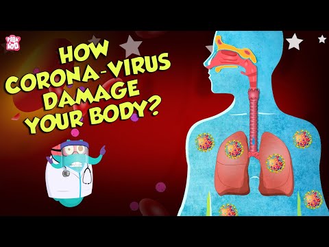
How Corona Virus Affects Your Body? | COVID-19 | The Dr Binocs Show | Peekaboo Kidz
 0:01:40
How the Novel Coronavirus Infects a Cell: Science, Simplified
 0:05:19
What Coronavirus Symptoms Look Like, Day By Day
 0:11:47
How coronavirus (Covid-19) spread day by day
 0:11:39
What do the current mutations mean for the coronavirus pandemic? | COVID-19 Special
 0:11:51
Where did the coronavirus come from? | COVID-19 Special
 0:12:59
Coronavirus: How contagious are children and how sick can they get? | COVID-19 Special
 0:11:34
Coronavirus vaccine update: How close are we? | COVID-19 Special
 0:12:00
Coronavirus vaccine update: The global race is on | COVID-19 Special
 0:01:35
How do I know if I have coronavirus? - BBC News
 0:12:52
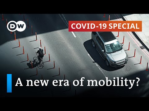
Will the coronavirus pandemic reshape mobility and transportation? | COVID-19 Special
Комментарии