filmov
tv
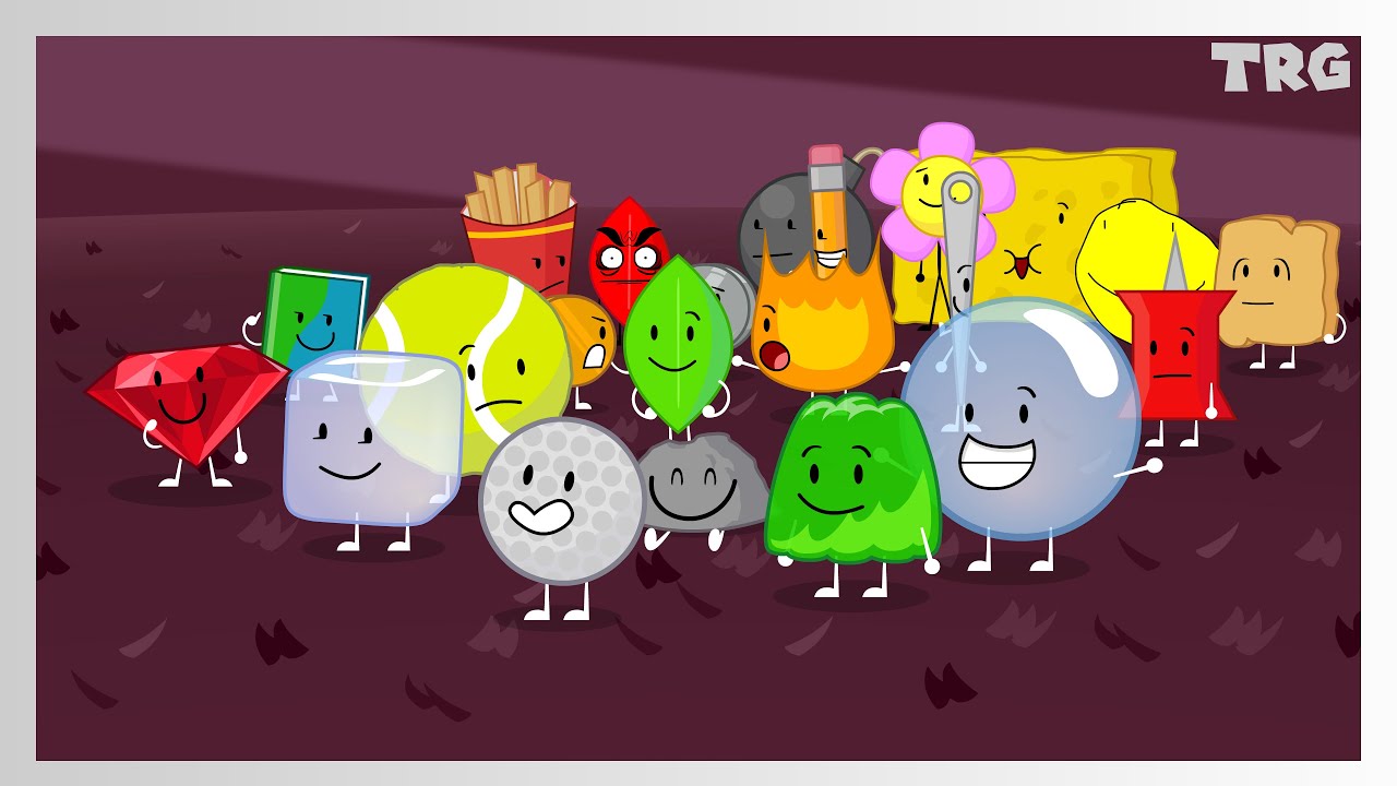
IDFB Intro But Better
Показать описание
This is the best intro fight me
Animated In Adobe Animate
Edited in Cap-cut for Windows
Battle for Dream Island & Assets Created by Cary and Michael Huang
- Stuff so the algorithm can notice me -
#bfdi #bfb #tpot #bfdia #idfb #animation #jacknjellify #battlefordreamisland #battlefordreamislandagain #battleforbfdi #battleforbfb #thepoweroftwo #youtube
#objectshowcommunity #objectshows #youtubeseries
 0:00:26
IDFB Intro But Better
 0:00:26
IDFB Intro but it's BFDI
 0:00:20
BFB Intro but Better
 0:00:26
IDFB intro but it fits on your phone
 0:00:26
IDFB intro but sprunki pyramixed
 0:00:26
IDFB intro; with TPOT characters (2021)
 0:00:27
IDFB Intro but a bit different
 0:00:26
iiii intro but bfdi (bro im sorry but this does NOT deserve this much views 😭😭😭😭😭😭😭)...
 0:00:27
IDFB intro with the BFB post split cast
 0:00:13
Bfb intro but everyone is a Letter From the Cartoon Network logo
 0:00:25
idfb intro but better
 0:00:25
Idfb intro but (FIXED)
 0:00:26
IDFB intro
 0:00:27
IDFB intro but it's BFDI (BETTER VERSION)
 0:00:27
IDFB intro reanimated but better
 0:00:15
BFB INTRO BUT (ITS THE OBJECTS OLD DESIGN)
 0:00:53
If the end of BFDI:TPOT 15: 'Seasonal Shift' had the IDFB intro:
 0:00:27
IDFB intro but bomby
 0:00:21
TPOT INTRO But Everyone Is Two: Comparison of Original vs Reanimated | Song Extended Remix AI #BFDI
 0:00:13
TPOT 8 is next week! #bfdi #tpot
 0:00:24
TPOT intro but (nearly) EVERYONE is here
 0:00:30
Bfb intro remarked but I added mashups
 0:00:20
IDFB Intro, but 'Places' plays, but i try to sync it. (Better version)
 0:00:25
BFDIA Intro but it’s BFB
Комментарии