filmov
tv
Creating a Bell Curve in Qlik Sense

Показать описание
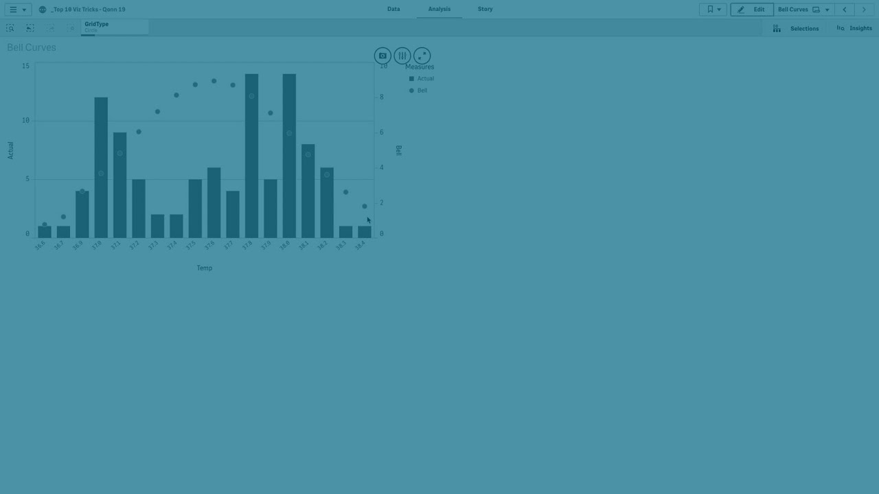
In this video, learn how to create a bell curve in Qlik Sense and Qlik Cloud to analyze the distribution of your data. We’ll guide you through the process of setting up a combo chart and using Qlik functions to overlay a bell curve on your data visualization.
First, we’ll start by adding a combo chart to your sheet. You’ll learn how to add a dimension by creating a calculated dimension using the round function, specifically for temperature in this example. After that, we’ll show you how to add a measure using the count function to visualize the frequency of the dimension values.
We’ll also cover how to label the bell curve and the bars in your chart to ensure that the legend reflects the appropriate labels. Additionally, you’ll learn how to use markers to display the bell curve as data points, making it easier to assess if your measurements are normally distributed or if there are any anomalies.
By the end of this video, you’ll have a clear understanding of how to create and customize a bell curve in Qlik Sense to better analyze your data distribution.
Video Chapters:
00:00:07 - Introduction to creating a bell curve in Qlik Sense
00:00:12 - Adding a combo chart to your sheet
00:00:25 - Adding and configuring a dimension using the round function
00:00:39 - Adding a measure with the count function
00:01:36 - Customizing the bell curve and bar chart with labels
00:01:48 - Using markers to display the bell curve as data points
00:01:56 - Assessing data distribution and anomalies
00:02:05 - Conclusion
 0:07:37
 0:10:33
 0:06:55
 0:05:35
 0:04:38
 0:11:05
 0:04:06
 0:06:08
 0:01:04
 0:04:51
 0:05:25
 0:00:13
 0:12:33
 0:02:24
 0:13:05
 0:07:59
 0:09:33
 0:06:15
 0:04:10
 0:09:37
 0:12:09
 0:07:16
 0:22:59
 0:00:53