filmov
tv
Interactive Dashboard in Tableau using Action Filter | Parameter Action | Highlight Action

Показать описание
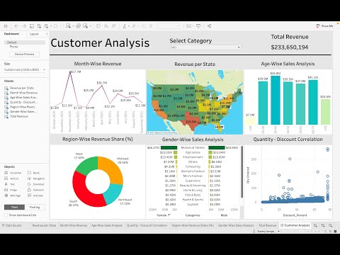
How to create a tableau interactive dashboard from start to end using parameter action, action filters and highlight action. How to use tableau to visualize your data in a interesting way. Will also be sharing a tip to remove fading of section in dashboard when we click on particular selection using tableau highlight action. Step by step tutorial on tableau dashboard for beginner to pro.
The power of interactive dashboard enable you to visualise your data, filter on demand and simply click to dig deeper into underlying data - Getting to insights isn’t only fun but its fast.
--------------------------------------------
📚 Recommended Books
--------------------------------------------
📚 DATA VISUALISATION & STORYTELLING
📚 SQL
📚 DATA ENGINEERING
📚 SOFTWARE ENGINEERING
-----------------------------------------
👇 CHECK THIS OUT! 👇
-----------------------------------------
🏪 AMAZON STOREFRONT
All my recommendations for books, gadgets and gear are also available at my
Amazon storefront. Check it out!
👕 LIKE THE "DATA RELATED GIFTS" WITH CREATIVE, FUNNY & HUMOROUS QUOTES FOR ANYONE WHO LIKE TO LAUGH ?
--------------------------------------------------------------------------------
😍 📧 REACH OUT TO ME ON SOCIAL MEDIA 😍
--------------------------------------------------------------------------------
-------------------
GEAR I USE
-------------------
📷 Video
🎙️ Audio
Thanks for being a part of this channel and all your support! 💪 🙏
⏱ TIMESTAMPS
00:00 - Introduction
01:06 - Requirement and scoping and audience for dashboard
02:10 - How will the final dashboard look like
03:51 - Steps to create a basic interactive dashboard in tableau
04:27 - Connect to Sample Superstore Data set
05:05 - First worksheet to show Sales for selected Quarter
06:20 - Second worksheet to show Sales by Sub categories for selected Quarter
07:48 - Third worksheet to show Sales trend
09:23 - Forth worksheet to show Sales timeline by Quarter
12:11 - Show different colour for each selection using parameter action
15:56 - Create a dashboard by bringing all the worksheets together using layout containers
17:52 - Parameter action to assign value to parameter on quarter selection
19:23 - How to remove fading of other values with particular selection on a chart
22:47 - How to use highlight action to highlight trend line on sub category hover over
‼️ DISCLAIMERS
Links included in this description may be affiliate links. When you buy a product or service with these links, I may receive a small commission. However, there is no additional cost to you :) I genuinely appreciate you supporting my channel so I can continue to provide you with awesome content for free!
Комментарии
 0:11:31
 0:22:17
 0:03:19
 0:05:29
 0:17:04
 0:36:44
 0:34:32
 0:16:28
 0:55:29
 0:29:58
 0:47:22
 0:26:43
 0:17:04
 0:32:48
 0:09:28
 2:24:15
 0:07:15
 0:07:03
 0:05:14
 0:00:52
 0:12:18
 0:03:41
 0:33:09
 0:01:42