filmov
tv
$10 vs $1000 MARKER Art | Cheap vs Expensive!! Which is WORTH IT..? | The Joker

Показать описание
Will a 100x Price Difference make the Difference in today's episode?
Or can we get by in life with the cheaper things in life...?
This episode was a long awaited chance to FINALLY bring the Copic Markers to the channel, how are they? how did I find them..?
I hope you enjoy today's video and of course please do keep your recommendations coming for future content. Any supplies you would like to see me compare, I would love to hear.
Be sure to subscribe and like the video to show your support for the series and more videos like this one.
Have a great day and I will see you all in the next video.
BYE
Time Stamps -
0:00 Intro
2:15 Marker Test
4:27 Cheap
7:44 Expensive
10:23 Final Review
 0:12:56
$10 vs $1000 MARKER Art | Cheap vs Expensive!! Which is WORTH IT..? | The Joker
 0:05:09
$10,000 Markers vs. $10 Markers ...
 0:06:44
$10 vs $1000 MARKER Art | Cheap vs Expensive- This SURPRISED Me
 0:13:02
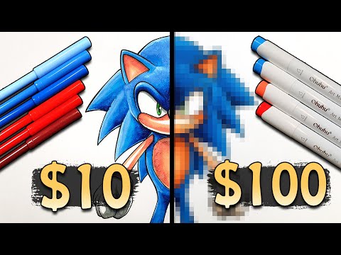
$10 vs $100 MARKER Art | Cheap vs Expensive!! Which is WORTH IT..?
 0:23:22
$100 vs $4000 MARKER ART | Cheap vs Expensive!! Which is WORTH IT..? | IRON SPIDER MAN
 0:00:38
Cheap markers Vs copics: doodle art! Part 1
 0:13:51
$1 vs $1000 MARKER ART | The BEST Cheap Markers - BARBIE
 0:00:39
EXPENSIVE Markers vs.1000$ Pencils | drawing Anxiety from Inside Out 2 - part 2 🧡
 0:00:33
5 wala pen vs 1000 wala pen#sorts
 0:08:33
$1 vs $750 MARKER ART | Which is WORTH IT..? | MARIO
 0:12:23
$10 vs $300 MARKER ART | Which is WORTH IT..? LUIGI
 0:00:35
Which POSCA Marker is better?
 0:00:16
Alcohol marker ❤️12 colour ❤️ #subcribe 😀😎🙏👍🤑✨✨✨✨✨✨✨
 0:00:49
Trying out Ohuhu’s alcohol markers for the first time! Unleashing my inner Artist! #shorts
 0:10:42
$1 vs $2000 MARKER ART | CHEAP vs EXPENSIVE - Spyro The Dragon
 0:22:03
$40 vs $1500 - GOUACHE vs MARKER ART | Which is WORTH IT..? | MILES MORALES Spider-Man
 0:18:19
$100 vs $500 MARKER ART | Cheap vs Expensive!! WHICH is WORTH IT..?
 0:00:57
Activating my THICK Pink Posca Mop’r Marker! #shorts
 0:20:00
I BOUGHT EVERY MARKER!! - ($5,000+) and USED them ALL...
 0:00:16
New Corslet 60 colour markers 😍 #shorts
 0:00:37
This is why I h@te alcohol markers 😡 #shorts #shortsmas
 0:00:43
I tested $100 EXPENSIVE markers VS $1 CHEAP pencils😳.. who won?✨ #shorts
 0:00:58
Organizing my Ohuhu markers #shorts
 0:22:22
🌱 let’s try new art supplies! | marker ASMR ☁️
Комментарии