filmov
tv
Logo Design – How to Improve Your Letterforms

Показать описание
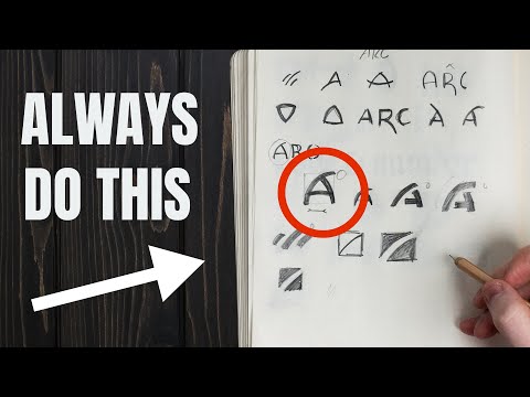
How do you improve the letterforms in your logos? How do you optically balance your logo designs? How do you improve the overshoots of your curved typography?
In this episode, Chris Do, carefully adjusts the details of this “devote” logotype.
0:46 - problems with the logo
0:54 - What are overshoots?
1:18 - Matching thicks and thins
1:44 - Aim for optical balance
3:18 - Finessing the letter thicknesses
3:40 - Comparing to Bauer Bodoni
4:50 - Study well-drawn typefaces
6:30 - Simplify your illustrator curves
8:05 - Compare each logo version
8:23 - How to draw an "e" in Adobe Illustrator
#LogoDesign #Tutorial #AdobeIllustrator
===
#TheFutur
Want a deeper dive? Typography, Lettering, Sales & Marketing, Social Media and The Business of Design courses available here:
—
Love the content? Become a sustaining member for $5/mo today.
Our recommended products and Booklist:
Kits & Proposals:
Visit our website:
FREE resources:
Mandarin (Chinese) Subtitles on UiiUii
—
AFFILIATE LINKS*
🙏 Support The Futur but purchasing through our affiliate links:
✍️ Sharpen your skills by taking a course, using our affiliate links:
🎧 Do you like the music? Check out the music libraries we use in our affiliate links below:
*By making a purchase through any of our affiliate links, we receive a very small commission at no extra cost to you. This helps us on our mission to provide quality education to you. Thank you.
—
Futur Podcast on iTunes: 🎙
Spotify: 🎙
—
We love getting your letters. Send it here:
The Futur
c/o Chris Do
1702 Olympic Blvd.
Santa Monica, CA 90404
USA
—
Host– Chris Do
Content Director– Matthew Encina
Cinematographers– Mark Contreras, Stewart Schuster, Aaron Szekely, Ricky Lucas, Jona Garcia
Editors– Mark Contreras, Stewart Schuster, Aaron Szekely, Ricky Lucas, Jona Garcia
Live Editor– Jona Garcia
Social Team– Elle Money, Alex Burlui
Typefaces: Futura, DIN, Helvetica Neue, Calibre
Futur theme song— Adam Sanborne
 0:18:03
The ONLY Logo Design Tutorial You'll Ever Need! (Professional Reveals All)
 0:06:30
LEARN 13 Golden Rules Of Logo Design! (MUST KNOW)
 0:06:26
Master Logo Design In 7 Minutes!!
 0:09:55
10 MIND BLOWING Logo Design Tips ✍️ 2024
 0:01:50
Logo Design - Illustrator Logo Design Tutorial | Adobe Illustrator CC
 0:05:11
How to Design a Logo - From Start to Finish.
 0:13:05
How I Became a Logo Designer - My Full Story 📖
 0:08:29
7 MIND BLOWING Logo Design Tips ✍
 0:00:32
Logo Design: Secrets to a Trendy Illustration #trendingshorts
 0:00:57
Simple Logo Design in Adobe Illustrator #shorts #illustrator
 0:00:51
Adobe Illustrator - Letter H Logo Design with Rectangle
 0:08:26
6 GOLDEN Rules Of Logo Design (Logotype) — 100% Essential!
 0:01:00
Any Circle Logo Design using Grid- Adobe Illustrator Tutorials
 0:09:19
Simple logo design illustrator || Simple logo design || How to design a simple logo in illustrator
 0:08:08
13 Advanced Logo Design Techniques YOU NEED TO KNOW!
 0:09:29
How To Find The BEST Logo Design Ideas 2024 ✍️
 0:01:00
Logo design trends 2022 | Best Logo design tutorial in #coreldraw #vce #shorts
 0:00:28
we make your logo for Personal /Business Brand. #logodesign #emil#shorts #growonyoutube
 0:11:57
Use This Method for Better Logo Design Ideas 🚀
 0:15:25
Advanced Logo Design Techniques
 0:00:59
D letter Logo Adobe illustrator tutorial #short #logodesign
 0:01:00
Any Monogram Logo in 1 Minute - Monogram Logo Design Illustrator cc tutorial
 0:01:01
coreldraw mercedes logo design YouTube tutorial by #vce #shorts
 0:05:35
My Logo Design Process (from start to finish)
Комментарии