Create a Magazine Layout with the WordPress Gutenberg Block Editor
preview_player
Показать описание
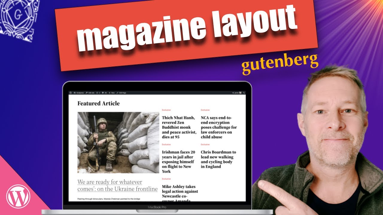
How to create a Magazine Layout for your website or blog with the WordPress Gutenberg Block Editor, full site editing, no plugins and no code!

In my tutorial I'm using the 2022 Theme and WordPress 5.9

Timeline
0:00 - Intro
0:05 - The magazine layout we'll build
0:50 - The Gutenberg Blocks we will need
1:00 - How the magazine layout is constructed
2:00 - How to create a page template
2:30 - Designing the magazine layout
3:00 - The Gutenberg List layout view
3:30 - Add the Columns Block
4:00 - Changing the Columns Block widths
4:45 - Adding the Query Loop Block
5:00 - Editing the Query Loop Block
5:00 - Choosing the quantity of Posts to display using the Query Loop
6:15 - Filtering the posts on the Query Loop Block
7:20 - Showing Post Titles using the Query Loop Block
8:20 - Choose the Query Loop categories
8:40 - What the Query Loop offset setting does
9:13 - Editing what Blocks to show in the Query Loop
9:35 - Adding text within the Query Loop Block
10:00 - Styling the Query Loop Block
10:20 - Duplicating Gutenberg Columns
12:00 - Use the Group Block to add a background colour to a Section
13:25 - How to display your Page Template
Рекомендации по теме
Комментарии
Автор

Thanks for this. I've been resisting Gutenberg until now, but seeing what it can do is making me rethink.

philipgowman
Автор

I am seeing many popular post grid plugins soon becoming redundant. Great video.

vinivivekvishal
Автор

This can be reconfigured for other purposes besides online magazines. Very useful!

kevinschmidt
Автор

I've been talking smack about FSE for weeks, and you just showed me it might actually be useful. I had no idea what the Query block was for.

DTPIIXART
Автор

Wonderful Gutenberg by wonderful teacher

ehsantubeyou
Автор

Nice video, thanks Jamie. I know it's for the sake of the demo, but just to be exact, if you offset by 1 or 4 in columns 2 and 3, then it will skip the 1st post, however, when the next first post is not in the "featured" category, it won't appear anywhere. Thanks again and hello to the cat

PatriciaBT
Автор

That's pretty cool stuff, Jamiel. This is the first of your videos that I didn't get a good grasp on the first pass. That query loop block is still a bit of a mystery to me, but I'll get to the video on that soon enough, I'm sure. 🙂

SuttonsNest
Автор

This is what I have been looking for. Thank you.

zingbawi
Автор

Thank you! Very inspirational video as always.

ViktorChuprin
Автор

Great video. Puts the new 5.9 in plain understandable english. One question. If you wanted to make the page wider, how would you do that? I know how in the old wordpress but can't find it in 5.9 Trying to squeeze those three column into the default space given in the theme I am working on jut won't work. It ends of being vertical text! Need to give it more room somehow. How to? Must be simple!

menaregood
Автор

Thank you! Your tutorials are excellent!

kimcesarettiart
Автор

nice work, well done but if i wanted to change the layout

suzy
Автор

The ideal is to arrange a larger layout with just one or few query loops. Every time you use a query loop block it translates to a database request. The more you use increments significatively the load on the page and affects rather hard the performance

Автор

This has to be one of the best Wordpress blog post layout videos I've ever seen. So many other videos assume you need to use plugins or site builders to do this.
One question which I don't think you explained in the video is the grid layout of the photos in the middle Sports section. The photos in this section seem to be fixed in size, square shaped, how would you make that responsive to a mix of portrait and landscape photos (masonry layout)? If I contrast the Sports section layout to the section above it, the size of the text is driving a masonry-style grid layout here, so it's responsive to the amount of text. The Sports section doesn't appear to be responsive to different image shapes. This might be an idea for another video altogether (fixed grid vs masonry responsive layouts)

PaulPhillipsUK
Автор

Please make a video on how to create a single post template for a custom post type by using a full site editing theme.
Also, how to make a custom archive page, would be very useful. (A catalog with filters, more like a shop than a homepage)
So basically, the two main templates of a listing website.

Thank you for the vids. Really enjoying the content

rale
Автор

thank you - so how do we decide to use group vs container?

RajeshPatel-zbqf
Автор

The other thing we newbies need is a check list of what has be be present before one can proceed. I just recently had an ah-ha moment (from watching this vid) that you get the content in a page form a post. Yes, probable a basic point. But, show me a place where it is talked about. So, to proceed I need to populate posts with this and that so it will show up on my page. Additionally, I need to add some tags and categories so that part works. Am I getting closer yet? Thanks for your patience. kaw

kentek
Автор

Another interesting and informative video, Jamie. One quick question; how are you populating the posts with The Guardian news stories? I am intrigued! 👍🤔

simonkerridge
Автор

Hi Jamie, I am strugging a lot to recreate the same magazine for posts but in Bento like style as you showed in another video. would it be possible to please create a tutorial to make bento grid with cover block for blog posts using query loops?

AshishBanerjee
Автор

This is amazing. Thank you. I wish you could do a tutorial like this on Generate Press theme.

dinorossi