filmov
tv
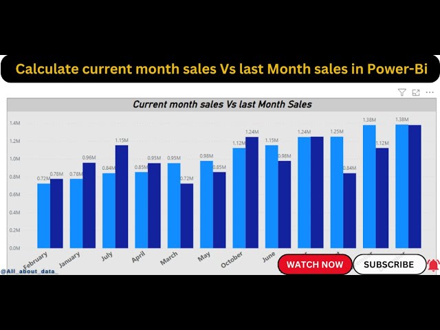
Create a visual to show the current month's sales vs last month's sales | Power-Bi Tutorial 2023
Показать описание
Create two measures: one for the current month's sales and one for the last month's sales. You can use the following DAX formulas for these measures:
Create a visual to display the two measures. You can use any visual that supports two values, such as a bar chart, column chart, or line chart.
Set the visual's Axis property to the Date column.
Set the visual's Values property to the two measures that you created in step 1.
For example, you could create a column chart with the Date column on the Axis and the CurrentMonthSales and LastMonthSales measures on the Values. This would create a chart that shows the current month's sales vs last month's sales for each date in the Date column.
You can also use conditional formatting to highlight the differences between the current month's sales and last month's sales. For example, you could format the columns in the chart to be different colors depending on whether the current month's sales are higher or lower than last month's sales.
 0:11:33
Create a Power BI Custom Visual in 10 Minutes!
 0:06:35
Show another Chart when you hover over a visual in PowerBI | ToolTip | MI Tutorials
 0:01:11
Power BI Tutorial: Percentage Measure & Gauge Visual
 0:06:20
Real time scenario how to Show and hide visual based on slicer selection in Power BI
 0:02:30
How To Create a KPI visual in Power BI
 0:03:58
Bookmarks for Selected Visual in Power BI
 0:02:58
BETTER Visual Storytelling With This Simple Technique
 0:18:23
New Card Visual Tutorial - Power BI (June 2023 Update)
 0:02:00
Power BI - Card visual - (Blank) to Zero - Implicit to Explicit measure
 0:05:37
Show/Hide Visual based on Slicer Selection in Power BI | Realtime scenarios| Learnatcloudanalytics
 0:04:10
How to Show Forms Inside Panels in Visual Basic Net
 0:02:33
How to show Default values in a Card Visual | Show 0 Instead of Blank in PowerBI | MiTutorials
 0:12:38
C# Charts \ Graphs Visual Studio
 0:05:23
Make your Power BI Visual POP with this column header trick
 0:08:22
How to show all applied Filters in the Visual Tooltip
 0:01:54
How To TURN OFF all the Visual INTERACTIONS at once in POWER BI
 0:08:48
Implementing a Search Bar in Power BI: Default vs Custom Visual
 0:02:51
Map Visual Power BI
 0:06:30
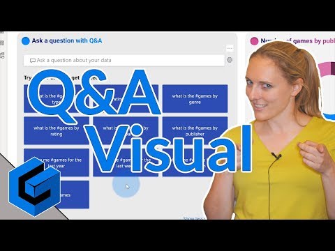
Ask a question with the new Q&A visual in Power BI Desktop
 0:05:17
QT#49 - Create a Drill Through From a Power BI Card Visual in 5 Simple Steps
 0:10:06
Display KPIs & Targets in Dial Gauge and Default Gauge Visual in Power BI
 0:06:03
matrix in power bi | Tips on using the Matrix Visual in Power BI |
 0:04:49
Important Elements of Visual Merchandising in Retail
 0:08:12
How Movie VFX Are Made: The 8 Steps of Visual Effects!
Комментарии