filmov
tv
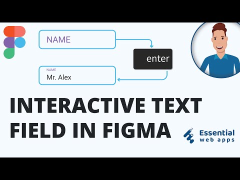
Figma Input Field Components | Design System for Beginners

Показать описание
If you’ve ever struggled with making clean, responsive input fields in Figma this video is for you. I’ll walk you through how to build a flexible input field component that works across different states and use cases, all within a proper design system setup.
We’ll cover everything from setting up basic input boxes, adding placeholder text and icons, handling focus and error states, and making sure your components are reusable and easy to update later. Whether you’re working on a login form, contact form, or a bigger product UI, these input fields will keep your design consistent and scalable.
Here’s what you’ll learn:
– How to build responsive input fields in Figma
– Creating a solid base for form components
– Adding states like focus, error, and disabled
– Working with icons inside input boxes
– Setting up variants for different use cases
– Tips to keep your components clean and easy to manage
This is a beginner-friendly guide, so even if you’re new to design systems or Figma components, you’ll be able to follow along and build something solid by the end.
Stick around till the end to see how everything comes together.
Part 04 : Buttons System
 0:07:49
 0:05:29
 0:26:45
 0:16:48
 0:08:09
 0:01:00
 0:17:58
 0:04:14
 0:11:11
 0:20:57
 0:08:08
 0:09:28
 0:00:19
 0:00:30
 0:04:17
 0:00:27
 0:17:50
 0:07:40
 0:03:20
 0:12:07
 0:00:31
 0:00:15
 0:05:59
 0:01:01