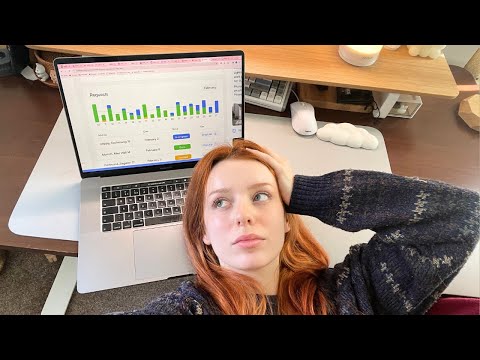
We Had a UX Designer Fix Our Power App Part 1

preview_player
Показать описание

Full Blog Writeup

Josh's User Friendly Design Blog

Start Learning Power Apps Today

💡Check out the Internal Communication Guidebook we mentioned:

If you found this video helpful, subscribe to always be in the know of O365. This whole channel is focused on creating content around the Microsoft space. We create videos on Sharepoint, Power Platforms, Planner, Outlook, and other M365 tools. Technology should be an enabler, not a barrier, to productivity and happiness at work. Our mission is to empower your workforce through technology.

Other Free Resources + Guides 👇

Presenter: Mike Bodell, Josh Everingham

0:00 Intro
1:27 Don't Distract Users
3:29 Use Simple Icons
5:22 Don't Break User Expectations
9:02 Native Device Functions
10:08 Primary Colors
12:00 Get Rid of Text When Icons are Sufficient
16:45 Eliminate Paging
21:00 Conclusion
Рекомендации по теме
Комментарии
Автор

This is probably one of the best explanations/examples of what a UX designer does I've ever seen. Very nice!

chrisnelson
Автор

For the gallery, if you put in select(parent) for the objects then put in 'on select' of the gallery the navigate code, you don't need to put in a button.

HenryE
Автор

I normally give thumbs up for most videos I watch on YouTube to honour the YouTuber's time on putting video together (if you ever done any video editing, however small, you know how long it takes and you start respecting others more for it). This video series, though, definitely deserves my Like (and a comment) for the great content they put up for us. Well done, chaps!

washingtonalmeida
Автор

Just a pointer on the dont break user expectations and having the whole gallery clickable, the gallery its self has a on select property, so there's no need to include a transparent button. If your worried about having dead zones where labels are placed etc, you just need to add Select(Parent) to the labels on select property and the on select event will fire for the gallery. If you are including the button for its on hover pointer change behavior, consider using the pop or push transition, though like here if its for a mobile experience a hover state doesn't need to be included. Cheers

GoWstingray
Автор

@7:27 While you're in the neighborhood of adding an on select to the button, it's good to add the gallery item text to the accessibility text of the button.

MrGomezJr
Автор

The only reason I keep version numbers on the splash or welcome screen is to make sure the app is opening to the latest version since PowerApps tends to cache the last version it opened. Later, I've added a version checker at startup to make sure the app is showing the latest version, and if not, then it tells the user to Refresh the browser until the correct version is showing before allowing the user to continue.

Iwanski
Автор

This is one of the best videos I've ever seen about PowerApps. THANK YOU guys! for sharing this knowledge.

alfredotorresj
Автор

I opened the video and thought 'Wait, did Joshua Weissman leave the kitchen and works in IT now?'
...and then it turns out that the specialist's name is Josh.
There are no coincidences, just signs.

I love the video, really makes you think of all the possible simplifications for your app.

armagedongoesto
Автор

Being dyslexia myself I found your two videos brilliant. Thank you.

CloudhoundCoUk
Автор

This is a great discussion! I've been programming developer for nearly 40 years and find it way too easy to get bogged down with "I make things work".

jasont
Автор

This was brilliant. Wasn't really sure what UX designers did 😅 And hearing the thinking process was insightful. Thank you.

josephansah
Автор

Version numbers on canvas apps are important if you are updating often / testing - canvas apps tend to cache and this is currently the only way in an app to know you are using the latest version via a web page - mobile app covers this, but not web pages. Main use case is - 'hey I have a problem in the app', cool we've updated the app to v2, the user needs to refresh their web browser until the cache updates. Otherwise - thanks for the tips.

Richie
Автор

One of the best Power Apps videos I've seen!

RyanPuffer-rn
Автор

Hey I just wanted to pop in and say - I loved this video BUT the part about adding a button into the gallery to make the whole thing clickable wasn't necessary! You can actually select the top gallery item to edit it, and then instead of clicking any controls inside the gallery and setting their "On Select" property (like you did originally with the right chevron), you just use the "On Select" property of the top gallery item itself! No need for the button or any of that and it works identically. Just wanted to add that!

Queesinbean
Автор

I, too, hate scrollbars and ALWAYS turn that option off. I usually leave the "show navigation" option on since that provides (when needed) a visual cue that there is more content to be seen.

cvkealey
Автор

Simple yet effective observation. Thank you.

AhmedBalfaqih
Автор

I'm all for using icons where they make sense, and try to use the least obtrusive ones I can. You can also leverage the "padding" to give users a larger "touchable area" without a cartoonishly huge icon. Finally, expect some pushback from users who don't "get" icons. I built an app used by faculty for entering grades and had the ubiquitous floppy disk icon as the save button, located at both the top and bottom of the form. Sadly, some instructors "couldn't find" that or "didn't know" what it meant (they've only used it to save Word and Excel files for 25+ years, after all). I was forced to replace the disk icon with a button labeled "SAVE".

cvkealey
Автор

Wow wasn’t expecting much at this, but this is a really great video and explanation and reasoning on each change was great. Made me look at some apps and been like dang… I could really make that looks way better.

TheDdicateDGamerS
Автор

Damn, Josh is good! Everything made sense, I will redesign all my apps now! thx guys

MrBombsn
Автор

This is really helpful with UX designer insight! Love to see more such content.

daxteoh
welcome to shbcf.ru