filmov
tv
Make it in Excel! | Two different types of dot plots

Показать описание
Dot Plots aren't standard chart types in Excel so we need to be a little creative when making them. This video goes step by step through making two versions, the Cleveland and Connected Dot Plots.
JUMP TO THE SECTION THAT INTERESTS YOU
00:00 Intro
00:24 What is a dot plot?
02:12 How to make a cleveland dot plot?
06:22 How to make a connected dot plot?
12:45 BONUS - How to make a connected dot plot - version 2
14:45 Making category labels dynamic
16:45 Recap and outro
BONUS RESOURCES
IMPROVE YOUR DATA VISUALIZATION & STORYTELLING SKILLS
INTRODUCING OUR NEW BOOK - AVAILABLE TO PREORDER
📚 STORYTELLING WITH DATA: BEFORE & AFTER
WORKSHOPS and 8-WEEK COURSE - Use YOUTUBE10 for 10% off!
ADDITIONAL RESOURCES
STAY CONNECTED
 0:11:54
How to create a spreadsheet in excel in 5 minutes | excel for beginners
 0:54:55
Excel for Beginners - The Complete Course
 0:05:42
How to Change a Theme and Make it the Default in Excel
 0:00:37
Excel for fresher Excel tutoring Excel for beginners Job interview questions
 0:00:29
How To Create An Excel Table
 0:00:11
How to Merge 2 Cells in Excel! #excel
 0:00:14
COUNTIF function in Excel! #excel
 0:03:16
How to Make a Pie Chart in Excel
 0:00:03
👌MS Excel Home Tab Functions #shorts #excel
 0:00:12
Excel tip advanced filter unique values
 0:00:06
Use Sum Formula In Excel | Excel Sum Formula In Hindi
 0:03:57
How to Make a Totaling Column Formula in Excel : Using Microsoft Excel
 0:00:14
How To Merge Cells in Excel! #excel #exceltutorial #exceltips
 0:12:29
Excel Formulas and Functions Tutorial
 0:03:42
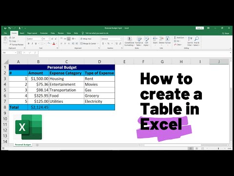
How to Create a Table in Excel (Spreadsheet Basics)
 0:00:41
How to Make a Graph in Excel
 0:00:19
Excel Trick: How to quickly insert heading after 5 rows in excel.
 0:00:14
How to use VLOOKUP in Excel! #excel
 0:00:13
Serial Number in excel shortcut || Automatic serial Number in Excel
 0:00:14
Excel Tip: Sort names alphabetically
 0:06:48
How to Make Tarpapel using Microsoft Excel? | Tagalog Tutorial
 0:00:22
How to Insert an Excel file into MS Word?
 0:00:27
Excel tip to filter with images staying the right size #exceltips #excel #exceltricks
 0:16:10
How to Make a Risk Assessment Matrix in Excel
Комментарии