filmov
tv
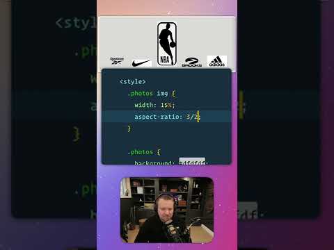
Resize CSS property and Grid Responsive display #coding #cssanimation #webdevelopment #programming

Показать описание
📝 Explanation:
The grid-template-columns property configures the number and width of columns in a grid container. It defines how your grid layout will look by determining the structure of the columns.
👉 The repeat function creates multiple columns of a specified width. You can use it to generate a certain number of columns quickly without manually specifying each one.
💡 When using auto-fit as the column count, the grid intelligently creates the optimal number of columns by distributing the available container width among the items. This means your layout will automatically adjust based on the content.
📏 Each item is set to have a width between 100px and the full width of the container. This ensures that items wrap naturally within the grid but don't shrink below 100px, maintaining a consistent and responsive design.
🔧 Additionally, the resize property in CSS allows you to control whether an element, such as a div, can be resized by the user. You can specify if the element should be resizable both horizontally and vertically (resize: both;), only in one direction, or not at all (resize: none;). This feature is especially useful for text areas or other resizable elements, enhancing user interaction while keeping your design intact.
#css #csstricks #coding #programming #webdesign #webdevelopment #frontend #fullstack #javascript #html
 0:06:14
 0:00:45
 0:00:20
 0:05:46
 0:11:04
 0:03:45
 0:00:52
 0:06:54
 0:09:39
 0:00:17
 0:04:38
 0:00:47
 0:00:22
 0:04:05
 0:02:18
 0:04:27
 0:01:00
 0:00:07
 0:00:17
 0:20:37
 0:00:15
 0:02:32
 0:08:16
 0:07:01