filmov
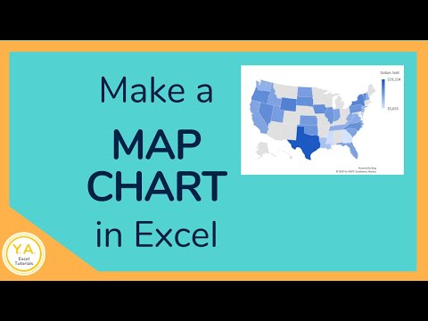
tv
Excel Map Chart - Only Show Regions With Data And Macro - Episode 2555

Показать описание
Microsoft Excel Tutorial: Map Only Regions With Data in Excel.
Welcome to another Excel tutorial from MrExcel! In this video, we will be discussing how to create a map chart in Excel and how to only show regions with data. This topic was suggested by one of our viewers on the Excel feedback site, and we are excited to share this solution with you.
If you have ever tried to create a map chart in Excel, you may have noticed that it can be frustrating when the entire world map is displayed, even if you only have data for a specific region. This can make the chart difficult to read and understand. However, with just two clicks, we can solve this issue and only display the regions with data.
In this video, we will walk you through the steps to create a map chart and then show you how to use a simple macro to only display the regions with data. We will also discuss the different options for map labels and map areas, and explain why the "only regions with data" option is our favorite. Additionally, we will show you how to customize your quick access toolbar to make this process even easier in the future.
But that's not all! We will also address the issue of missing borders and labels for regions with no data. With a few simple adjustments, we will show you how to add these elements to your map chart without cluttering it with unnecessary colors. And as always, we will provide you with the code for the macro used in this tutorial in the YouTube description.
We want to thank our viewer Ozveri for suggesting this topic and for all of you who have left feedback on the Excel feedback site. We appreciate your ideas and suggestions, and we always try to incorporate them into our tutorials. So don't forget to like, subscribe, and ring the bell to stay updated on our latest videos. And if you want to learn more about Excel, be sure to check out our other tutorials and net casts. Thank you for watching and we'll see you next time for another Excel tutorial from MrExcel.
Table of Contents
(0:00) Welcome
(0:20) Why World Map in Excel Map Chart when only a few countries?
(0:35) Create a Filled Map Chart in Excel
(0:50) Format Map Chart Only Regions with Data
(1:20) Compare Four Choices for Region to Show
(1:49) Both sides of US/Canada border
(2:06) Why Excel Map Chart defaults to Entire World?
(2:50) Create Personal Macro Workbook
(3:28) Pasting VBA Code in Excel VBA Editor
(3:54) Adding Icons to QAT in Excel
(4:42) Testing the Macro to format the Filled Map Chart
(5:00) Including Region without Data
(5:33) Even values of 0 have some color in the map
(5:47) Diverging Three Color Gradient for Map Chart in Excel
(6:20) Border between two missing states is missing
(6:42) Clicking Like really helps the algorithm
(7:36) Outtake: Drawing the border between two zero regions
#excel #microsoft #microsoftexcel #exceltutorial #exceltips #exceltricks #excelmvp #freeclass #freecourse #freeclasses #excelclasses #microsoftmvp #walkthrough #evergreen #spreadsheetskills #analytics #analysis #dataanalysis #dataanalytics #mrexcel #spreadsheets #spreadsheet #excelhelp #accounting #tutorial #excel3dmap #excelmaps
This video answers these common search terms:
excel how to control map charts in excel
how to format map chart in excel
how to add map chart to excel 2016
how to add a map chart in excel
how to make a regional map in excel
how to fill a map chart excel
how to create a map chart in excel
how to create an excel map chart?
Ozveri is wondering why the Excel Filled Map Chart shows the entire world when he has just a few countries around the Mediterranean Sea. It is an annoying part of Excel Filled Map Charts. But there is a solution. It is buried where you will never find it.
Format the data series in Excel and choose Only Regions with Data.
Also in this video, I show you how to create a tiny macro in your personal macro workbook that will quickly change this setting.
The macro from 3:00 minute mark:
Sub ShowOnlyRegionsWithData()
' ShowOnlyRegionsWithData Macro
ActiveChart.FullSeriesCollection(1).GeoMappingLevel = xlGeoMappingLevelDataOnly
ActiveChart.FullSeriesCollection(1).RegionLabelOption = xlRegionLabelOptionsShowAll
End Sub
 0:06:55
Create a Map Chart in Excel
 0:07:54
Excel Map Chart - Only Show Regions With Data And Macro - Episode 2555
 0:00:26
How to show 2 measures on the map? Example for Excel Map France
 0:12:53
🌍 How to make interactive Excel Map charts
 0:03:45
Excel Chart Maps used with the Geography Data Type
 0:03:48
How to make a Map Chart in Excel - Quick & Simple Tutorial
 0:03:25
Easy Map Chart Tutorials in Excel
![[TUTORIAL] How to](https://i.ytimg.com/vi/YEZQ9Rm6bzU/hqdefault.jpg) 0:02:17
0:02:17
[TUTORIAL] How to Easily Make a GEOGRAPHICAL MAP CHART in Excel
 0:09:03
Create a Map Chart in Excel
 0:17:34
How to Create a DYNAMIC Map Chart With Drop-Down (works with ANY Excel version)
 0:09:35
Elevate Your Charts: Excel Map Visualization!
 0:09:25
Excel Heat Map Chart Fast & Easy | State + Zip | Postcode + Country | Australia + Indonesia + W...
 0:09:27
How to create a Dynamic Map Chart with drop down in Excel 🗺 Excel Map Chart India
 0:08:44
How to Create a Map Chart in Excel With Slicers
 0:07:04
Making a dynamic map in MS Excel
 0:15:23
Use 3D Maps in Excel - Create Beautiful Map Charts
 0:10:44
Easy Way To Plot Cities on a Map Using Excel
 0:00:50
Create a Map from Excel Spreadsheet Locations
 0:15:36
Dynamic Filled map in Excel | Connect with Wikipedia page to get population Data
 0:04:34
How to Make a Map Chart in Excel - Tutorial 🗺️ 📊
 0:14:53
Create a Map Chart in Microsoft Excel
 0:03:54
How to Make a State County Heat Map in Excel from ZIP Code Lists 🗺️[Lesson 10 of 11]
 0:07:14
How to Create Map Charts in Excel and Google Sheets
 0:03:35
Make Map Chart in Excel 2019
Комментарии