filmov
tv
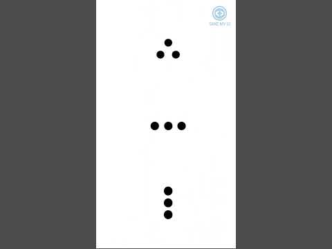
Liquid Loader Spinner Animation with SVG filters & CSS transforms HTML5 CSS3 Tutorial for Beginners

Показать описание
In this CSS3 tutorial for beginners we will learn basics of keyframes and build a liquid loader spinner animation with SVG filters & CSS transforms using just HTML5 and CSS3
For more creative CSS animation tutorials for beginners as well as advanced HTML & CSS guides, hover animation and transition examples from scratch with pure vanilla CSS, new experimental animations on buttons, menus, forms and other web elements, CSS animation examples, creative ideas for web design, advanced CSS selectors and the best CSS tricks of 2019, check out my CSS3 & HTML5 playlist:
I also have pure vanilla JavaScript animation series, in each tutorial we create all different kinds of interactive animated effects from scratch. No plugins, no libraries, no frameworks. Every line of code is explained to give you hands on experience and teach you as much JavaScript as possible. If you want more creative JavaScript tutorials, HTML canvas animations, interactive animated effects, code alongs, video guides for beginners as well as advanced pure vanilla JavaScript, check out the playlist here:
If you liked this advanced CSS3 tutorial I'm sure you will enjoy other videos on my channel. You can find HTML Canvas Animation Tutorials, JavaScript tutorials, animated effects and step by step animation guides, each video shows many examples of the final effect. I will help you learn modern web development techniques by building real projects you can show off on your personal website or GitHub. Code along with me and gain skills to get your first job in the industry. If I could do it you can do it too. If you decide to code along and modify the effects, share your Codepen/JS Fiddle in the comments, I want to see what you came up with.
My name is Frank, I'm a self-taught Front End Web Developer. I learned everything I know in my free time and I used the knowledge to get a great job in web development industry. The part I enjoy the most is building creative animations and interactive effects for the web using HTML, CSS and JavaScript. Thank you for watching my video.
For more creative vanilla JavaScript tutorials, CSS tricks, HTML canvas animations, front end web development and web design guides, subscribe to the channel and click the bell icon to get notified when I release a new animation tutorial.
#css3 #html5 #frankslaboratory
Music:
The description of this video may contain affiliate links, which means that if you buy one of the products that I recommend, I'll receive a small commision without any additional cost for you. This helps to support the channel and allows me to continue making videos like this. Thank you for the support!
 0:06:21
Liquid Loader Spinner Animation with SVG filters & CSS transforms HTML5 CSS3 Tutorial for Beginn...
 0:00:41
Liquid Loading Animation in Figma
 0:00:18
Spinning Liquid in Box Loader || #animation #css #loading #coding #softwareengineer
 0:03:04
Creative CSS Loader Spinner | CSS Animation Examples
 0:05:17
Design Liquid Loading Animation in Figma (Secret Trick)
 0:02:52
Amazing Liquid Loader HTML CSS | CSS Loader Animation
 0:11:43
Build Liquid loader animation in Figma
 0:00:10
Amazing Animated Liquid Preloader With HTML CSS JS 🌊💦
 0:02:30
CSS Liquid Dots Loader | CSS Animation
 0:00:09
Liquid Loading Animation In Figma🔥| Figma Animation | 😃 DiGiUS | #shorts #figma #figmaanimation...
 0:02:51
Loader Ring Animation || Making a Spinner CSS Loader
 0:08:05
Create An Extra Fancy Animated CSS Spinner/Loader
 0:00:09
💯Liquid effect loader in figma #figma #tutorial #uidesign #ui #uxdesign #figmatutorial #design #ai...
 0:00:08
Create a Liquid Loading Animation with HTML & CSS 💧💻
 0:02:04
Liquid Loader Animation Effects | No Image/SVG (Link In Description)
 0:00:08
CSS Loader Animation | CSS Spinner Loader Animation
 0:00:23
Cube Flipping Loader CSS Animation || #animation #css #loading #coding #softwareengineer
 0:00:23
CSS Dot Loader | CSS Dot Loading Spinner | Codepen #webdesign #takemyui
 0:00:19
HMS CSS Loader Animation || #animation #css #threejs #coding #developer #designidea #cssanimation
 0:00:13
CSS Loader Animation | CSS Spinner Loader Animation
 0:00:24
Create a Loading Button with a Spinner Effect Using HTML and CSS' #cssbuttons
 0:00:36
Create with me a Loading Animation in #figma! 💻
 0:00:08
4 Dot Liquid Loader | HTML CSS | Loader #html #css #shorts
 0:02:32
CSS Loading Spinner || CSS Animation
Комментарии