filmov
tv
Ace Attorney - Evolution of Phoenix's 2D Sprites Resolution

Показать описание
An idea comes to my mind that it would be interesting to combine different resolution versions of Phoenix's 2D sprites into a video, so here it is! The Evolution of Phoenix's 2D Sprites Resolution!
The video will quickly showcase GBA to PS4/NS/PC versions. Noted that this is only for "2D" sprites evolution, so the DD and SOJ ones didn't included.
Software used : Adobe Premiere Pro CC 2018
───────────────────
Big thanks to my patrons:
Ressdon
───────────────────
(Blog doesn't update a lot, so please check my Facebook or Twitter instead, thank you!)
 0:00:39
Ace Attorney - Evolution of Phoenix's 2D Sprites Resolution
 0:07:37
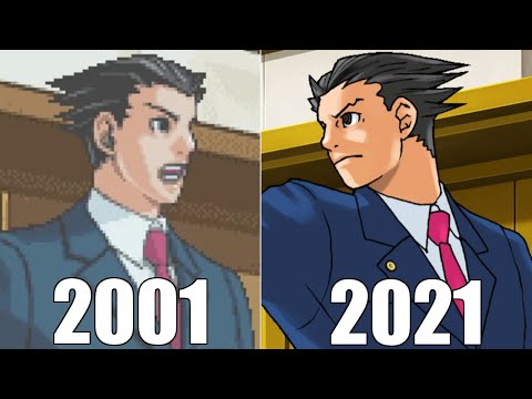
Evolution of Ace Attorney Games 2001-2021.
 0:06:45
Evolution of Ace Attorney Games [2001-2021]
 0:45:41
The History of Ace Attorney - 20th Anniversary Retrospective | Rewind Arcade
 0:16:47
Phoenix Wright: Ace Attorney Trilogy Explained (in 16 minutes)
 0:00:56
The Evolution Of Miles Edgeworth - Ace Attorney
 0:00:24
Ace Attorney but everyone is Baby
 0:06:45
EVOLUTION OF ACE ATTORNEY GAMES [2001-2019]
 0:08:41
Evolution of Ace Attorney Games ( 2001-2021 )
 0:00:26
phoenix's OBJECTION but gently... (ft. edgeworth's '*hoho*'
 0:00:25
Yakuza Ace Attorney
 0:00:34
Name Every Law (Phoenix Wright: Ace Attorney)
 0:08:03
Ace Attorney - That's Wright! Ace Attorney TV!
 0:00:24
THIS CANT BE A REAL QUOTE FROM A GAME
![[Flash Warning] Ace](https://i.ytimg.com/vi/Zg61RS3hCjg/hqdefault.jpg) 0:00:35
0:00:35
[Flash Warning] Ace Attorney every two seconds be like
 0:08:03
Ace Attorney - That's Wright! Ace Attorney TV!
 0:00:36
Ace Attorney Gameplay vs Lore
 0:05:12
The Meaning Behind EVERY Ace Attorney Name Pun [2001-2016]
 0:05:46
Evolution Of Ace Attorney
 0:00:47
Phoenix and Edgeworth become 3D (Objection.lol)
 0:00:41
Flipping the Parrot (Ace Attorney Animation)[Paula Peroff]
 3:36:08
Why Ace Attorney Is A Classic
 0:04:27
So This is Basically Ace Attorney
 0:00:16
Some Unused Ace Attorney Sprites (part 1??)
Комментарии