filmov
tv
Looking at your designs - UI/UX Design Audit 10

Показать описание
==COOL INFO HERE 👇 =======================================
MY BOOKS:
MY FREE UX COURSE:
BE MY FRIEND:
⁉️ You can ask me questions on Twitter, just @ me or DM :-)
ABOUT ME:
👨🏻💻 I'm a designer, entrepreneur and startup founder. I started back in the late 90's and currently my main goal is to share my knowledge, both paid and free. This channel is one of the places where I share my tips on design, growth, marketing, life and mindfulness. Subscribe to stay in touch.
This video does NOT contain any paid promotion - we're only promoting our own content here :)
=========================================================
We're looking mostly at UI design problems and issues here, but whenever I can I try to also point out UX problems and potential solutions to them. In this case navigation could be a simple set of bottom aligned tabs.
#uxdesign #uidesign #uxui
 0:05:28
Looking at your designs - Audit 2
 0:02:48
Figma Design Audit - looking at your designs 7
 0:04:06
A neumorphic clock? Looking at your designs - design audit 4
 0:09:30
Looking at your designs - UI/UX Design Audit 10
 0:04:47
Music player app design audit - Looking at your designs 5
 0:08:56
Looking at your designs - UI UX audit and tutorial
 0:04:35
UI Design Audit - looking at your designs #3
 0:00:31
Make your line art as good as Kooleen 🐐 #art #digitalart #arttutorial #arttips #artist
 0:00:57
Make Your Photo Look 100 Years Old in Seconds! #motionmation #photoshop #vintage #nostalgic
 0:00:13
Tips to make your home feel more expensive
 0:00:16
Never Draw The Glow Effect This Way! 😡 #drawing #art #poscamarkers
 0:00:59
art tip to make your drawings look ~fancy~ #shorts
 0:00:59
A day in the life of a Graphics Designer
 0:00:46
These TRENDS will make you look 10 years older!
 0:00:57
3 Things That are Making Your House Look Cheap!
 0:00:07
POV: You looking at your design after finishing it! #shorts
 0:00:17
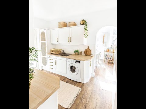
Woman shares incredible rental-friendly DIY kitchen makeover – and it cost just £300
 0:00:19
Never Draw The Glitch Effect This Way! 😡 #drawing #art #shortsmaschallenge
 0:00:42
Your First Sketchbook
 0:00:21
Web Design Timelapse: Nike Homepage | Wix Studio (Webpage Design)
 0:00:09
modren kitchen new design
 0:30:55
40 Design Style Names You've Been Looking For (Find References Faster)
 0:00:23
Students Draw Their Teacher Part 2 #teacher #school #student #art
 0:00:09
New Scissors Only T-shirt Dress!
Комментарии