filmov
tv
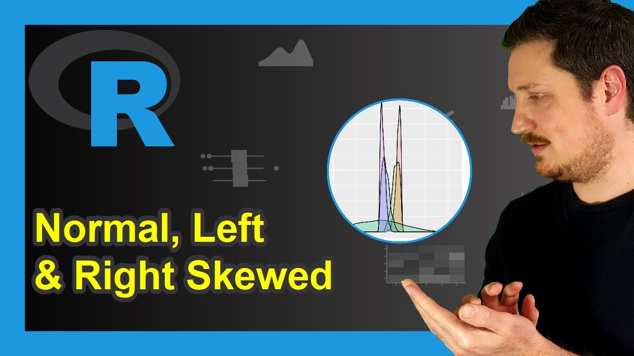
Draw Normal, Left & Right Skewed Distributions (2 Examples) | ggplot2 Density Plot | tidyr Package
Показать описание
R code of this video:
x2 = rbeta(1000, 5, 2),
x3 = rnorm(1000),
x4 = rbeta(1000, 2, 5),
x5 = rbeta(1000, 2, 10))
plot(density(data$x1), col = 2, # Overlay all columns as densities
xlim = c(- 3, 3),
ylim = c(0, 5))
lines(density(data$x2), col = 3)
lines(density(data$x3), col = 4)
lines(density(data$x4), col = 5)
lines(density(data$x5), col = 6)
legend("topleft", # Add legend to plot
legend = c("x1 = rbeta(1000, 10, 2)",
"x2 = rbeta(1000, 5, 2)",
"x3 = rnorm(1000)",
"x4 = rbeta(1000, 2, 5)",
"x5 = rbeta(1000, 2, 10)"),
col = 2:6,
lty = 1,
cex = 0.8)
library("tidyr")
data_long <- data %>% # Convert wide to long data
pivot_longer(colnames(data)) %>%
library("ggplot2") # Load ggplot2 package
ggplot(data_long, # Draw all densities in ggplot2 plot
aes(value,
fill = name)) +
geom_density(alpha = 0.25)
Follow me on Social Media:
 0:05:39
Draw Normal, Left & Right Skewed Distributions (2 Examples) | ggplot2 Density Plot | tidyr Packa...
 0:01:04
The Bell Curve (Normal/Gaussian Distribution) Explained in One Minute: From Definition to Examples
 0:05:21
Normal Distribution: Calculating Probabilities/Areas (z-table)
 0:01:47
Normal Distribution: Give an Area to Left/Right, Find the Area to the Right/Left
 0:10:22
Skewness - Right, Left & Symmetric Distribution - Mean, Median, & Mode With Boxplots - Stati...
 0:00:13
NORMAL PEOPLE vs ME: Waiting For The Elevator (Animation Meme) #shorts
 0:04:06
Symmetry and Skewness (1.8)
 0:06:55
How to Plot a Normal Distribution (Bell Curve) in Excel – with Shading!
 0:01:00
normal distribution curve for medical students
 0:51:03
Standard Normal Distribution Tables, Z Scores, Probability & Empirical Rule - Stats
 0:02:35
The Left vs. Right Song! | Scratch Garden
 0:07:09
Finding Areas Under And What Is The Standard Normal Distribution Curve And Z Scores Explained
 0:04:51
Normal Distribution: Find Probabilities Given Z-scores Using Table (Left of Z-score)
 0:10:59
Normal Distribution EXPLAINED with Examples
 0:06:56
Quantile-Quantile Plots (QQ plots), Clearly Explained!!!
 0:05:29
Maths Tutorial: Describing Skewness of Boxplots (statistics)
 0:06:51
Statistics-Left Skewed And Right Skewed Distribution And Relation With Mean, Median And Mode
 0:12:09
Normal Quantile-Quantile Plots
 0:04:42
Normal Tympanic Membrane
 0:07:16
Excel Histogram with Normal Distribution Curve
 0:01:00
Do you have a normal mind?
 0:15:24
5.1.3 Find the Area Under The Standard Normal Curve To The Left, Right & Between Z-Score(s)
 0:00:39
GOLF GRIP 101
 0:00:48
Normal Distribution #Shorts
Комментарии