filmov
tv
How To Create a Histogram in Python?

Показать описание
You might know how to create a histogram in Excel, but how about in Python. In this 365 Data Science Tutorial you are going to learn how to create a histogram in Python using Jupyter Notebook. The libraries you will need for this tutorial are pandas for data handling, matplotlib and seaborn for data visualization, while sns is set as the default style.
Once you load up the table you will learn how to build a histogram based on the price column, in other words showing the price distribution. Watch the whole video to find out how to set up different parameters- the number of bins, range, Boolean density, as well as alter the graph color and dimensions to create professional looking histograms.
► Consider hitting the SUBSCRIBE button if you LIKE the content:
365 Data Science is an online educational career website that offers the incredible opportunity to find your way into the data science world no matter your previous knowledge and experience. This is why we have dedicated this channel to those who are completely new and are curious to explore the wonderful world of data science. Once you have built a basic theoretical knowledge you can sign up to our comprehensive curriculum where we have prepared numerous courses that suit the needs of aspiring BI Analysts, Data Analysts and Data Scientists.
#typesofdata #datanalysis #datatrail #365datasciencetutorials
 0:04:38
How to Make a Histogram in Excel
 0:07:21
How to create a histogram | Data and statistics | 6th grade | Khan Academy
 0:04:00
How To Create A Histogram in Excel (& change the bin size)
 0:03:58
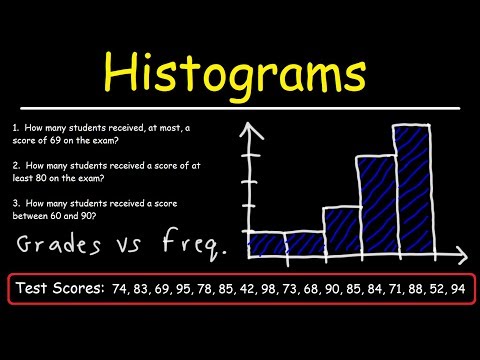
What Is And How To Construct Draw Make A Histogram Graph From A Frequency Distribution Table
 0:03:31
Histograms Explained! | How to Make a Histogram | Math Defined with Mrs. C
 0:11:16
How To Make a Histogram Using a Frequency Distribution Table
 0:00:51
How to Make a Histogram in Excel
 0:06:32
How To Create A Frequency Table & Histogram In Excel
 0:19:13
Descriptive Data Analysis in 15 mins for my Live Project: Box Plots, Correlation, NPC, Means, IQR
 0:00:45
Create Histogram Chart in Excel
 0:03:21
How to make a Histogram in Google Sheets
 0:01:57
Creating a histogram and with a frequency polygon in Microsoft Word
 0:03:40
Mat 144 - How to Create Histogram in Excel. SQL Videos below👇Tap/Click 'more'.
 0:03:10
How to Make a Histogram in Microsoft Excel
 0:07:39
3 Easy Ways to Create a Histogram Chart in Excel
 0:06:32
Create a Histogram with Excel
 0:00:22
Insert Simple Histogram in Excel #shorts #shortvideo
 0:00:28
How to Create a Histogram in Excel Fast
 0:18:10
How to Create Histogram with Bell Curve in Excel
 0:09:45
Creating Histograms in SPSS
 0:00:58
How to Make a Histogram in Excel #Shorts
 0:07:16
Excel Histogram with Normal Distribution Curve
 0:11:38
How to Make(Draw) a Histogram with Class Boundaries Example #1
 0:00:42
#Tableau Histogram using built-in Bins #tableaututorial #tableauvisualization #tableautips #chart
Комментарии