filmov
tv
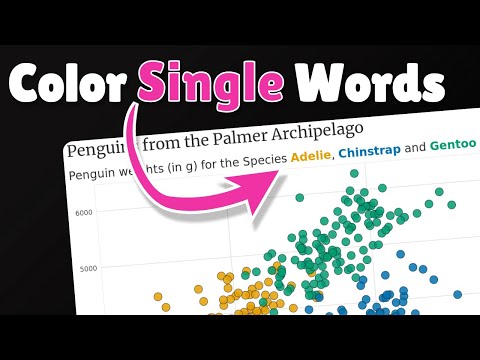
Change Legend Labels of ggplot2 Plot in R (2 Examples) | Modify Item Text | scale_color_manual()

Показать описание
R code of this video:
y = 1,
data # Print example data
library("ggplot2") # Load ggplot2
ggp <- ggplot(data, aes(x, y, col = group)) + # Create default ggplot2 plot
geom_point()
ggp # Draw ggplot2 plot
ggp + # Modify labels and colors
scale_color_manual(labels = c("Group 1", "Group 2", "Group 3"),
values = c("red", "blue", "green"))
data_new <- data # Duplicate data
levels(data_new$group) <- list("Group 1" = "a", # Change factor levels
"Group 2" = "b",
"Group 3" = "c")
ggp_new <- ggplot(data_new, aes(x, y, col = group)) + # Recreate ggplot2 plot
geom_point()
ggp_new # Draw updated ggplot2 plot
Follow me on Social Media:
 0:05:39
Change Legend Labels of ggplot2 Plot in R (2 Examples) | Modify Item Text | scale_color_manual()
 0:01:05
R : How to change ggplot legend labels and names with two layers?
 0:01:42
How to Customize Legend Title and Labels in ggplot2
 0:01:53
Change the position of the title and legend with ggplot2 in R (2 minutes)
 0:04:13
How to Change Legend Title ggplot
 0:04:20
Change Legend Title in ggplot2 in R (Example) | Modify Text of Plot Legends | scale_color_discrete
 0:03:34
Remove your plot legend and colorize your title instead
 0:01:23
How to Change Legend Title in ggplot2
 0:03:32
Change Labels of Continuous ggplot2 Legend in R (Example) | Replace Numbers | scale_color_continuous
 0:09:24
R programming - ggplot2 legend- examples of how to add, remove, alter the legend
 0:01:27
How to Change Legend Place in ggplot2 Using RStudio
 0:12:52
Change Title, Axis labels, legends, Scaling (ggplot2)
 0:01:04
How to Change the Legend Title in ggplot2
 0:01:03
R : How to change scientific notation on legend labels in ggplot2
 0:01:01
R : How to change legend title in ggplot
 0:06:42
Remove Legend in ggplot2 (3 Example Codes) | Delete One or All Legends | guides & show.legend Op...
 0:05:33
Change Font Size of ggplot2 Plot in R (Examples) | Axis Text, Main Title & Legend
 0:03:18
ggplot2 Legends and Labels - Data Communication / Data Visualization
 0:01:05
R : How to change the size of legend text in ggplot2?
 0:03:23
Remove Legend Title from ggplot2 Plot in R (Example) | Delete Text Above Legend | element_blank
 0:01:22
R : In ggplot2, how to change the legend labels but leave the colors unchanged?
 0:01:29
R : Change text/labels ggplot legend
 0:04:48
How to Change or Remove the Title of the Legend in Rstudio:Using ggplot2
 0:01:57
How to Adjust the Font Size of Legend Labels in ggplot2 after Using scale_fill_discrete()
Комментарии