filmov
tv
PLAN WITH ME | July 2023 Bullet Journal Setup With Watercolors

Показать описание
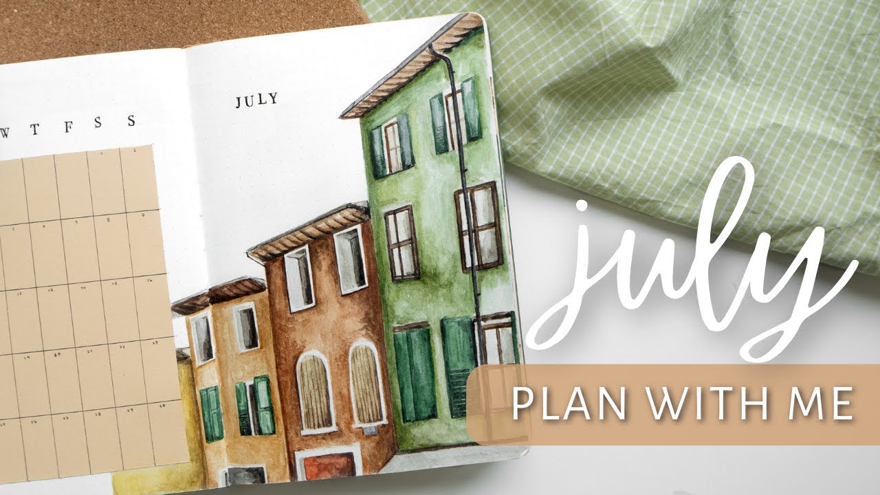
In this video I’m setting up my first theme in my brand new Mellow Days journal so it’s time for my july 2023 bullet journal setup! In all honesty, this wasn’t a very fun and exciting setup for me, I wish it was but sometimes that just happens and it felt like all the stress and anxiety of life came to me all at once 🙈 But my theme for this month is loosely inspired by my 2021 July theme with mediterranean houses and I also painted a lot of fun colored, kinda wonky and imperfect houses in this one and I have to say, even though I kiiiiinda hated the spreads immediately when I got them done, now with some distance, I like this theme and I’m excited to use it!!
New mid-year bujo migration setup in my new journal:
If you want to get a watercolor bullet journal notebook I'm using, you can get 10% off of Mellow Days with my code ”TIINA10” 🌿 (The exact one I use in the video isn't available on their website right now, but it will most likely be within a month when they are officially released)
If you want to see a similar-ish setup from July 2021, check it out here
———
✨ FIND ME HERE:
———
✨ MUSIC
(When you sign up using this link, we can both get a month free of Epidemic Sound 🤍)
———
✨ ALL DISCOUNT CODES
*Get 10% off of Archer & Olive with my code ”TIINA10”
*Get 10% off of My Mellow Days with my code ”TIINA10”
*Get 12% off of StationeryPal with my code ”TIINASDIARY”
*= affiliate links, these discount codes and/or links give you $$ off of your order and I get a small commission from the brand. I really appreciate you using my affiliate links to support me and my small art channel! 💕
———
✨ PRODUCTS I USED (affiliate links)
My notebook:
Mellow Days “Rêverie” 160gsm Watercolor Notebook | Get 10% off of My Mellow Days with my code ”TIINA10” (this color isn't currently on the shop yet, but this collection is released soon!!!)
Paints:
Winsor and Newton Cotman watercolor set
Brushes:
Van Gogh watercolor brush series 191 no. 6 (gifted)
Pens:
Uniball signo dx 0,38
Gelly roll white gel pen 10 for fixing mistakes
Pigma micron 005
Pigma brush pens for stamps
Koi coloring brush pen in light cool gray
Other:
Nail polish
Essie ”beleaf in yourself” "blanc" "mademoiselle"
Washi tape:
Green washi tape from MT (these aren't the exact ones but the same brand)
Glue tape roller (not the same but a similar one)
binder clips (similar)
Colorful papers
Bought from a local art store
Stamps
———
✨ ABOUT ME
Hello friends! My name is Tiina, I’m a 24 year-old art loving cat lady from Finland. I’ve been bullet journaling since 2019 and fell in love with creating right after opening my notebook for the first time! My other passions include sustainability, thrift shopping, vintage clothes, feminism and horror movies. Everyone’s welcome here ❤️🌈
00:00 Intro
00:23 Cover page and calendar
09:22 Habit tracker and playlist
15:54 Content planner
17:53 Weekly spreads
22:36 Final flip through
#artjournal #painting #planwithme
Комментарии
 0:17:48
 0:20:23
 0:19:17
 0:11:28
 0:16:15
 0:10:28
 0:10:05
 0:24:10
 0:23:36
 0:08:33
 0:13:22
 0:17:39
 0:13:35
 0:16:41
 0:00:31
 0:14:22
 0:10:10
 0:19:53
 0:08:23
 0:11:40
 0:11:28
 0:09:59
 0:16:23
 0:08:35