filmov
tv
Create Responsive CSS Grid Layouts in 8 Minutes

Показать описание
•Are you ready to master CSS Grid and take your website designs to the next level? In this video, we’ll break down CSS Grid layouts step by step - so even beginners can create stunning, responsive layouts with ease!
CSS Grid is a powerful, two-dimensional layout system that makes it simple to arrange elements into rows and columns. Whether you want a responsive grid layout or need your elements to wrap automatically, CSS Grid has you covered.
We’ll walk through the core concepts of CSS Grid, showing you how to create flexible, adaptable layouts without relying on complicated hacks or heavy JavaScript. By the end of this video, you'll know exactly how to build beautiful, responsive designs that look great on any screen size!
-----------------------------------
🛠️ What You’ll Learn:
• Grid Basics: Understanding rows, columns, and grid lines
• Defining Layouts: Using grid-template-rows and grid-template-columns
• Repeat & Minmax: Creating flexible, dynamic grids with CSS repeat
• Auto-fit & Auto-fill: Letting the grid adjust automatically to screen size
• Wrapping Grids: How to make your layout wrap elements responsively
• Grid-template-areas: Mapping out sections with names instead of line numbers
• Positioning Items: Using grid-row, grid-column, and grid-area
• Layering Elements: Stacking items on top of each other with z-index
-----------------------------------
⏱️ Video Chapters:
0:00 - Introduction
0:11 - What is CSS Grid?
0:36 - Creating a grid
0:50 - grid-template-rows & columns
1:45 - repeat()
2:32 - auto-fit
3:02 - justify-items & align-items
3:24 - grid-gap
4:14 - minmax()
5:01 - Positioning items
5:35 - grid-row & grid-column
5:50 - span keyword
6:06 - grid-area
7:27 - grid-template-areas
-----------------------------------
📌 Why Learn CSS Grid?
• Simplifies Layouts: No more floating elements or tricky Flexbox workarounds
• Responsive by Default: Easily adjust columns and rows for any device
• Complete Control: Place and resize elements exactly where you want them
• Beginner-Friendly: Intuitive properties that make layout building faster
If you’ve been struggling with responsive design or want to replace messy layouts with clean, scalable solutions, this CSS Grid tutorial is for you.
#cssgrid #csslayout #responsivedesign #learncss #webdevelopment
 0:06:14
Create Responsive CSS Grid Layouts with GRID WRAPPING
 0:08:26
Create Responsive CSS Grid Layouts in 8 Minutes
 0:31:52
Learn how to create a responsive CSS grid layout
 0:11:04
How to create RESPONSIVE Layouts with CSS GRID
 0:17:14
Responsive CSS Grid Tutorial
 0:09:00
Learn CSS Grid Layouts the Easy Way
 0:11:37
The Joy of CSS Grid - Build 3 Beautifully Simple Responsive Layouts
 0:00:06
Responsive Grid Layout #codewith_muhilan #css #coding
 0:00:15
Best Understanding of CSS Grid | Master Grid Layout in Just Minutes! 💡#cssgrid #htmlcss #cssfilter...
 0:00:11
Responsive CSS grid - Flexbox using HTML & CSS 👨🏼💻🤩 | Your Code School #javascript #yourcodesch...
 0:00:24
Learn How to Create a Responsive Grid with CSS in 24 Seconds
 0:13:35
Learn CSS Grid - A 13 Minute Deep Dive
 0:45:33
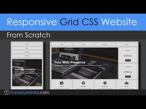
Build a Responsive Grid CSS Website Layout From Scratch
 0:05:56
Learn GRID-AREA to Build Amazing BENTO GRIDS | CSS Tutorial
 0:07:10
Simplify your CSS with these 3 grid layout solutions
 0:12:38
CSS Grids For Responsive Blog-Site Layouts
 0:00:08
Responsive CSS Grid Layout in 60 Seconds! 🚀 Master Your Web Design Skills' #shorts #css #cssgri...
 0:00:21
Grid Layout - HTML CSS
 0:15:43
Build Responsive CSS Layouts with CSS GRID ~ Beginner Tutorial
 0:04:38
Learn How to Make a Responsive CSS Grid Layout
 0:00:08
CSS Grid Responsive Layout with 2 Column Layout Flex #html #css #video #youtube #viral #shorts
 0:00:24
Learn CSS Grid Column and CSS Grid Row in 24 Seconds
 0:13:46
Become A Master Grid CSS In 13 Minutes
 0:00:58
5 Responsive Layouts in 60 seconds
Комментарии