filmov
tv
Lesson 5: Introduction to Satellite Earth Observation - Adjusting your map output 📶 | Earth Blox

Показать описание
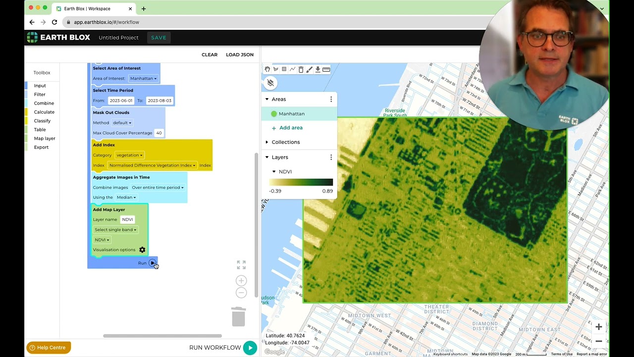
Creating good quality maps is important for presentations, reports and webpages. Maps are a form of communication, so it's just as important to get the tone, emphasis and clarity right for a map, as it is for the text that accompanies it. That is why in this lesson, the fifth in our 14-video series, I explain how to adjust the scaling, the colour ramp (the palette of colours used in the map), and the contrast options of the data you add to the map.
NB: The photos on your smartphone only have 256 brightness levels for each of the red, green and blue channels. That means that when you edit your photo you can't tease out subtle differences in the very dark, or very light areas of the photo. (An HDR setting on your phone partially gets around that by increasing the brightness levels). A satellite image, on the other hand, can have many thousands of brightness levels. Sentinel 2, for instance, has 4096 brightness levels in each channel. So, when you are adjusting the contrast in your image output on Earth Blox, don't hesitate to experiment with all the options provided.
-----
Earth Blox provides climate and nature analytics from satellite imagery to help businesses accelerate their sustainability transition.
The software maps and analyses key metrics for biodiversity, water and carbon across forestry, agriculture, and financed and insured assets worldwide.
 0:05:21
 0:03:37
 0:12:35
 1:12:08
 0:18:00
 0:05:24
 0:08:22
 0:14:03
 0:01:39
 1:21:53
 0:02:44
 0:07:05
 0:23:23
 0:07:44
 0:05:25
 0:00:56
 0:05:26
 0:06:18
 0:05:15
 0:06:47
 0:04:20
 0:03:47
 0:05:33
 1:04:03