filmov
tv
TABLEAU LOLLIPOP CHART TUTORIAL
Показать описание
Become a cutting-edge TABLEAU expert in as little as 8 HOURS with our newest data science online course — now 95% off.
Dive into all that Tableau 2018 has to offer and take your data science career to whole new heights with “Tableau 2018: Hands-On Tableau Training For Data Science” — currently rated 4.6/5 on Udemy.
Learn by doing with step-by-step lectures, real-life data analytics exercises and quizzes.
=================================================
95% OFF — A limited time, YouTube ONLY offer!
=================================================
Here’s what some of our bright students have to say about the course!
“I took almost every course from [instructor] Kirill and his team. This is one of the best ones so far. Examples and pace of the course are perfect in my opinion.” — Philipp S.
“Intuitive guidance about how to interpret data and present it in a way that is easily comprehensible.” — Khushwinder B.
Join over 523,000 data science lovers and professionals in taking your skills to the next level. Leverage opportunities for you or key decision makers to discover data patterns such as customer purchase behavior, sales trends, or production bottlenecks.
Master everything there is to know about Tableau in 2018
========================================
- Getting started
- Tableau basics
- Time series, aggregation and filters
- Maps, scatterplots and launching your first dashboard
- Joining and blending data
- Creating dual axis charts
- Table calculations, advanced dashboards, storytelling
- Advanced data preparation
- Clusters, custom territories, design features
- What’s new in Tableau 2018
Learn on-the-go and at your convenience — via mobile, desktop, and TV — in a 70-lecture course that breaks down topics into fun and engaging videos while covering all the Tableau 2018 functions you’ll ever need. And don’t hesitate to start from the beginning, or skip ahead with our independent modules.
Get the dataset and completed Tableau workbook here:
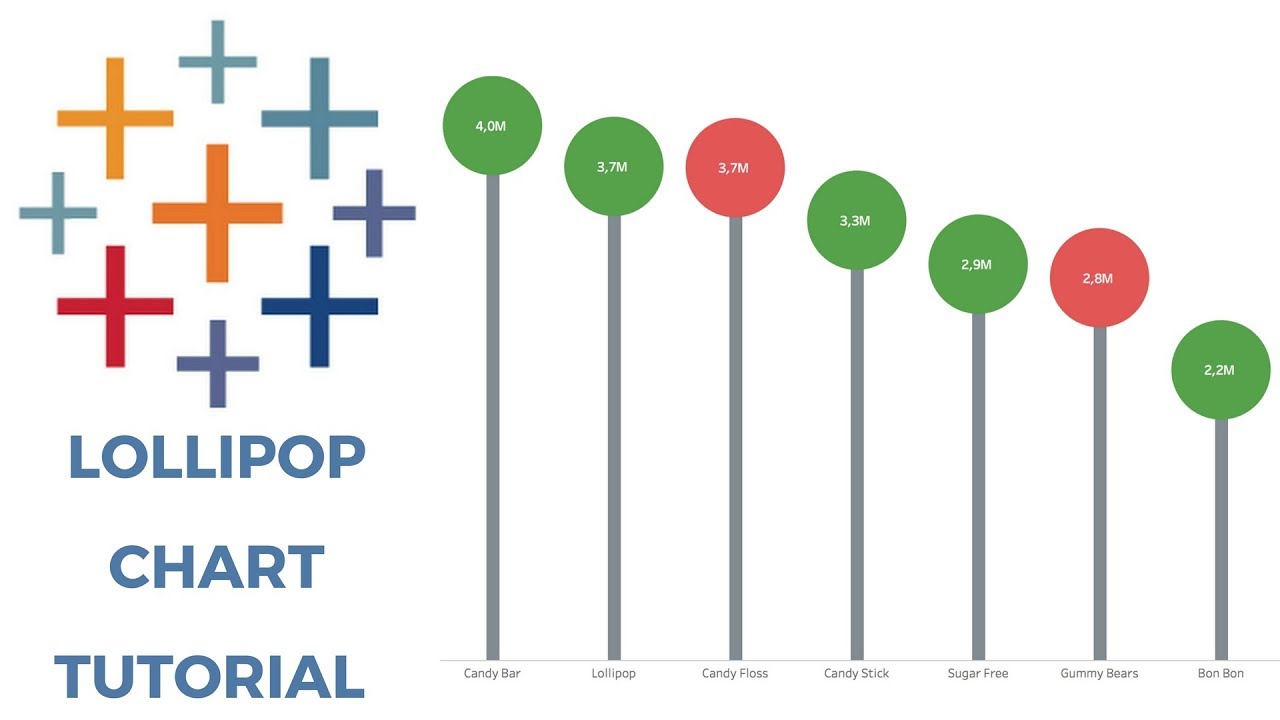
Lollipop charts are in function the same as bar charts but have a great way of being much more visually appealing than a regular boring bar chart. It also allows for additional dimensions to be added to the chart where your users can get all of the insights they need from a single chart. In this tutorial, we show you a couple of different flavors of the lollipop chart (no pun intended!) - and we have even added a very helpful tip to customize it with your pictures and have your users asking for more!
Dive into all that Tableau 2018 has to offer and take your data science career to whole new heights with “Tableau 2018: Hands-On Tableau Training For Data Science” — currently rated 4.6/5 on Udemy.
Learn by doing with step-by-step lectures, real-life data analytics exercises and quizzes.
=================================================
95% OFF — A limited time, YouTube ONLY offer!
=================================================
Here’s what some of our bright students have to say about the course!
“I took almost every course from [instructor] Kirill and his team. This is one of the best ones so far. Examples and pace of the course are perfect in my opinion.” — Philipp S.
“Intuitive guidance about how to interpret data and present it in a way that is easily comprehensible.” — Khushwinder B.
Join over 523,000 data science lovers and professionals in taking your skills to the next level. Leverage opportunities for you or key decision makers to discover data patterns such as customer purchase behavior, sales trends, or production bottlenecks.
Master everything there is to know about Tableau in 2018
========================================
- Getting started
- Tableau basics
- Time series, aggregation and filters
- Maps, scatterplots and launching your first dashboard
- Joining and blending data
- Creating dual axis charts
- Table calculations, advanced dashboards, storytelling
- Advanced data preparation
- Clusters, custom territories, design features
- What’s new in Tableau 2018
Learn on-the-go and at your convenience — via mobile, desktop, and TV — in a 70-lecture course that breaks down topics into fun and engaging videos while covering all the Tableau 2018 functions you’ll ever need. And don’t hesitate to start from the beginning, or skip ahead with our independent modules.
Get the dataset and completed Tableau workbook here:
Lollipop charts are in function the same as bar charts but have a great way of being much more visually appealing than a regular boring bar chart. It also allows for additional dimensions to be added to the chart where your users can get all of the insights they need from a single chart. In this tutorial, we show you a couple of different flavors of the lollipop chart (no pun intended!) - and we have even added a very helpful tip to customize it with your pictures and have your users asking for more!
 0:01:17
Tableau Tutorial - Lollipop Charts
 0:11:55
TABLEAU LOLLIPOP CHART TUTORIAL
 0:03:09
Lollipop Bar Chart in Tableau | Analytics Planets
 0:03:23
Tableau Tutorial - Creating Lollipop Charts
 0:03:11
Tableau Lollipop Chart Tutorial
 0:03:19
Lolipop Chart in Tableau | Tableau Charts - Tableau Tutorials
 0:00:35
#Tableau - Lollipop Chart 🍭
 0:02:43
Tableau Mini Tutorial: Lollipop Chart
 0:05:18
Tableau Custom Charts Lollipop Chart
 0:01:33
Lollipop chart in Tableau just in few seconds
 0:03:04
How to Create Lollipop Charts in Tableau
 0:09:41
How To Create Lollipop Chart in Tableau
 0:05:15
Lollipop Chart | Build This Viz | Tableau Tutorial with Data Coach
 0:02:59
Tableau Explained: How to Create a Lollipop Chart
 0:05:34
Lollipop Chart in Tableau || Tableau Tutorial for Beginners || Charts in Tableau
 0:05:34
Lollipop Chart | #Tableau #Tutorial Advanced Session 42 @laksmiles3171 #dataviz #visualization
 0:00:47
Tableau Tutorial — How to create a Lollipop Chart
 0:02:59
How te create Lollipop chart using Tableau Software - Skill Pill
 0:06:59
Lollipop Chart in Tableau
 0:03:43
How to Create a Lollipop Chart in Tableau? | Step By Step
 0:16:02
Tableau - Lollipop Chart | How to create Lollipop Chart in Tableau.
 0:03:14
Tableau Lollipop Chart
 0:06:10
How to in Tableau in 5 mins: Create a Lollipop Chart
 0:11:42
How to Create Lollipop Gantt Charts in Tableau
Комментарии