filmov
tv
How To Create A Split Color Background using CSS // Squarespace CSS Tutorial

Показать описание
---
---
---
***
This tutorial shows you how to use CSS gradient effects in a clever way, to create a vertically split color page background with one color on the left and one on the right, all the way down the page!
Now before you copy and paste this into your site, I want to talk about mobile too. To keep a site looking great on all devices is an unwritten code of honor that designers need to uphold. And sometimes a split color background on a tiny screen looks, well, terrible. So this weeks CSS tutorial is two fold - one code to split the background into two colors, and another to revert it back on any screen smaller than 640px in width.
As a designer, you have full flexibility on this - no need to use the second mobile code if you like the look. I do recommend testing your design among friends and on a few device layouts before you decide to split the screen on everything. Anywho, on to the code!
BRINE TEMPLATES
.Main {background: linear-gradient(90deg, #000000 50%, #FFFFFF 50% ); } @media only screen and (max-width: 640px) {.Main {background: #FFFFFF !important }}
BEDFORD TEMPLATES
#siteWrapper{background: lineargradient( 90deg, #000000 50%, #FFFFFF 50% ); } @media only screen and (max-width: 640px) {#siteWrapper {background: #FFFFFF!important }}
PACIFIC & YORK TEMPLATES
#page {background: linear-gradient(90deg, #000000 50%, #FFFFFF 50% ); } @media only screen and (max-width: 640px) {#page {background: #FFFFFF!important }}
---
---
---
---
The term "Squarespace" is a trademark of Squarespace, Inc. This content is not affiliated with Squarespace, Inc. I just really love their platform ♥
---
#squarespace #squarespacecss #howto #customizesquarespace #css #squarespacetricks #squarespacehacks #squarespacetips
---
---
***
This tutorial shows you how to use CSS gradient effects in a clever way, to create a vertically split color page background with one color on the left and one on the right, all the way down the page!
Now before you copy and paste this into your site, I want to talk about mobile too. To keep a site looking great on all devices is an unwritten code of honor that designers need to uphold. And sometimes a split color background on a tiny screen looks, well, terrible. So this weeks CSS tutorial is two fold - one code to split the background into two colors, and another to revert it back on any screen smaller than 640px in width.
As a designer, you have full flexibility on this - no need to use the second mobile code if you like the look. I do recommend testing your design among friends and on a few device layouts before you decide to split the screen on everything. Anywho, on to the code!
BRINE TEMPLATES
.Main {background: linear-gradient(90deg, #000000 50%, #FFFFFF 50% ); } @media only screen and (max-width: 640px) {.Main {background: #FFFFFF !important }}
BEDFORD TEMPLATES
#siteWrapper{background: lineargradient( 90deg, #000000 50%, #FFFFFF 50% ); } @media only screen and (max-width: 640px) {#siteWrapper {background: #FFFFFF!important }}
PACIFIC & YORK TEMPLATES
#page {background: linear-gradient(90deg, #000000 50%, #FFFFFF 50% ); } @media only screen and (max-width: 640px) {#page {background: #FFFFFF!important }}
---
---
---
---
The term "Squarespace" is a trademark of Squarespace, Inc. This content is not affiliated with Squarespace, Inc. I just really love their platform ♥
---
#squarespace #squarespacecss #howto #customizesquarespace #css #squarespacetricks #squarespacehacks #squarespacetips
 0:07:34
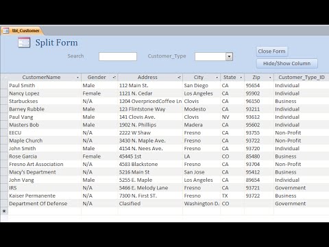
How to Create a Split Form
 0:00:42
Creating Split Forms in Access
 0:00:13
How to create a split screen on your PC
 0:01:04
Create Split Screen | CapCut PC Tutorial
 0:07:54
How To Create Split Screens in Premiere Pro 2023 (Step-By-Step)
 0:01:14
Create Split Screen | CapCut Android & iOS Tutorial
 0:02:32
How to Make a Split Screen Video
 0:00:57
How To Create Split Screens | DaVinci Resolve 18 Tutorial
 0:02:57
How to split screen on Redmi 13C | How to enable split screen on Xiaomi Redmi 13C
 0:06:19
Make Easy Split/Slice Transitions in Premiere Pro (Tutorial)
 0:03:27
Access - Split Form
 0:02:52
How To Create A Basic Split Screen in Adobe Premiere Pro
 0:04:26
INSTAGRAM GRID in a few seconds - split a large photo into multiple posts
 0:07:44
How to create split screens in Premiere Pro (Simple and advanced)
 0:01:36
Synth Tips | How to create a Keyboard Split | MODX/MONTAGE
 0:03:41
Create a Split Screen in Premiere
 0:01:00
How to Create Split Screen Animations in Adobe Premiere Pro
 0:05:54
Roland FANTOM - How to create a basic Split
 0:07:14
How to Create Vertical Split Screen Videos in Adobe Premiere Pro
 0:10:19
4 ways to make SPLIT SCREENS in Premiere Pro
 0:01:45
Quick Split Screen Tutorial | Premiere Pro 2020
 0:00:21
How To Split Laptop Screen With Keyboard Shortcut Keys | how to split laptop screen into two
 0:05:05
MS Access - How to split your database and allow multiple users to enter data at the same time
 0:03:26
Roland Juno-DS - How to create a Split layer
Комментарии