filmov
tv
Solving the Issue of Justify-content Not Working in Your HTML CSS Nav-Bar

Показать описание
Discover why `justify-content` may not work in your HTML CSS navbar and learn effective solutions and tips to properly apply it in your projects.
---
Visit these links for original content and any more details, such as alternate solutions, latest updates/developments on topic, comments, revision history etc. For example, the original title of the Question was: Why Justify-content not working in nav-bar in html css
If anything seems off to you, please feel free to write me at vlogize [AT] gmail [DOT] com.
---
Why is justify-content Not Working in My Navbar?
If you’re working on a project in HTML and CSS, you might have encountered the frustrating issue of the justify-content property not functioning as expected in your navbar. This scenario is common among developers, especially when starting their journey with CSS Flexbox. Understanding how to ensure that justify-content works correctly can enhance the styling of your navigation bar and create a more visually appealing user interface. In this guide, we’ll dive into the problem, explore possible reasons, and outline effective solutions that you can implement right away.
Understanding justify-content
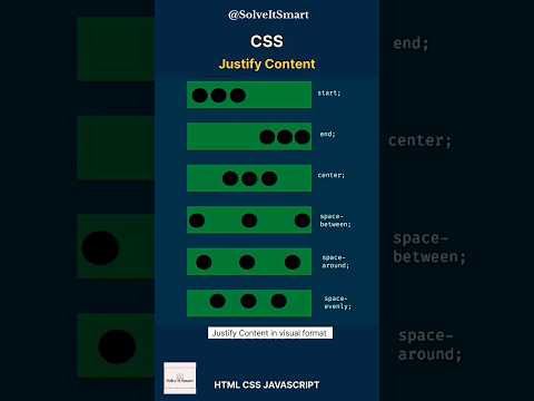
The justify-content property in CSS is used to align the children (or flex items) of a flex container along the main axis. It provides various alignment options, such as:
flex-start: Aligns items to the start of the container.
flex-end: Aligns items to the end of the container.
center: Centers items in the container.
space-between: Distributes items evenly, with the first item at the start and the last at the end.
space-around: Distributes items with space around them.
For a navbar, using justify-content: space-between is particularly common as it helps space logos and navigation items across the available width effectively.
Common Issues Preventing justify-content from Working
When justify-content doesn’t seem to be functioning, there could be several reasons for it. Here are some things to check in your code:
Parent Container Configuration:
Ensure that the parent container of the items (in this case, the navbar) is set to display: flex;. This is crucial as justify-content only applies to flex containers.
Nested Elements:
If there are any block-level elements like <hr> or other divs within the navbar that can break the flex context, they can lead to unexpected behavior with justify-content.
Width Limitations:
The flex container needs enough width to apply justify-content properly. If the width is set too small, the items may not distribute as expected.
Solution to Your Navbar Issue
In your provided code, you experienced this issue because of the <hr> tag placed inside the navbar. Here are the steps to resolve it:
Step 1: Move the <hr> Outside of the Navbar
Simply relocating the <hr> tag to outside the navbar structure ensures that it doesn't interfere with the flex properties applied to the navbar. Here’s the updated code for clarity:
[[See Video to Reveal this Text or Code Snippet]]
Step 2: Confirm Flex Configuration
Make sure that your CSS correctly applies display: flex; to the navbar class:
[[See Video to Reveal this Text or Code Snippet]]
Tips for Using justify-content Effectively
Always Check Your Structure: Ensure that there are no elements inside your flex container that could disrupt the flex context.
Experiment with Different Options: Try different values for justify-content to see which one suits your layout best.
Inspect with Developer Tools: Utilize browser developer tools to inspect the element and understand how CSS properties are being applied.
By following these steps, your justify-content should function as intended, creating a clean and responsive navbar for your website.
Conclusion
Understanding and applying CSS flexbox properties like justify-content can significantly enhance your web layout. By ensuring that your HTML structure aligns with your CSS styling intentions, you can easily avoid issues that may arise. Remember to move potential block elements outside of flex containers and experiment with alignment properties to achieve your desired layout.
Happy coding!
---
Visit these links for original content and any more details, such as alternate solutions, latest updates/developments on topic, comments, revision history etc. For example, the original title of the Question was: Why Justify-content not working in nav-bar in html css
If anything seems off to you, please feel free to write me at vlogize [AT] gmail [DOT] com.
---
Why is justify-content Not Working in My Navbar?
If you’re working on a project in HTML and CSS, you might have encountered the frustrating issue of the justify-content property not functioning as expected in your navbar. This scenario is common among developers, especially when starting their journey with CSS Flexbox. Understanding how to ensure that justify-content works correctly can enhance the styling of your navigation bar and create a more visually appealing user interface. In this guide, we’ll dive into the problem, explore possible reasons, and outline effective solutions that you can implement right away.
Understanding justify-content
The justify-content property in CSS is used to align the children (or flex items) of a flex container along the main axis. It provides various alignment options, such as:
flex-start: Aligns items to the start of the container.
flex-end: Aligns items to the end of the container.
center: Centers items in the container.
space-between: Distributes items evenly, with the first item at the start and the last at the end.
space-around: Distributes items with space around them.
For a navbar, using justify-content: space-between is particularly common as it helps space logos and navigation items across the available width effectively.
Common Issues Preventing justify-content from Working
When justify-content doesn’t seem to be functioning, there could be several reasons for it. Here are some things to check in your code:
Parent Container Configuration:
Ensure that the parent container of the items (in this case, the navbar) is set to display: flex;. This is crucial as justify-content only applies to flex containers.
Nested Elements:
If there are any block-level elements like <hr> or other divs within the navbar that can break the flex context, they can lead to unexpected behavior with justify-content.
Width Limitations:
The flex container needs enough width to apply justify-content properly. If the width is set too small, the items may not distribute as expected.
Solution to Your Navbar Issue
In your provided code, you experienced this issue because of the <hr> tag placed inside the navbar. Here are the steps to resolve it:
Step 1: Move the <hr> Outside of the Navbar
Simply relocating the <hr> tag to outside the navbar structure ensures that it doesn't interfere with the flex properties applied to the navbar. Here’s the updated code for clarity:
[[See Video to Reveal this Text or Code Snippet]]
Step 2: Confirm Flex Configuration
Make sure that your CSS correctly applies display: flex; to the navbar class:
[[See Video to Reveal this Text or Code Snippet]]
Tips for Using justify-content Effectively
Always Check Your Structure: Ensure that there are no elements inside your flex container that could disrupt the flex context.
Experiment with Different Options: Try different values for justify-content to see which one suits your layout best.
Inspect with Developer Tools: Utilize browser developer tools to inspect the element and understand how CSS properties are being applied.
By following these steps, your justify-content should function as intended, creating a clean and responsive navbar for your website.
Conclusion
Understanding and applying CSS flexbox properties like justify-content can significantly enhance your web layout. By ensuring that your HTML structure aligns with your CSS styling intentions, you can easily avoid issues that may arise. Remember to move potential block elements outside of flex containers and experiment with alignment properties to achieve your desired layout.
Happy coding!
 0:00:39
 0:00:19
 0:00:15
 0:04:05
 0:01:37
 0:01:54
 0:02:05
 0:08:16
 0:01:36
 0:00:20
 0:01:28
 0:02:29
 0:00:13
 0:00:57
 0:00:34
 0:01:47
 0:01:14
 0:00:17
 0:00:33
 0:00:09
 0:01:10
 0:01:37
 0:02:14
 0:00:07