filmov
tv
Latest Covid19 Virus Data Visualization in Bar & Line Charts Animation to March 27th - After Effects

Показать описание
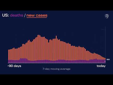
This video showcases how corona pandemic Covid-19 know as #coronavirus changed globally from January 22th to March 27th among the countries, as well as globally. Bar chart race animation reveals the most affected country at the top of the stack. Area and line charts covers cases globaly: confirmed, recovered, deaths.
Area Chart 00:10 - 01:00
Bar Chart 01:00 - 01:55
Line / Rect Chart 01:55
If you are interested in building motion design systems, which would allow dynamic videos creation on the fly - do not hesitate to get in touch.
Data source: Novel Coronavirus COVID-19 (2019-nCoV) Data by Johns Hopkins CSSE. There are missing sources about 'recovered' people in few major countries!
 0:02:56
Latest Covid19 Virus Data Visualization in Bar & Line Charts Animation to March 27th - After Eff...
 0:04:21
Visualizing COVID
 0:06:56
Epidemic Data Exploration for the Novel Coronavirus COVID-19
 0:00:51
JHU’s Daily COVID-19 Data in Motion: July 22, 2022
 1:30:31
How to Visualize COVID-19 Data
 0:09:52
Datavis 2020 Episode 11 - Coronavirus Dataviz Hackathon Part I (Coronavirus Dataviz)
 0:04:06
Coronavirus Data Extraction & Visualization (COVID-19)
 0:00:32
Viral Visualizations: How Coronavirus Skeptics Use Orthodox Data Practices to Promote Unorthodox ...
 0:01:06
JHU’s Daily COVID-19 Data in Motion: April 19, 2022
 0:03:11
The Crucial Role of Accurate Data Visualization in COVID-19 Decision-Making
 0:21:32
Visualizing Coronavirus spread using Animated Charts -Part 2
 0:01:06
JHU’s Daily COVID-19 Data in Motion: August 12, 2021
 0:04:57
Viral Visualizations: How Coronavirus Skeptics Use Orthodox Data Practices to Promote Unorthodox ...
 0:13:40
😷 Visualize Coronavirus Data - Download Raw COVID-19 Data - Visualize Spread & Outbreak Using Py...
 1:01:01
Albert Tian Chen - COVIDCG:SARS-CoV-2 Mutation Tracking + Genomic Data Visualization | PyData Boston
 0:00:43
COVID-19 Global Impact on Clinical Trials - Interactive Data Visualization
 0:01:01
JHU’s Daily COVID-19 Data in Motion: Sep. 16, 2020
 0:45:10
Charting a virus - COVID-19 in New Zealand | Ingeborg Hawighorst - #M365May
 0:04:51
Data viz experts explain COVID-19 graphs | Things to Know
 0:00:24
DHS revamps COVID-19 data visualizations
 0:49:07
Statistics and data visualization - Lessons learned from the SARS-Coronavirus-2
 0:07:19
COVID-19 (Coronavirus) World Map to WordPress With Visualizer
 0:00:25
COVID-19 Virus visualization from Russia
 0:10:32
Viruses, Visualization, and Validation... - Varun Mittal - COVID-19 Special Track - ISMB 2020
Комментарии