filmov
tv
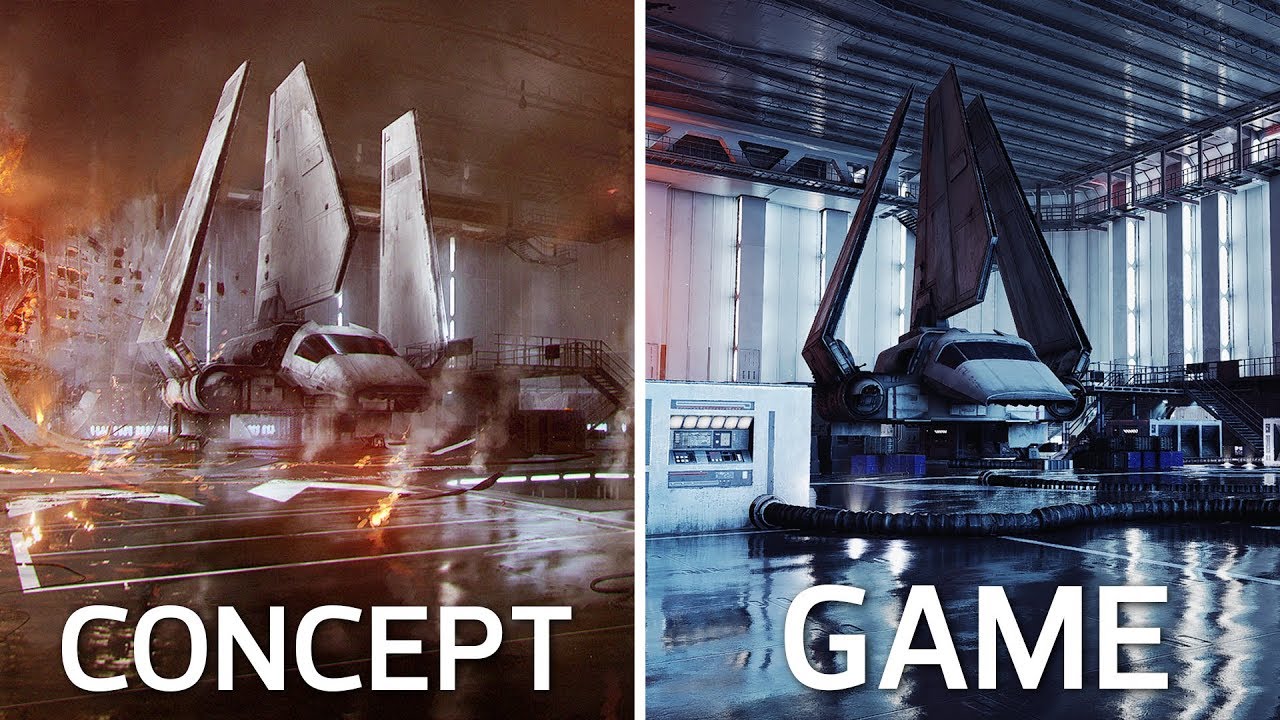
Concept Art vs Final In-Game Images | Battlefront II Comparison
Показать описание
Quick reminder that some lighting and such doesn't look as good as it usually would in game due to the fact that I am going outside their render regions in some photos. Also remember that this is just concept art and not representative of what the final product is supposed to look like. It is created as a reference for the game artists.
I was curious to see how close the concept art compared to the final in game layouts. So here are some photo comparisons.
First image is always the concept art, and the second is the in game shot.
The Extremely Talented Concept Artists:
Music: Battlefront II Campaign
If you enjoy my content and want to support the channel, please consider donating through patreon
 0:20:52
The World of Bloodborne: Concept Art vs. Final In-Game
 0:02:19
Concept Art vs Final In-Game Images | Battlefront II Comparison
 0:14:53
Halo 3 Concept Art vs Final Game
 0:01:25
Concept Art Vs Final Design √ My Singing Monster
 0:12:34
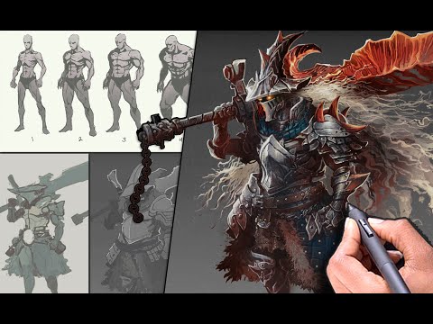
Become a CONCEPT ARTIST for video games - What to practice?
 0:07:41
Dark Souls 2 World - CONCEPT ART vs. IN-GAME
 0:03:33
Concept art VS final game | THE LAST OF US PART 2
 0:00:46
MSM Concept Art VS. Final Design (Part 2)
 0:00:57
MSM Concept Art VS. Final Design
 0:00:49
#mysingingmonsters Concept Art VS Final Design #msm #shorts #scary
 0:11:07
Fallout 76 | Concept Art VS The Game – BECOME A SUPER MUTANT!?
 0:08:05
Concept Art For Video Games Explained
 0:00:43
Sonic Prime - Concept Art V.S. Final Design
 0:00:43
The Batman concept art vs final product #thebatman #conceptart #shorts
 0:00:31
Marvel concept art vs final result (part-2) | #marvel #shorts #mcu #trending
 0:00:14
Just a Goblin Webtoon! Our Pitch vs Final Concept Art!
 0:04:41
Final Fantasy XV: Concept Art vs Reality (FFXV)
 0:08:18
Don't learn CONCEPT ART!
 0:00:58
Elder Scrolls Villans VS Concept Art #vs #tes #skyrim #morrowind #oblivion #conceptart #comparison
 0:05:06
Concept Art vs Illustration
 0:14:47
SO YOU WANT TO BE A CONCEPT ARTIST?
 0:00:23
MSM CONCEPT VS. FINAL DESIGN (Part 2) #msm #mysingingmonsters #concept #conceptart
 0:00:28
News Concept Revealed | Monsters Vs Concept Art | My Singing Monsters - Part 19
 0:00:25
Monsters Vs Concept Art | My Singing Monsters - Part 4
Комментарии