filmov
tv
3 Tips for Designing an Eye-Catching Poster [Design Tutorial]

Показать описание
Want to create a poster that really stands out? In this tutorial, I share three key tips to help you design eye-catching posters. Whether you're just starting out or have been designing for years, these practical tips will boost your skills. I'll dive into layout, color choices, and typography to help you create visually stunning and effective posters. Enjoy the video, and don't forget to like, comment, and subscribe for more design tips and design tutorials!
🌍 RESOURCES FOR NEW DESIGNERS:
⭐️ How to Learn Graphic Design Course:
Learn the skills to create quality graphic designs without having to dig through dozens of how-to videos or pay thousands of dollars in expensive programs.
⭐️ Download this FREE Guide to 6 Exercises to Learn Graphic Design:
It is vital to learn graphic design correctly so that you can gain confidence and create professional designs. This guide will get you started with the 6 vital basics of design composition.
🌍 RESOURCES FOR FREELANCE DESIGNERS:
Free Guide to Get More Design Clients to Your Business:
Free Pricing List for Freelance Graphic Designers:
———
---
Time Stamps:
0:00 - Introduction to poster design
0:45 - Tip # 1
1:38 - Tip # 2
5:20 - Tip # 3
#graphicdesigntutorialsforbeginners #posterdesign #learngraphicdesignbyyourself
 0:06:22
3 Tips for Designing an Eye-Catching Poster [Design Tutorial]
 0:12:38
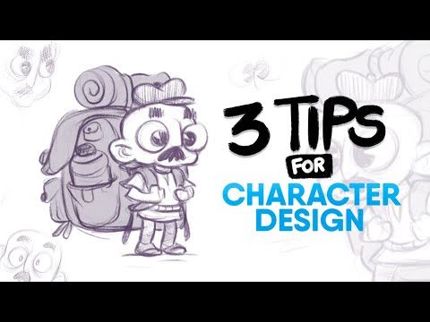
3 PRACTICAL Tips for Character Designing
 0:06:36
AVERAGE TO AWESOME IN SECONDS! 5 Tips For Professional Design Artwork
 0:14:51
3 Tips To Design Your KITCHEN Like a Pro! Interior Designer Fixes Common Kitchen Layout Mistakes.
 0:07:23
3 Design Tips for Better 3D Printed Holes - CAD For Newbies
 0:13:49
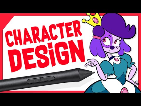
3 Tips to Improve Character Design Sketches
 0:08:19
3 Simple Tips for Enhancing Your Poster Design
 0:06:44
Tips for High Performance Home Floorplan: Designing Out Condensation, Odors, Discomfort, and Hassle
 0:00:25
Art and craft best craft ideas 'Art and Craft Hacks: #artandcraft #art #craft #diy #short
 0:02:13
3 TIPS to improve any Motion Design!
 0:16:23
3 TIPS for DESIGNING GREAT Power BI Reports 📊
 0:01:34
3 Tips to design the perfect page
 0:08:29
7 MIND BLOWING Logo Design Tips ✍
 0:06:28
Smart Gamification: 3 tips for designing engagement
 0:17:17
Design With Elementor - 3 Tips To Improve Design Skills
 0:05:09
3 Tips on starting your own design agency.
 0:00:35
3 EQ Tips For Sound Design
 0:02:04
3 Tips for Designing Your Own Ring
 0:09:13
3 Tips to Step Up Your Design Game
 0:12:02
3 Tips To Stay Motivated When Looking For A Job In Design
 0:00:40
3 Quick Tips To Design An Intentional Space 🪴 | #shorts
 0:00:58
3 Tips to Level Up as a UX/UI Designer!
 0:20:21
GOOD vs BAD Character Design: Tips and Tricks!
 0:02:06
3 Tips to Make Your Design Portfolio Stand Out - Luciano Bove
Комментарии