filmov
tv
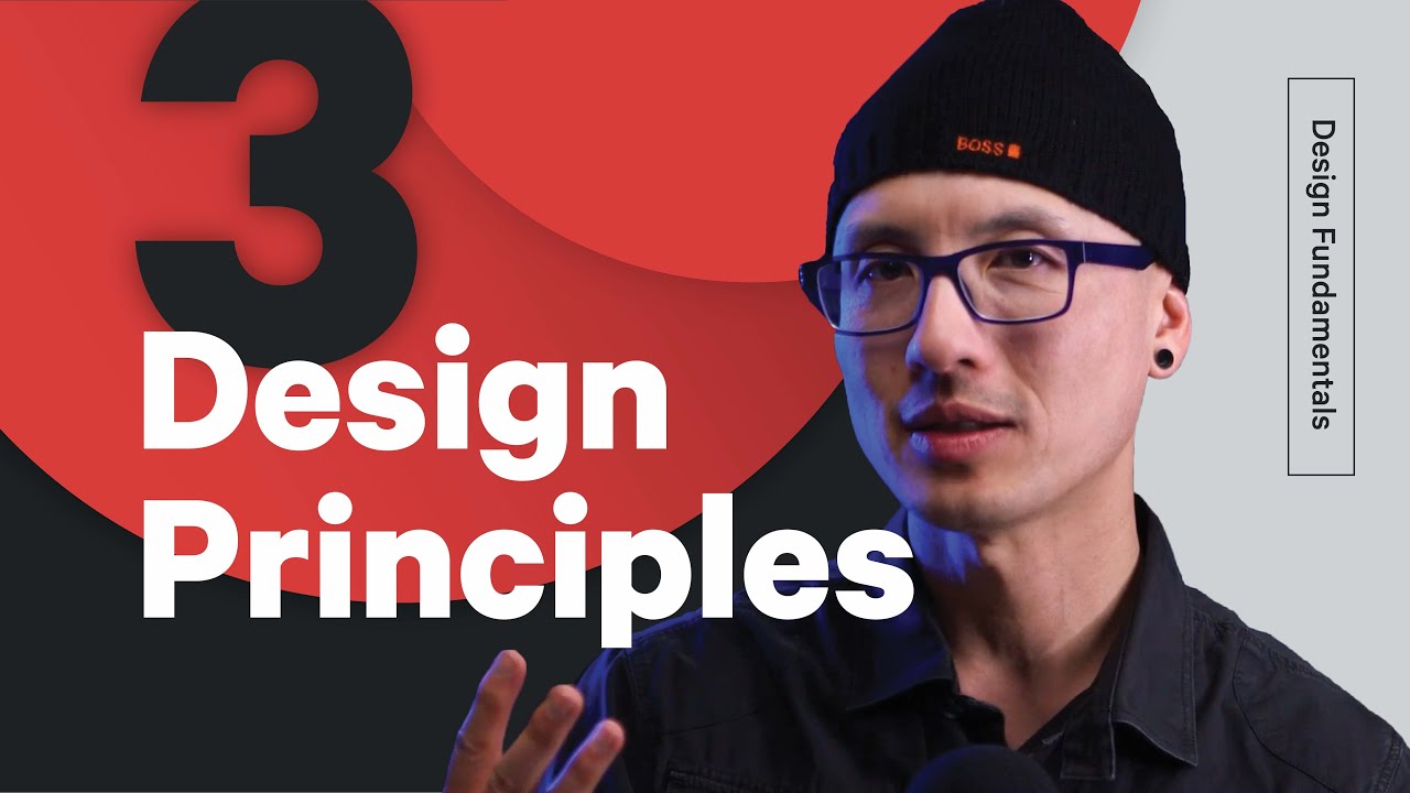
3 Principles to Improve Your Logo Design Process - Legibility, Hierarchy, and Contrast
Показать описание
Are you a graphic designer, web designer, package designer, or motion designer? Use these 3 Steps to Improve your design process:
1. Design in black and white - As we all know, Design can be frustrating, it’s easy to get overwhelmed. I find it helps to focus my attention on only whats important. That's why I design in black and white. It forces me to focus on only the most important aspects of the logo: Hierarchy, Contrast and Legibility.
2. Focus on legibility - Legibility is essential but can get in the way of some really fun ideas. Sometimes In pursuit of a clever idea, we get carried away to the point the logo becomes hard to read. Rookie mistake. The solution? Periodically check in and ask yourself (or someone else) does the logo read well?
3. Giving a good Critique is an art - There’s much more to it than simply throwing out random opinions. Whether critiquing your own work or someone else’s, it’s important to remember that a good critique follows a process. I think of it like peeling an onion: Start by simply describing what you’re seeing. Then, say 1 thing you like and 1 thing that feels kinda funny. Then, move into what isn’t working and why. Finally, suggest ways to fix it.
These are 3 small things you can start doing that will improve your logo design skills. Getting better is a slow process, but these 3 things are a step in the right direction. We will have more tips for you soon. Keep learning stuff, one day you will be great! Thanks for watching. The Futur.
=================
#TheFutur #design #principles
Want a deeper dive? Typography, Lettering, Sales & Marketing, Social Media and The Business of Design courses available here:
—
Love the content? Become a sustaining member for $5/mo today.
Our BOOKLIST:
Kits & Proposals:
Visit our website:
FREE resources:
Mandarin (Chinese) Subtitles on UiiUii
—
AFFILIATE LINKS*
🙏 Support The Futur but purchasing through our affiliate links:
✍️ Sharpen your skills by taking a course, using our affiliate links:
🎧 Do you like the music? Check out the music libraries we use in our affiliate links below:
*By making a purchase through any of our affiliate links, we receive a very small commission at no extra cost to you. This helps us on our mission to provide quality education to you. Thank you.
—
Futur Podcast on iTunes: 🎙
Spotify: 🎙
—
We love getting your letters. Send it here:
The Futur
c/o Chris Do
1702 Olympic Blvd.
Santa Monica, CA 90404
USA
—
Host– Chris Do
Content Director– Matthew Encina
Cinematographers– Mark Contreras, Stewart Schuster, Aaron Szekely, Ricky Lucas, Jona Garcia
Editors– Mark Contreras, Stewart Schuster, Aaron Szekely, Ricky Lucas, Jona Garcia
Live Editor– Jona Garcia
Social Team– Elle Money, Alex Burlui
Typefaces: Futura, DIN, Helvetica Neue, Calibre
Futur theme song— Adam Sanborne
 0:35:28
3 Principles to Help Your Relationships | Michael Todd and Craig Groeschel
 0:06:13
3 Principles to Improve Your Logo Design Process - Legibility, Hierarchy, and Contrast
 0:06:47
3 Principles to Improve Your Interpersonal Skills
 0:02:34
3 Principles To Maintain Happy Relationships | Gaur Gopal Das
 0:17:01
3 principles to take your life coaching skills to the next level
 0:15:02
3 design principles to help us overcome everyday bias | Thaniya Keereepart | TEDxPortland
 0:03:34
Science X Design: Three Principles to Improve Outcomes for Children
 0:17:36
3 principles for creating safer AI | Stuart Russell
 0:14:19
She Only Used “3 Words” To Manifest large amounts of Money | Neville Goddard
 0:05:20
This tool will help improve your critical thinking - Erick Wilberding
 0:12:24
3 Djokovic Secrets to Winning More Matches - Tennis Lesson
 0:08:11
3 Principles for Social Success: Level up your social skills
 0:07:41
8 Simple Self Improvement Principles
 0:05:03
3 Principles That Changed My Graphic Designs FOREVER! 🙌
 0:19:22
3 PRINCIPLES from Buddha for high ENERGY levels | Mahatria on Spirituality
 0:52:01
12 Stoic Principles For Immediate Life Transformation
 0:11:10
20 Principles You Should Live By To Get Everything You Want In Life! - MASTER THIS!
 0:15:27
How Not to Fail Your Children: 3 Principles for Empowerment | Marko Londa | TEDxSalzburg
 0:06:05
My Journey Learning English: 3 Principles to Fluency
 0:06:40
3 Stages of Thinking | The most Powerful Way to THINK | First Principles Thinking | Only 0.1% do
 0:39:14
Three Principles for a Successful Life | Wednesday Night Exclusive
 0:01:42
Three Principles by Sydney Banks - Animated by CoachCafe.no
 0:23:40
Wife Wants to Separate: Mastering The 3 KEY Artful Principles to Help You Reconcile
 0:02:28
3 Principles of Design Thinking
Комментарии