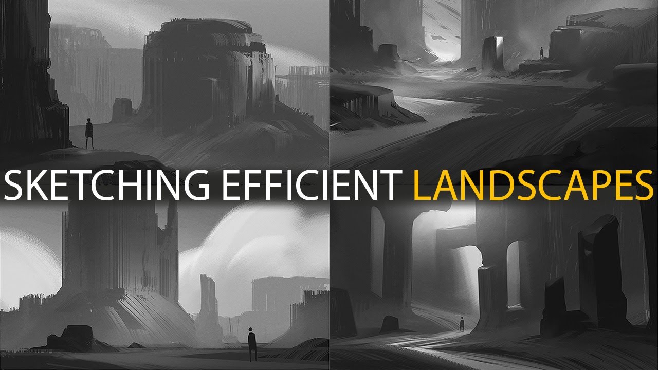
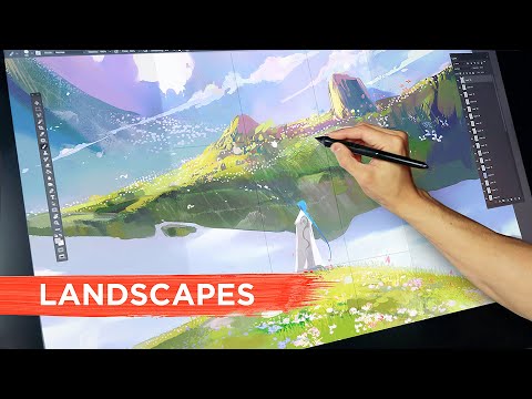
How To Sketch Landscapes: Tutorial

preview_player
Показать описание


→ More arty stuff on my home page and Artstation:

TIMESTAMPS:
0:00 - Intro & First Sketch
2:27 - Brush Efficiency & Workflow Overview
5:18 - Keyboard Shortcuts
7:57 - Layer Setup
10:22 - Moving Marks
12:43 - Why is this kind of sketching important?
14:43 - Second Sketch
16:33 - Depth & Contrast
18:55 - Building Form
23:51 - Third Sketch
26:11 - Leading the Eye
29:03 - Repeating Shapes and Shape Language
39:29 - Fourth Sketch
54:37 - Outro

Licensed under Creative Commons: By Attribution 4.0 License

Licensed under Creative Commons: By Attribution 4.0 License

Licensed under Creative Commons: By Attribution 4.0 License

#conceptart #digitalpainting
Рекомендации по теме
Комментарии
Автор

people who provides this kind of content for free has vip card in heaven. Thank you, Jordan!

cubicpea
Автор

As a beginner in landscape painting, I truly appreciate the knowledge you've shared with this video. Before watching this, I've felt that I spent too much time sketching outlines of a biome or scene I have in mind. But then I'd start outlining smaller elements, but then I'd start erasing because things would start feeling out of place. This tutorial really explains how to set a landscape and the basic elements in it. Thank you so much!

kyberkreeper
Автор

Hi, Jordan. You'll probably not remember me, but you came to Teesside Uni over a year ago to do a presentation as well as some portfolio reviews. I was one of the last people you saw and because you were almost out of time, you had to give me and a few others really quick reviews. I'd just like you to know that I am really grateful that you set aside the time to create this video.

bengibson
Автор

i was on YouTube expecting to hear half the information and the rest behind a paywall but you're including a lot of technical details like what kind of brush you use, how, etc and I'm really grateful

Mello_me
Автор

A few words to add to what is said well in the video:

When approaching an artwork with a back-, mid-, and foreground, it is generally optimal to start out with the midground because this will be the portion of your scene that contains the main highlight and focus of what you want to display. It's what has the largest portion of the scene devoted to it. This means that everything else in some way has to relate to the midground scenery no matter if its a landscape artwork or a character scene or something else.
Basically, what exists in the midground determines the contrast levels of the background and foreground, it determines the general scaling of objects we can relate to (like a person in the foreground overlooking a mountain in the midground, and then having the backdrop to show if the main mountain in focus is a standalone massive peak, or if it's one out of many peaks in a large mountain range -simply acting as a representation of the general scenery itself).

Second part is on efficiency, and why it is important. It isn't really just about rushing your work or thinking you aren't allowed to put time and thought into what you're drawing. The reason efficiency is important, is because it allows you to focus on what is most important in your work, it is what is going to form the "first impression" aspect of your art. Efficiency and focusing on the bigger picture is going to establish a well balanced canvas, upon which you can then feel free to spend as much time as you desire on details, color grading, texturing, etc. But if you dive into these aspects too quickly, you might risk losing the cohesiveness of your work overall, and it might come out as disjointed, or the balance of which areas have more detail than others might be off too.
Most importantly, when working in a creative mindset, having an efficient and broad approach to your scene will help you to develop your idea over time, whereas details will make you focus on purely that element, and your creative decisions will as a result have a much smaller effect. "Think big, change big" is a motto you can use. The broader your initial approach is, the more freedom you give yourself to change and adapt your concept as a whole in that early conceptual stage.

Real_MisterSir
Автор

I can’t accurately articulate how much this has helped me. I just doodled something in ten minutes using your tips that looks better than something I tried to work on for hours and hours. I learned more in the first half of your video than I learned in a year of independent study of landscape painting.

Thank you very much for your assistance in my artistic journey

pinkpanda
Автор

Excellent. This is what kickstarts my 2021. 🎨

WanderFeetChronicles
Автор

This is amazing tutorial. I've watched over hundred hours of digital drawing and as far as I can tell, this encapsulates all the core techniques. Really amazing work.

Deathlupus
Автор

I downloaded the efficient landscape brush pack and tried scaling up the brush size on PS. I wanted to know what kind of shapes they're made up of and to my surprise, the flat-looking brush is actually made up of flattened shapes of flowers! Pretty neat!

christianfenis
Автор

We are literally covering this in class as we speak. So happy You uploaded this now

klunet
Автор

i cannot thank you enough, all of these little tips and your workflow helped me understand concept art and landscape painting so much more than any art school ever could
people really struggle with where to start or how to even do things when they are new to expansive skills like art and especially landscapes and backgrounds, This video wonderfully explains how you need to start and how to build your workflow instead of putting every shadow and shape with a brushstroke, and instead utilizing the power of digital art saving hours and hours of time

muneebhaider
Автор

Watching that for the second time...this is an amazing tutorial. For me, it`s like the fundamentals of landscape creation.

alexandrnochovka
Автор

Bless you these brushes has forever transformed my workflow

PonyExpresso
Автор

For someone who mostly draws portraits and lines for the shapes, this was actually helpful and easy to understand.
Hope to try this tips out soon to get into sketching and landscape concepts! Thank you so much for helping us small art beans!😁👍

LacrimaArt
Автор

my new year's resolution for 2023 was to get better at drawing environments, really lucky that this video got recommended to me!

colda.f.
Автор

Maybe an interesting phenomenon here. When I first saw the finished sketches in the intro, I was like holy cow genius. But each time you finished and moved on, I was sure you would come back and do more because it didn't feel the same as when I first saw it. Very interesting how powerful these sketches can be compared to the effort. But I think that's why focusing on readability first is so important. So much of the impact is in lighting and composition. You are very skilled at reading your own readability on the fly.

scroogemcdooge
Автор

Thanks for doing this for free man, happy 2021

brushrunner
Автор

I just want to start off by saying thank you so much for inspiring me to practice sketching landscapes!
I've personally always found drawing landscapes/buildings intimidating so I tend to stray away from learning it- But recently, I wanted to pick up these skill sets to broaden my artistic knowledge-
Just by watching a few minutes of your video, I can't express how invaluable the techniques/advices you've given in this vid- Especially for free for beginner artists like me!
So truly, thank you for being such an amazing and exceptional teacher to everybody!

thecoffeedemon
Автор

Thank You so much you don't understand how much these videos mean to me!!

amalsyed
Автор

Yes! Thank you so much, I can see that you put a lot of effort and time into this!

kohchenkit