filmov
tv
Probability and Statistics | Visualizing Grouped Data using Frequency Table and Histogram

Показать описание
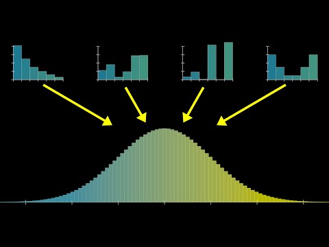
For some data sets the number of distinct values is too large it is useful to divide the values into groupings, or class intervals, and then plot the number of data values falling in each class interval. The number of class intervals chosen should be a trade-off between (1) choosing too few classes at a cost of losing too much information about the actual data values in a class and (2) choosing too many classes, which will result in the frequencies of each class being too small for a pattern to be discernible. Although 5 to 10 class intervals are typical, the appropriate number is a subjective choice.
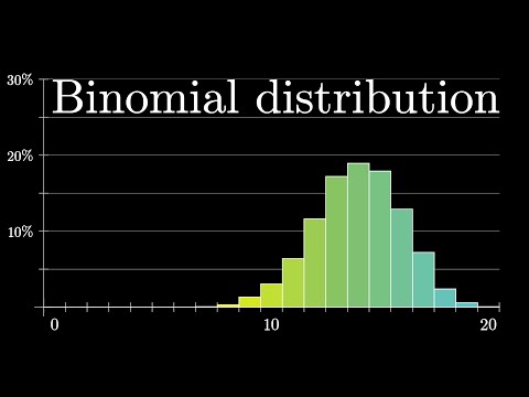
A bar graph plot of class data, with the bars placed adjacent to each other, is called a histogram. The vertical axis of a histogram can represent either the class frequency or the relative class frequency; in the former case the graph is called a frequency histogram and in the latter a relative frequency histogram.
A cumulative frequency plot is called an ogive.
#statistics
#histogram
#frequencytable
#statistics32
 0:27:25
 0:15:11
 0:12:34
 0:00:30
 0:05:26
 0:29:43
 0:09:25
 0:18:41
 2:28:01
 0:00:28
 0:06:53
 0:00:24
 0:04:34
 0:07:22
 0:31:15
 0:42:09
 0:06:54
 0:15:44
 0:09:26
 0:00:24
 0:00:11
 0:05:16
 0:15:49
 0:07:25