filmov
tv
How to Create a Responsive Header Navigation Menu with Centered Logo | Part 2 of 5

Показать описание
Smashtheshell: How to Create a Responsive Header Navigation Menu with Centered Logo | Part 2 of 5
Get the source code:
Smashtheshell: How to Create a Responsive Header Navigation Menu with Centered Logo | Part 1 of 5
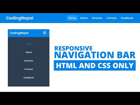
In this video series I am going to show you step by step how to create a responsive navigation bar with a logo in the center of menu items. This drop down menu will work both on mobile and desktop devices. The navigation bar will change its styles based on different devices. I am going to show you how to properly structure the navigation bar and insert the logo in the middle of your drop down menu in a right way using html5 and then I will show you how to style the navigation bar using pure css3.
This video series is divided into five parts and each part you will learn different skillsets and several useful css3 tips and techniques. And at the end video I will be showing you how to include jquery file from jquery cdn into your html document and then I will write very little bit of jquery so that I can provide the functionality to our hamburger icon, so whenever user click on this hamburger icon, it will toggle the active class back and forth.
Creating a responsive header drop down menu with logo in the center is quite bit trickier and it require some more efforts than that of simple navigation drop down menu. So, don't worry I'll show you how to create the nav bar right from the scratch. You'll learn about flex box module and you will see how we can use css filters to change the image colors without using any image editor.
You will learn to use media queries efficiently to write the different styles for different devices based on the viewport width. I'll write two media queries breakpoints to target two different resolutions or viewport size. And you will learn how to properly convert your desktop navigation design into responsive design using the media queries.
So guys topic is very interesting and in this video series you learn lots of css tricks along the way while creating the responsive header navigation bar with logo in the middle. So, go ahead and watch this whole video series.
So hope you guys like this video. Please hit like to this video and share with your friends if you really like it.
If you have any suggestions, recommendations, requests or criticisms please drop a comment below. Your feedbacks will be highly appreciated and these feedbacks encourages me to create more videos for you guys. Thanks a lot
To watch more videos and stay updated please subscribe to my channel and receive notifications as i upload videos.
Other Videos:
Smashtheshell: How to Create a Responsive Header Navigation Menu with Centered Logo | Part 3 of 5
Smashtheshell: How to Create a Responsive Header Navigation Menu with Centered Logo | Part 4 of 5
Smashtheshell: How to Create a Responsive Header Navigation Menu with Centered Logo | Part 5 of 5
Horizontal Navigation Bar with Full Width Submenu
Responsive Login Form With Social Media Buttons
CSS3 Tooltip Styling With Pure CSS3
_________________________________________________________
One thing to mention here friends,
Please do not forget to provide feedback in comments section. And please hit like if you like it and share with your friends and finally subscribe this channel to learn lots of about web design and development.
You can visit my codepen account for more stuff like this:
You can follow me on my twitter account here:
You can add me on facebook too :)
Share this video and Subscribe to this channel for latest updates and web design tips and tricks.
Waiting for feedback :) . Drop a comment
Комментарии
 0:23:13
 0:15:54
 0:00:16
 0:21:17
 0:00:58
 0:09:44
 0:08:18
 0:11:04
 0:07:07
 0:06:14
 0:20:19
 0:00:25
 0:15:21
 0:27:19
 0:15:13
 4:14:08
 0:00:38
 0:13:46
 0:08:00
 0:41:22
 0:00:55
 0:18:54
 0:19:16
 0:00:25