filmov
tv
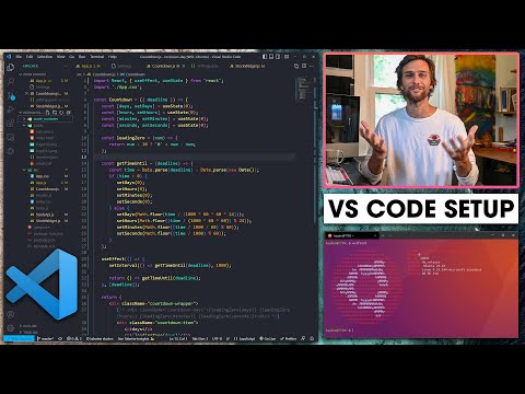
Theme your Web Apps like a PRO | Dark Mode in Storybook

Показать описание
How confident are you in your dark mode implementation? @chantastic shows how to implement a dark mode switcher using globalTypes — and all visually testable in Chromatic.
▬ Chapters ▬▬▬▬▬▬▬▬▬▬
00:00:00 Intro: implement dark mode components
00:00:30 Overview: use globals and decorators
00:00:51 Review theme-able Avatar component
00:01:41 Add a decorator to show both themes
00:02:13 Add a toolbar item to set color scheme
00:02:53 Respond to globals in decorators
00:03:23 Visually test all themes in Chromatic
00:03:55 Learn more about globals and visual testing…
▬ Links and resources ▬▬▬▬▬▬▬▬▬▬
▬ Follow us! ▬▬▬▬▬▬▬▬▬▬
Follow @chantastic on:
- youtube: @chantastic
▬ Learn more ▬▬▬▬▬▬▬▬▬▬
▬ Free Storybook hosting ▬▬▬▬▬▬▬▬▬▬
Chromatic is made by Storybook maintainers and sets up in just 2 minutes.
 0:04:29
Theme your Web Apps like a PRO | Dark Mode in Storybook
 0:14:23
10 Resources For Free Website & Web App Themes
 0:00:21
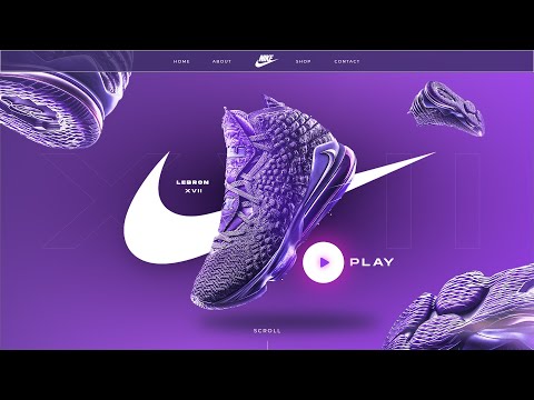
Web Design Timelapse: Nike Homepage | Wix Studio (Webpage Design)
 0:25:23
How to implement Bootstrap template(theme) in your web app like .NET Core 6.0, PHP, Angular
 0:00:19
Banking App - Sketch to UI Design Process
 0:03:37
How to customize the themes of your Streamlit web apps | Streamlit #24
 0:08:10
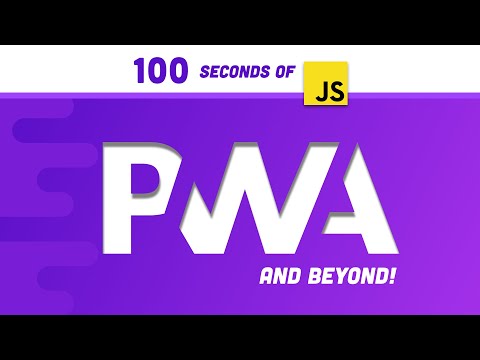
Progressive Web Apps in 100 Seconds // Build a PWA from Scratch
 0:06:18
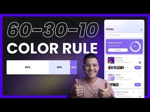
60-30-10 Color Rule
 0:06:52
The SECRET to Finding Inspiration for Web & App Design FAST
 0:16:33
Customize Streamlit Web Apps UI with Dark Mode and Custom Theme
 0:04:45
How to convert a Website into an App |100% Free|PWA App
 0:08:33
Most overpowered way to build mobile apps?
 0:05:43
Installable Web Apps (100 Days of Google Dev)
 0:00:24
Fast Food App in React Native 🔥 #shorts #reactnative #expo #reactjs #app #ui
 0:06:55
10 Rendering Patterns for Web Apps
 0:29:28
Figma UI Design Tutorial - How To Redesign Any Website (A Beginner's Guide)
 0:00:21
Sura - A Music Web App WordPress Theme | Themeforest Website Templates and Themes
 0:10:28
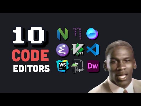
I tried 10 code editors
 0:07:00
Top 5 Animated Websites (And Why They're Good)
 0:13:56
My Visual Studio Code Setup for Web Development
 0:19:16
Build a Theme Switcher for Your Web App | CSS and JavaScript | Dharanz
 0:00:58
3 Windows Apps You Should Use Right Now
 0:05:23
I made the best way to choose colors for UI design - Realtime Colors v1
 0:11:11
6 UI Hacks I Wish I Knew As A Beginner
Комментарии